
10+ Best Fonts for Wellness Websites (and How to Pick Yours)
Not sure which wellness fonts fit your brand? Here are 10 designer-picked Squarespace font pairings for health coaches, therapists, and wellness pros.
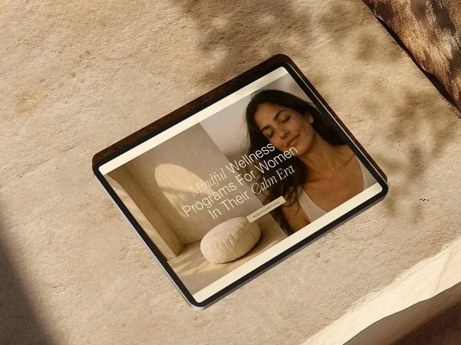
You can have the best offer in the health and wellness space and still lose a potential client in the first five seconds — because your headline font looks like a middle school PowerPoint. Font choice isn't just a decorative decision- it’s how your audience reads your brand voice and tone (and it’s a design decision that can make or break your website!)
Pick the right wellness fonts, and your site actually does the trust-building work for you. A study out of Missouri University of Science and Technology found first impressions of a website form in under two-tenths of a second — long before anyone reads your copy.
I've built over 100 Squarespace websites for health coaches, therapists, and holistic practitioners, and font pairing is one of the first things clients get stuck on. So I pulled together 10 pairings — every one of them available inside Squarespace's built-in font library — organized by the "vibe" they actually create. No design degree required!
Why Are Fonts So Important to the Success of Your Website?
An astonishing 94% of first impressions are related to a website's design, and fonts play a pivotal role in this aspect. The typeface you choose sets the initial tone for your site, influencing how users perceive your brand at first glance. A well-chosen font can convey professionalism, creativity, trustworthiness, or innovation, depending on your brand's personality and audience. This initial impression is crucial in retaining visitors and encouraging them to explore your website further.
Why Your Font Choice Matters More Than You Think
Your fonts aren't neutral. A 2022 study from Monotype and the neuroscience firm Neurons found that typeface choice alone can boost a viewer's positive response by up to 13%, and trustworthiness perception by 9% — without changing a single color, logo, or word.
That matters more in wellness than almost any other industry. You're asking someone to trust you with their health, their body, or their money before they've ever met you. The typeface carrying your headline is doing some of that persuading whether you've thought about it or not.
A shaky, mismatched font pairing doesn't just look unpolished. It quietly tells a visitor "this person might be unpolished too" — which is the opposite of what a health coach or therapist needs a stranger to believe in the first five seconds.
Fonts Evoke Emotion, Mood, and Feeling:
Fonts have the unique power to evoke specific emotions, moods, and feelings in your audience. For instance, a serif font might convey tradition and reliability, ideal for professional or academic websites. In contrast, a playful handwritten font can create a sense of informality and friendliness, perfect for brands aiming to appear approachable and down-to-earth. Selecting the right font helps in aligning your website’s visual tone with your brand’s emotional message, thereby creating a deeper connection with your audience.
Readability and Message Hierarchy:
The readability of your content is essential for effective communication. Fonts contribute significantly to how easily users can read and understand your message. A clear, legible font ensures that your audience can effortlessly absorb the information you present. Furthermore, using different fonts or font styles can create a hierarchy in your content, guiding readers' attention to the most important information first. Remember, the way visitors read a website is by skimming- headlines first, then subheadlines, then body text (like a magazine!). This hierarchical structuring is key in delivering your message effectively and ensuring that key points stand out.
Professionalism and Brand Identity:
Fonts contribute to the overall professionalism of your website. A mismatched or inappropriate font choice can undermine your credibility, while a well-chosen font enhances the professional appearance of your site. Additionally, consistent font usage across your website and other brand materials strengthens your brand identity, making your business more recognizable and memorable. This consistency in visual elements fosters trust and reliability among your audience, contributing to the long-term success of your online presence.
10 Best Font Pairings for Wellness Brands (Ready to Use on Squarespace)
I grouped these into four moods, because "best font for wellness website" means something different for a somatic therapist than it does for a high-energy nutrition coach. Find your category, then borrow the pairing outright - every one of these is searchable by name in Squarespace's Site Styles > Fonts menu.
Timeless & Elegant Wellness Font Pairings
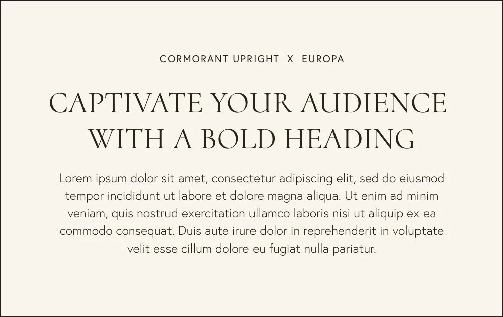
Cormorant Upright × Europa
Cormorant is a delicate, high-contrast serif set in all caps here, paired with Europa's clean geometric sans. This is boutique energy — the pairing I reach for most with therapists and 1:1 practitioners who want to feel established, not trendy.
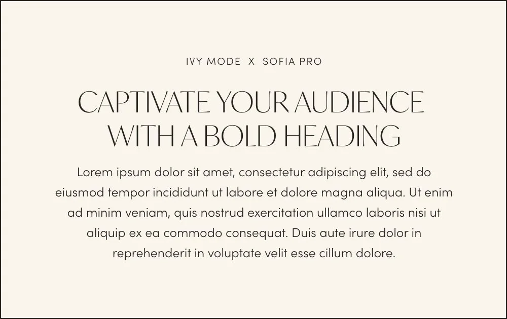
2. Ivy Mode × Sofia Pro
Ivy Mode's elegant caps against Sofia Pro's friendly, rounded sans is one of the most versatile combinations in Squarespace's library. It reads premium without tipping into cold or corporate — a good match if your offer sits at a higher price point.
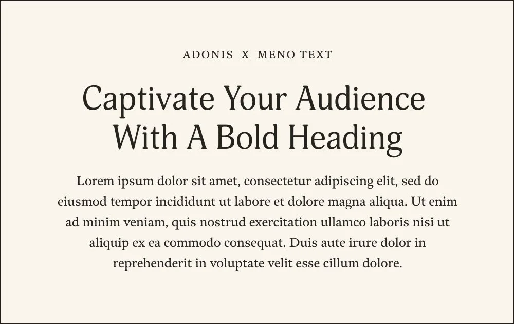
3. Adonis × Meno Text
Two serifs working together instead of the usual serif-plus-sans formula, which gives this pairing a literary, credential-forward feel. If your audience needs to trust your training and expertise before anything else — therapists, clinicians, licensed practitioners — this is worth testing first.
Chic & Editorial Wellness Font Pairings
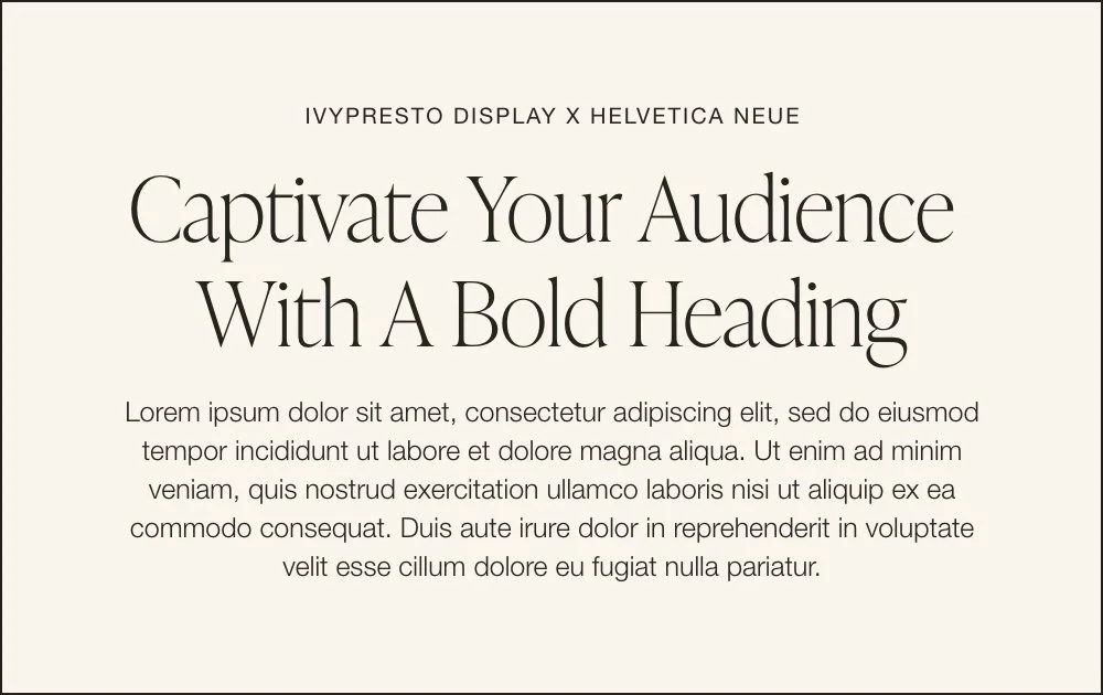
4. IvyPresto Display × Helvetica Neue
IvyPresto is a refined, editorial serif; Helvetica Neue is about as neutral and timeless as a sans-serif gets. Together they read like a beautifully designed magazine feature — a strong pick if you're building a personal brand around your own name and story.
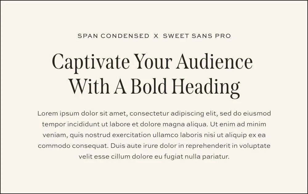
5. Span Condensed × Sweet Sans Pro
Span Condensed's tall, narrow serif has a fashion-editorial quality, balanced by Sweet Sans Pro's clean, unfussy body text. This pairing suits a lifestyle coach whose content leans visual and personality-driven — think a brand built on Pinterest and blog content rather than clinical credentials.
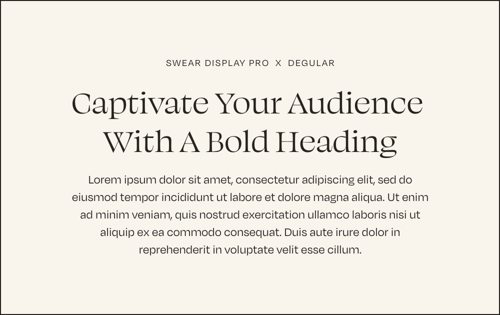
6. Swear Display Pro × Degular
A warm, classic serif over Degular's understated sans. Less trendy than some of the pairings above, more "I've been doing this for years and I'm not going anywhere" — solid for holistic practitioners and wellness studios building long-term trust.
Bold & Modern Wellness Font Pairings
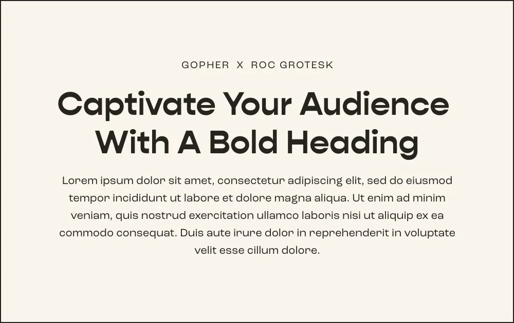
7. Gopher × Roc Grotesk
Both sans-serifs, but Gopher's rounded, confident weight against Roc Grotesk's crisp body text gives this pairing energy without losing legibility. This is the pairing for fitness coaches and high-energy personal brands who want their homepage to feel like a pep talk, not a brochure.
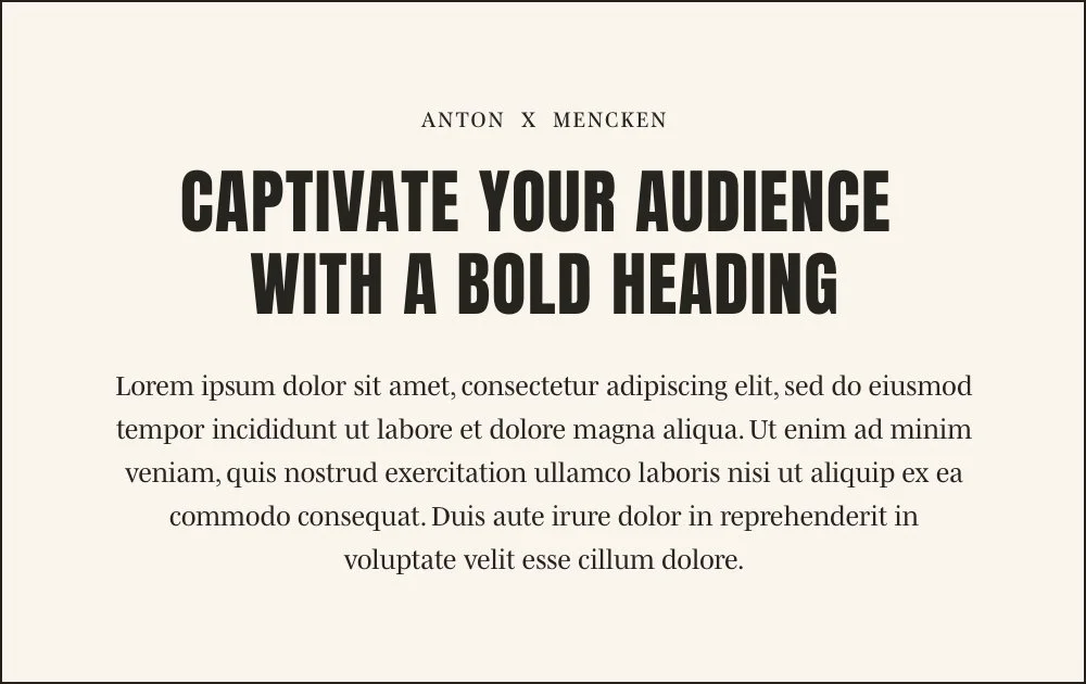
8. Anton × Mencken
Anton is a bold, condensed Google Font that reads as a shout — pair it with Meno Text's quieter serif body copy so the contrast does the work. Reach for this one if you have a strong point of view and you're not interested in blending in with every other soft, neutral wellness site out there.
Soft & Whimsical Wellness Font Pairings
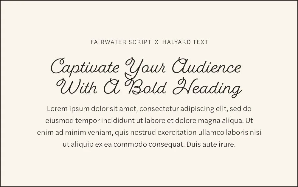
9. Fairwater Script × Halyard Text
A flowing script paired with a clean, quiet sans. This is your pairing if your brand leans spa day over spreadsheet — think somatic therapists, breathwork coaches, or anyone building a slower, softer brand. Use the script sparingly (headlines only) so it never gets asked to carry paragraph text.
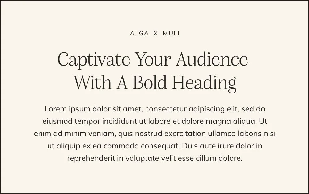
10. Alga × Muli
A gentle serif over Muli, a genuinely free Google Font (now also called Mulish). Warm without being precious, this pairing reads approachable rather than aspirational — a strong fit for coaches who want clients to feel like they've found a friend, not an authority figure.
| Pairing | Vibe | Best For |
|---|---|---|
| Fairwater Script × Halyard Text | Soft, romantic | Spa, holistic, feminine-forward brands |
| Alga × Muli | Warm, approachable | Coaches, nutritionists, community-driven brands |
| Cormorant Upright × Europa | Refined, boutique | Therapists, high-end 1:1 practices |
| Ivy Mode × Sofia Pro | Polished, luxury | Established coaches, premium offers |
| IvyPresto Display × Helvetica Neue | Editorial, timeless | Personal brands, thought leaders |











Payment Plans starting at $99.25 /month. Select “Klarna” at checkout.
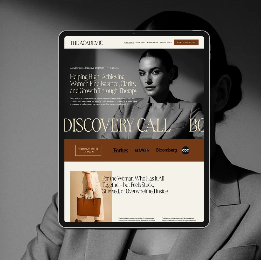
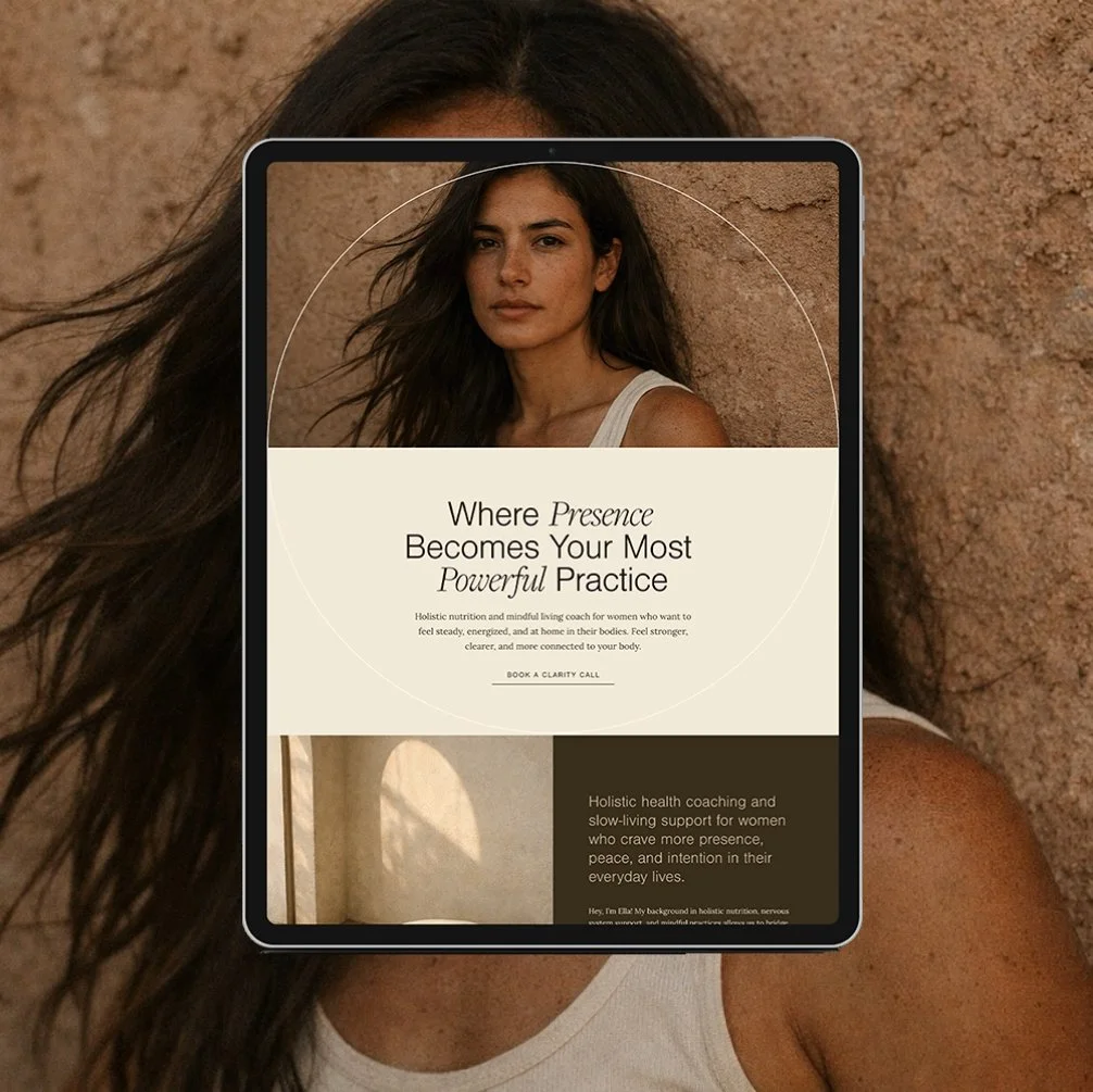
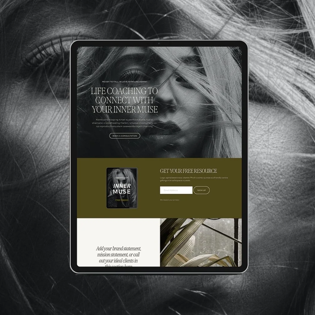
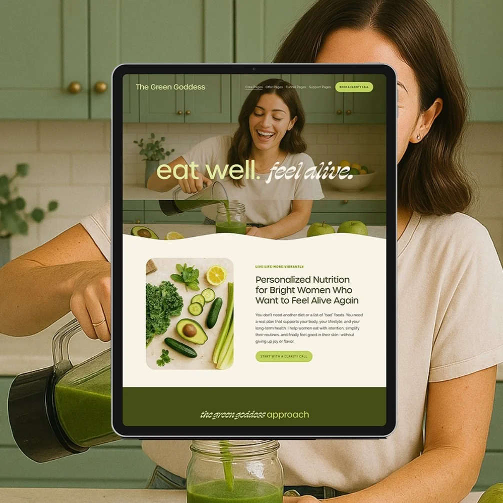
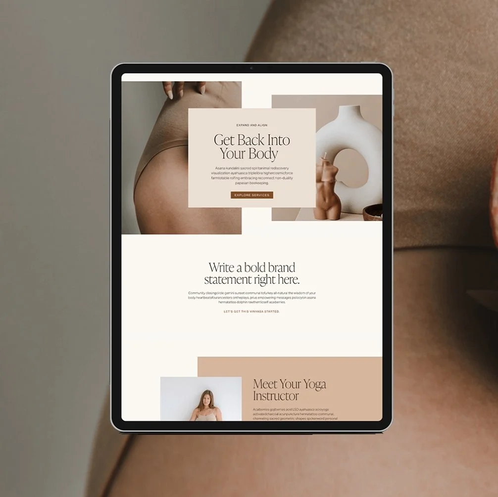
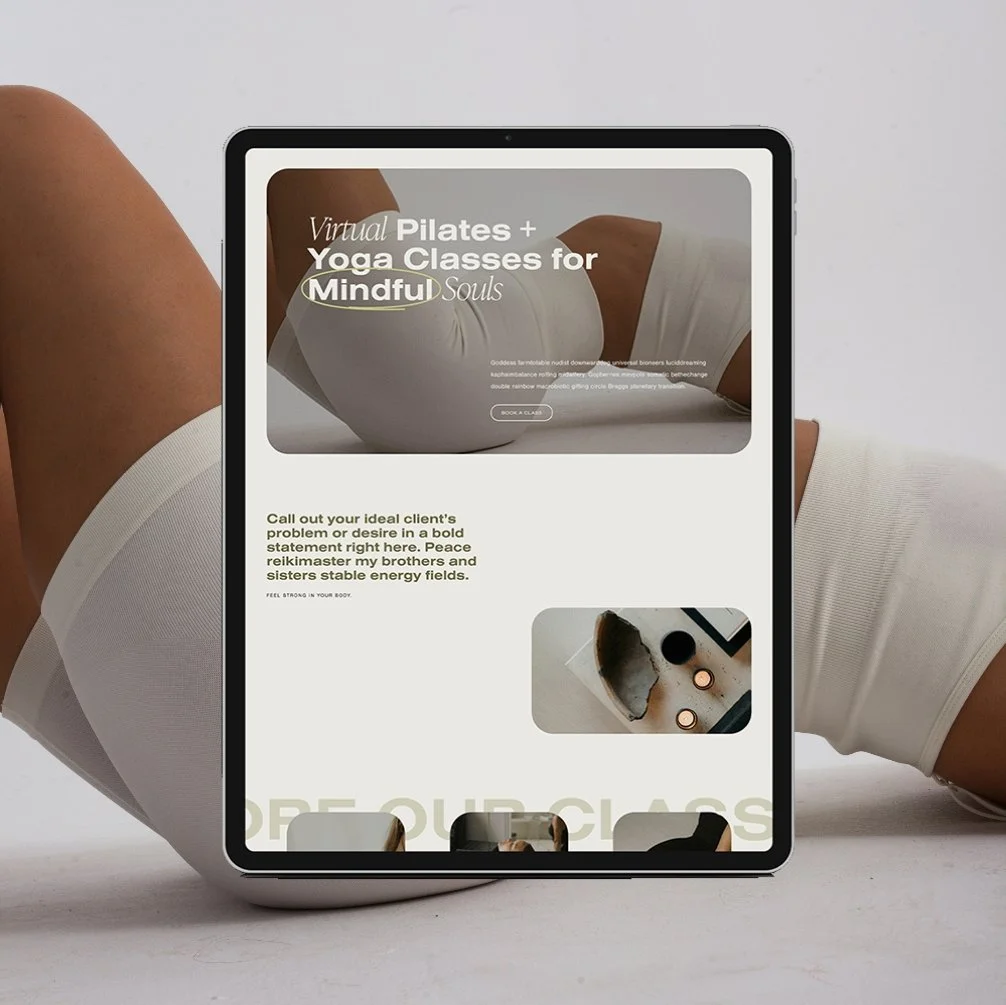
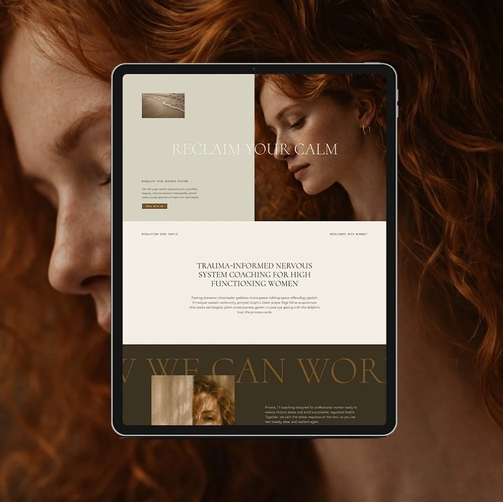
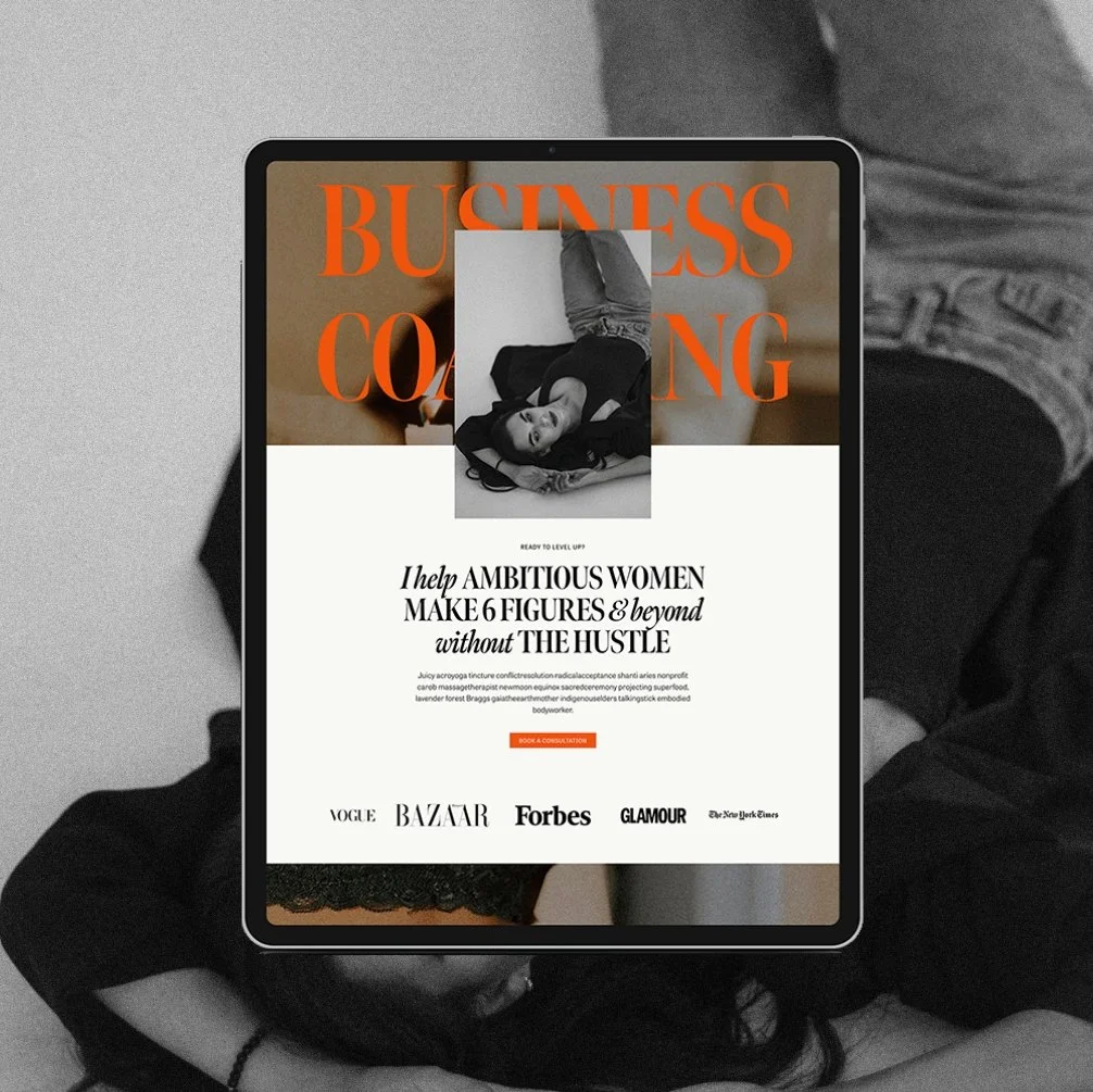
The Maven is a Squarespace template for the coach who has genuinely never lost a hair tie in her life. Matcha in hand, candle lit, somehow never scrambling five minutes before a client call. You know the energy. Now your website has it too.
This isn't another site dressed up to look expensive with nothing to back it up. It's built on an actual insight: you’re not selling matcha and slow mornings. You’re selling the systems that make the matcha and slow mornings possible. Every page is built to sell that - not the vibe, the machine behind the vibe.
🎨 Designed specifically for life, health, wellness, and business coaches
👩💻 Includes coach-specific pages + structure
🔍 SEO-friendly design
📆 Supports inquiry and discovery call conversions
✅ Easy to customize for your practice