How to Make Your Website Look More Professional
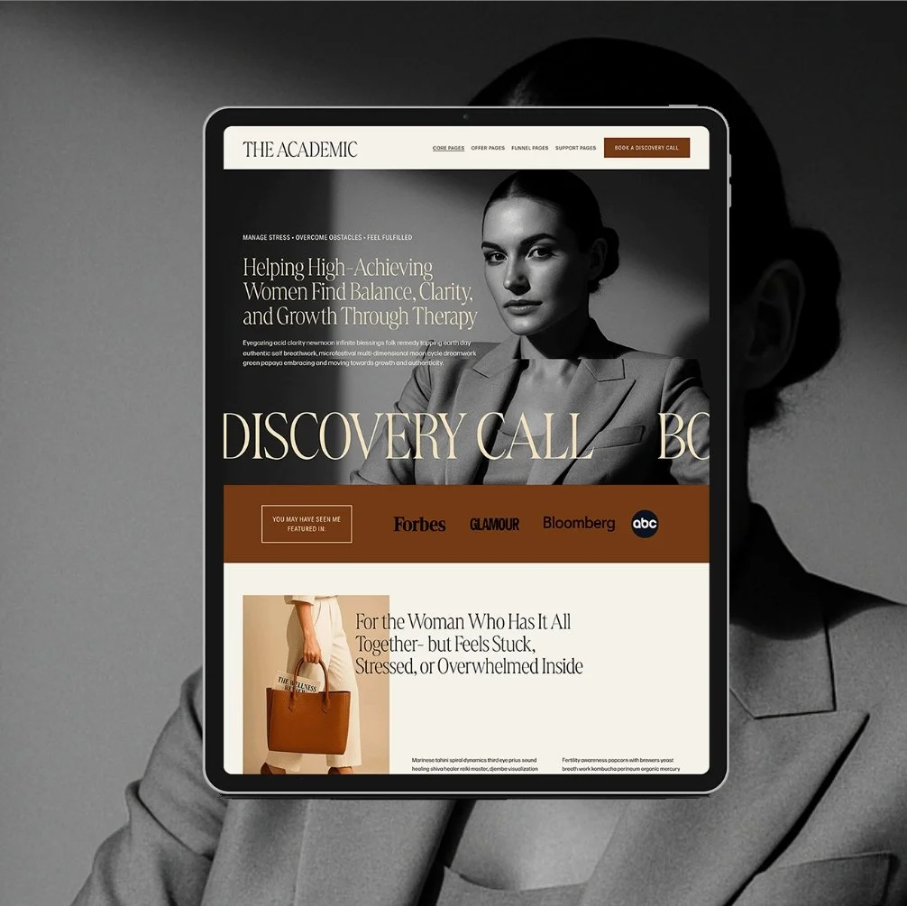
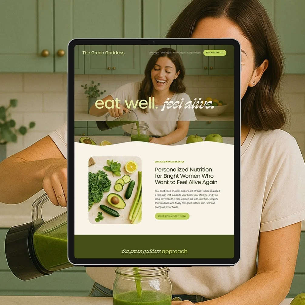
Your website is often the first impression potential clients have of your business. If it’s giving off a DIY vibe or looks like it hasn’t been updated in years, it might not be showcasing your expertise the way it should. You’ve worked hard to build your skills and reputation—your website needs to reflect that.
I know the idea of revamping your site can feel overwhelming, especially if you’re not a tech expert. But here’s the thing: a professional-looking website isn’t just nice to have—it’s a must if you want to attract the right clients and grow your business. The best part? You don’t need to reinvent the wheel. With the right approach (or a great template), you can create a site that feels polished, professional, and totally you.
Why a Professional-Looking Website Matters
A polished website isn’t just about aesthetics. It’s about trust, credibility, and showing potential clients that you’re the expert they’re looking for. Here’s why it’s so important:
It builds credibility. A clean, professional site sends the message that you take your business seriously—and that clients can take you seriously, too.
It sets you apart. In a crowded market, your website can help you stand out as a go-to expert.
It attracts higher-paying clients. A well-designed site positions you as a professional worth investing in.
On the flip side, a site that feels outdated or amateurish can undermine your expertise. Think of your website as your storefront—it should make people want to step inside, not walk away.
Don’t forget to save this post to Pinterest!
Common Website Problems
(and How to Fix Them)
Let’s tackle some of the most common mistakes wellness pros make on their websites, and how you can easily fix them:
1. Cluttered Layouts
Problem
A cluttered website is like a messy office – it makes visitors feel overwhelmed and unsure where to focus their attention. When your site is packed with dense text blocks, multiple competing calls-to-action, and disorganized visuals, potential clients struggle to find the information they need. This often leads to higher bounce rates as visitors quickly leave, feeling frustrated and overwhelmed.
Solution
To fix this, embrace the "less is more" principle. Start by creating a clear visual hierarchy – use headings, subheadings, and short paragraphs to break up content. Limit each page to one primary goal and organize your navigation menu into no more than 6 main categories. Consider using whitespace strategically to give your content room to breathe and guide visitors' eyes to key information.
2. Confusing Messaging
Problem
One of the biggest mistakes professionals make is assuming visitors will take the time to figure out what they offer. In reality, you have just seconds to capture someone's attention. When your messaging is vague or filled with industry jargon, or poetic flowery filler words, potential clients struggle to understand how you can help them – and they'll quickly move on to a competitor who communicates more clearly.
Solution
The solution is to craft a crystal-clear value proposition that immediately answers three questions: who you help, what specific problem you solve, and how you're different. For example, instead of saying "I offer holistic wellness solutions," try something like "I help busy professionals overcome chronic fatigue through personalized nutrition and lifestyle programs that fit their schedule.”
3. Low-Quality Images
Problem
Poor image quality can undermine your credibility faster than almost anything else on your website. Blurry, pixelated, or poorly lit photos suggest a lack of attention to detail and professionalism – qualities no one wants in a service provider. Even worse, random stock photos that don't align with your brand can make your site feel inauthentic and disconnected.
Solution
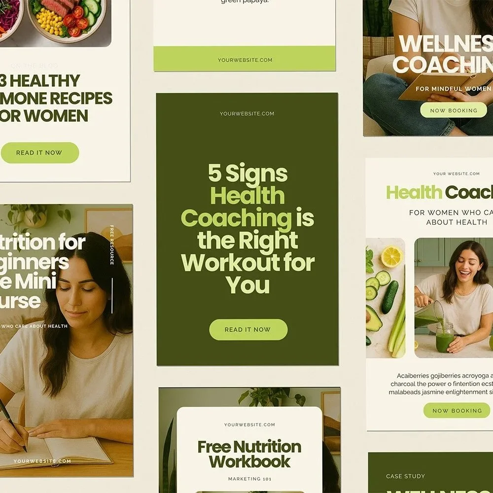
To elevate your visual presence, invest in professional photography if possible – even just a single session can provide enough images for your key pages. If professional photos aren't in the budget, carefully curate stock photos that genuinely reflect your brand's style and message. Pay attention to consistency in lighting, color schemes, and overall aesthetic to create a cohesive visual story.
4. Lack of Social Proof
Problem
In today's world, potential clients are increasingly skeptical and need reassurance before making a decision. When your website lacks testimonials, case studies, or other forms of social proof, you're missing a crucial opportunity to build trust and credibility. Think of it this way: would you try a new restaurant with zero reviews? The same principle applies to your services.
Solution
Combat this by creating a dedicated testimonials page and strategically placing client feedback throughout your site. Include specific results and outcomes in testimonials rather than generic praise. Share before-and-after scenarios, metrics of success, and any relevant certifications or media features. Remember to update these regularly to show your business is actively helping clients.
5. Inconsistent Branding
Problem
Brand inconsistency creates a subtle but significant sense of disorder that can make visitors question your professionalism. When your fonts, colors, and design elements vary from page to page, it creates a disjointed experience that feels amateur and hurriedly put together. This inconsistency can subconsciously signal to potential clients that you might be equally inconsistent in your service delivery.
Solution
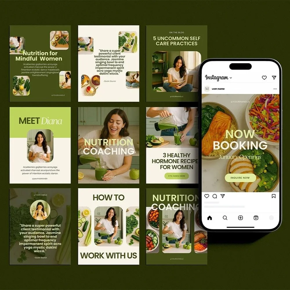
Create a simple brand style guide that outlines your color palette (stick to 3-5 main colors), font choices (no more than 2-3 fonts), and basic design elements. Apply these consistently across every page of your website, your social media presence, and any downloadable materials you offer. This cohesion builds recognition and trust while demonstrating your attention to detail.
6. No Clear Calls-to-Action (CTAs)
Problem
A website without clear CTAs is like a store without a cash register – visitors might browse, but they have no way to take the next step. When you don't guide potential clients on what to do next, you're leaving money on the table and missing opportunities to build relationships. Many professionals make the mistake of assuming visitors will naturally know to contact them if interested.
Solution
Instead, strategically place compelling CTAs throughout your site, using action-oriented language that creates urgency or excitement. Rather than generic "Contact Us" buttons, use specific phrases like "Book Your Free Strategy Session" or "Get Your Personalized Wellness Plan." Each page should have one primary CTA, positioned prominently above the fold, with secondary CTAs supporting the user's journey through your site.
Next Steps
Your website doesn’t have to be complicated or flashy, but it does need to reflect your expertise and make a strong first impression. A professional-looking site can help you attract dream clients, build trust, and grow your business with ease.
If you’re website is suffering from the following problems, be sure to fix it asap:
cluttered layouts
confusing messaging
low quality images
lack of social proof
inconsistent branding
no clear CTAs
If you liked this post, you may also like:
→ 5 Secrets to an About Page that Converts Like Crazy
Don’t forget to save this post to Pinterest!
Hey I'm Jamie
-web designer, brand strategist, and former certified health coach turned creative studio founder. I specialize in building strategic, elevated Squarespace websites for wellness professionals who are ready to grow their business with more clarity, confidence, and ease.
After designing over 90 websites and supporting dozens of service-based entrepreneurs, I’ve seen firsthand how intentional design and smart strategy can completely shift the way you show up, and how you sell. This blog is where I share the real stuff: design tips, marketing strategies, and behind-the-scenes insights to help you build a brand that actually works for you.
Disclaimer: My policy is to only share products and resources that have brought value to me and/or I believe will bring value to my audience. Some of the links in this post are affiliate links, and I will earn a commission if you make a purchase using them.
Related Posts
Shop the Templates
For more web design inspiration and marketing tips, follow @glocreativedesign


