
The 20 Best Squarespace Font Pairings of 2026
Looking for the best Squarespace fonts? Browse our favorite Squarespace fonts list by category, plus 20 designer-approved font pairings you can add to your site today.
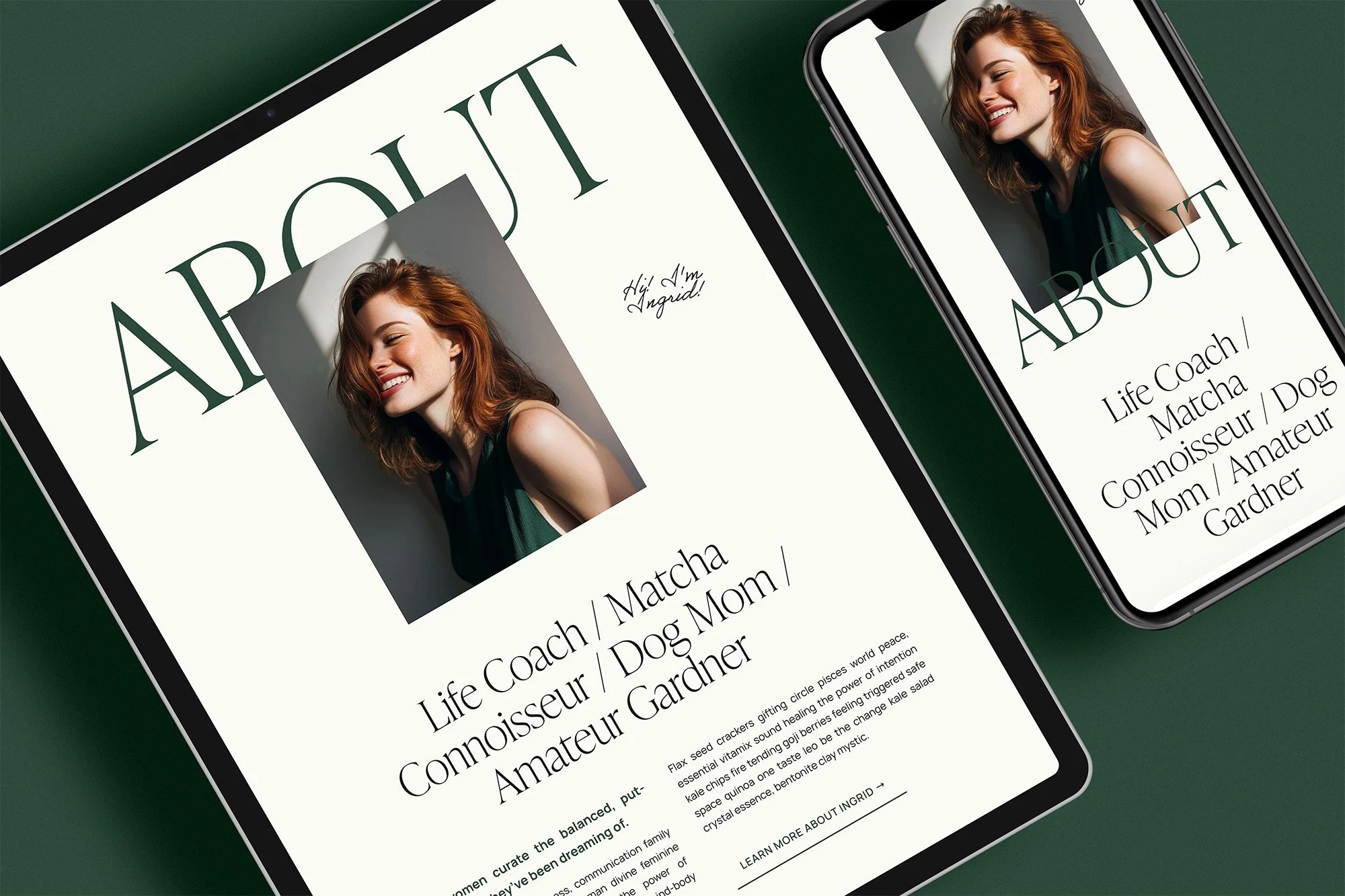
Did you know that marketers report a 30% increase in consumer engagement when using brand-consistent fonts?
In the world of Squarespace design, where every detail counts, selecting the perfect fonts is more than just a design choice—it's a strategic decision. In this post, I’m breaking down 20 designer-favorite Squarespace font pairings — plus a full list of the best individual Squarespace fonts by category, so you can build your own combination too. Whether you're leaning towards the crisp elegance of Squarespace serif fonts, the modern minimalism of a sleek sans serif pairing, or the unique flair of Squarespace display fonts, the right combination can transform your site's appeal. This guide is your go-to resource for choosing Squarespace website font pairings that are not only visually stunning but also optimized for growth and user experience.
Why Are Fonts So Important to the Success of Your Website?
An astonishing 94% of first impressions are related to a website's design, and fonts play a pivotal role in this aspect. The typeface you choose sets the initial tone for your site, influencing how users perceive your brand at first glance. A well-chosen font can convey professionalism, creativity, trustworthiness, or innovation, depending on your brand's personality and audience. This initial impression is crucial in retaining visitors and encouraging them to explore your website further.
Fonts Evoke Emotion, Mood, and Feeling:
Fonts have the unique power to evoke specific emotions, moods, and feelings in your audience. For instance, a serif font might convey tradition and reliability, ideal for professional or academic websites. In contrast, a playful handwritten font can create a sense of informality and friendliness, perfect for brands aiming to appear approachable and down-to-earth. Selecting the right font helps in aligning your website’s visual tone with your brand’s emotional message, thereby creating a deeper connection with your audience.
Readability and Message Hierarchy:
The readability of your content is essential for effective communication. Fonts contribute significantly to how easily users can read and understand your message. A clear, legible font ensures that your audience can effortlessly absorb the information you present. Furthermore, using different fonts or font styles can create a hierarchy in your content, guiding readers' attention to the most important information first. Remember, the way visitors read a website is by skimming- headlines first, then subheadlines, then body text (like a magazine!). This hierarchical structuring is key in delivering your message effectively and ensuring that key points stand out.
Professionalism and Brand Identity:
Fonts contribute to the overall professionalism of your website. A mismatched or inappropriate font choice can undermine your credibility, while a well-chosen font enhances the professional appearance of your site. Additionally, consistent font usage across your website and other brand materials strengthens your brand identity, making your business more recognizable and memorable. This consistency in visual elements fosters trust and reliability among your audience, contributing to the long-term success of your online presence.
Best Squarespace Fonts by Category
Not ready to commit to a full pairing yet? Here are some of our favorite individual Squarespace fonts, pulled from the pairings below, organized by style so you can mix, match, and build your own combination.
Serif Squarespace Fonts (elegant, editorial, trustworthy)
Ivypresto Display, Instrument Serif, Freight Display Pro, Lora, Bookmania
Sans-Serif Squarespace Fonts (clean, modern, versatile)
Instrument Sans, Raleway, Sofia Pro, Aktiv Grotesk, Manrope
Script & Display Squarespace Fonts (personality, warmth, statement-making)
Fairwater Script, Sloop Script, Adobe Handwriting Ernie, Moret, Ohno Blazeface
Want fonts with more editorial polish? My 20 favorite premium pairings below use elevated picks like Ivypresto, Moret, and Calmetta.
The 20 Best Squarespace Fonts and Font Pairings of 2026
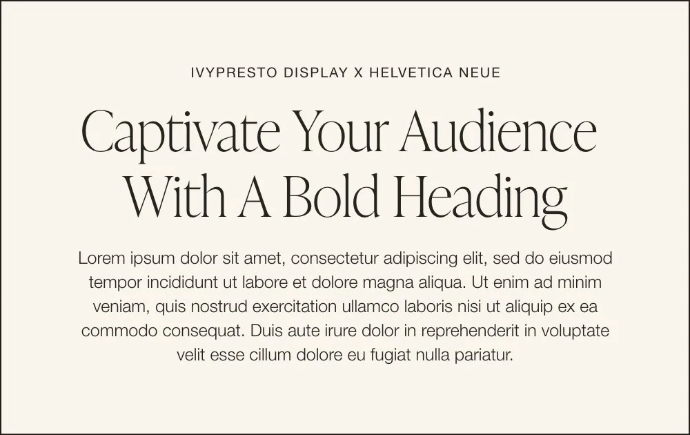
1. Ivypresto Display & Helvetica Neue
High-contrast, editorial, and effortlessly feminine - Ivypresto's elegant curves bring instant sophistication to a headline, while Helvetica Neue keeps the body text crisp and grounded. This pairing feels like a fashion editorial: polished, a little bold, never fussy. Perfect for luxury wellness brands and modern feminine businesses that want their site to feel elevated without feeling stiff.
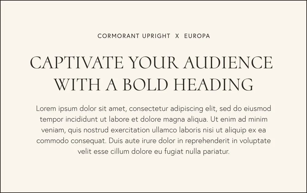
2. Cormorant Upright & Europa
Formal, stately, and unmistakably editorial — Cormorant Upright's tall, delicate caps read like a monogram, while Europa's clean geometry keeps everything readable and modern. It's the pairing you reach for when the brand needs to feel established, not trendy. Best suited to legacy-minded practices, high-end consultants, and brands leaning into timeless sophistication over flash.
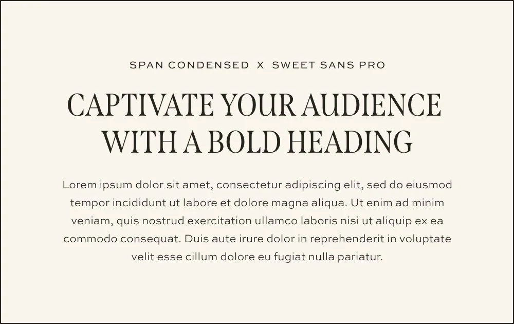
3. Span Condensed & Sweet Sans Pro
Earthy, elegant, and confident — Span Condensed's tall, narrow caps give headlines a refined presence, while Sweet Sans Pro rounds things out with a friendly, approachable body text. This combination reads sophisticated but never cold. It's a strong fit for feminine wellness brands, holistic practitioners, and coaches who want polish with warmth built in.
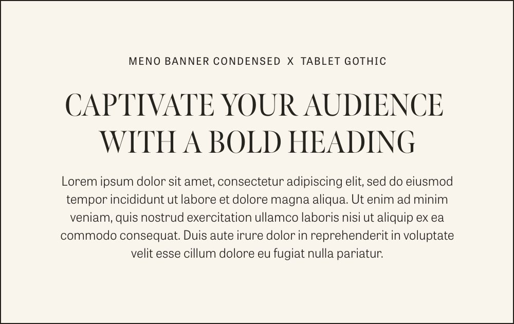
4. Meno Banner Condensed & Tablet Gothic
Refined and a little editorial, with a slight cool-girl edge — Meno Banner Condensed's tight, elegant caps feel straight out of a magazine spread, while Tablet Gothic's clean lines keep the rest of the page grounded. This one's for sophisticated feminine brands that want an edge without losing polish — think high-end coaches, boutique studios, and design-forward practices.
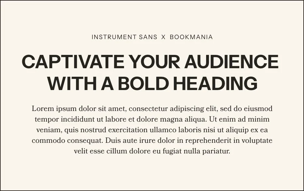
5. Instrument Sans & Bookmania
Bold, contemporary, and unapologetically loud in the headline, softened by a classic serif body — Instrument Sans commands attention while Bookmania brings warmth and readability back down to earth. The contrast is the point here. Great for brands that want to make a statement upfront: think disruptors, bold personal brands, and businesses ready to stand out in a crowded feed.
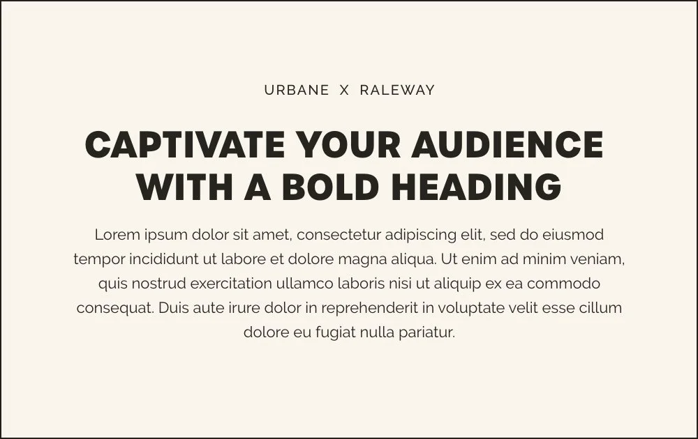
6. Urbane & Raleway
Fresh, bold, and clean — Urbane's rounded, confident caps give headlines real presence, while Raleway keeps the supporting text light and easy to read. This pairing feels modern without trying too hard. A great match for brands that want to feel current and approachable at the same time — think growth-stage coaches and practitioners ready to level up their look.
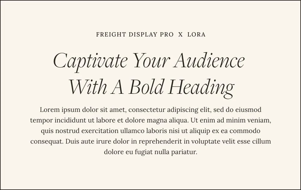
7. Freight Display Pro & Lora
Romantic and sophisticated, with an editorial flourish — Freight Display Pro's elegant italic curves feel almost handwritten in their grace, while Lora's classic serif body keeps things timeless underneath. This one leans soft and storytelling. Ideal for brands built around connection and warmth — think therapists, healers, and wellness practitioners whose work is deeply personal.
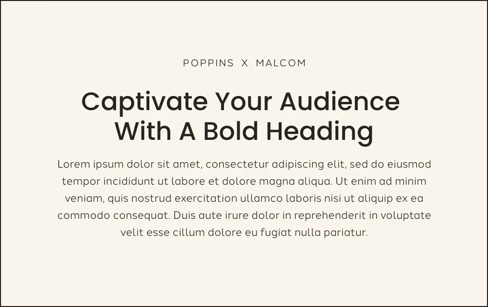
8. Poppins & Halcom
Bubbly, geometric, and instantly friendly — Poppins' rounded caps bring energy to a headline, while Halcom's soft sans keeps the body text approachable and easy on the eyes. This pairing feels like a warm welcome. It suits brands with a fun, upbeat personality — think coaches and practitioners who want their site to feel like their actual personality, not a corporate version of it.
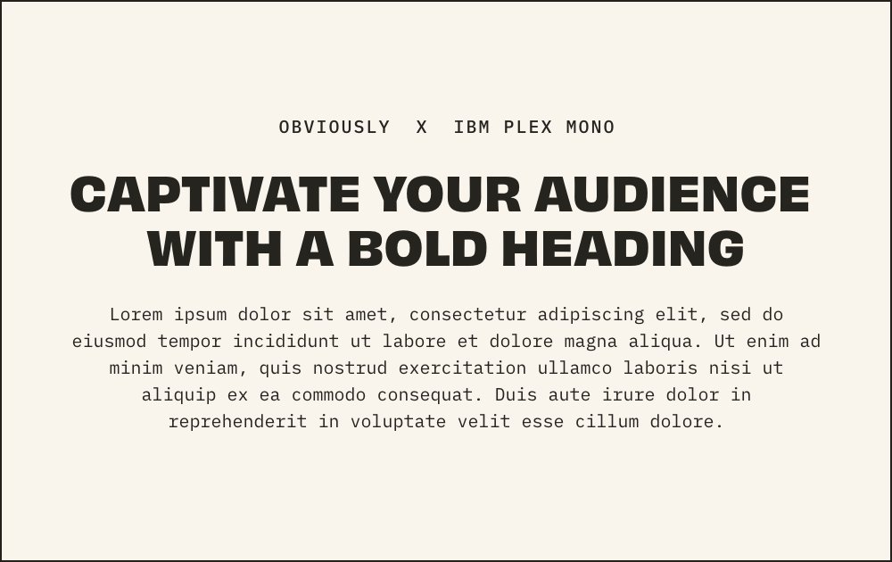
9. Obviously & IBM Plex Mono
Bold, technical, and a little unexpected — Obviously' heavy, condensed caps hit hard as a headline, while IBM Plex Mono's monospaced body text gives the page an unusual, almost coded texture. This is a statement pairing, not a subtle one. Best for brands that want to feel disruptive and modern — think tech-adjacent coaches, data-driven practitioners, or anyone building a brand that intentionally breaks from the soft-and-serif wellness norm.
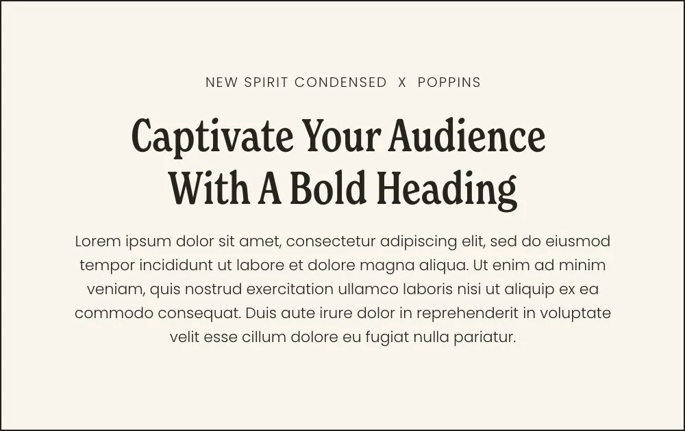
10. New Spirit Condensed & Poppins
Retro and a little bubbly, with real personality — New Spirit Condensed's quirky serif curves give headlines a vintage-meets-fun feel, while Poppins' rounded body text keeps things playful throughout. This pairing doesn't take itself too seriously. It's a great fit for brands with a funky, approachable energy — practitioners who want their site to feel like them on their best, most colorful day.
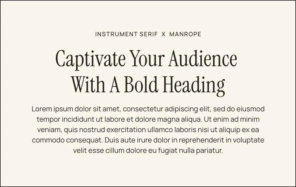
11. Instrument Serif & Manrope
Fresh and timeless at once — Instrument Serif brings classic elegance to a headline without feeling dated, while Manrope's clean sans keeps the body text modern and versatile. This pairing is quietly flexible; it works across almost any feminine brand aesthetic. A solid choice for practitioners who want an elevated look that won't need a redesign in two years.
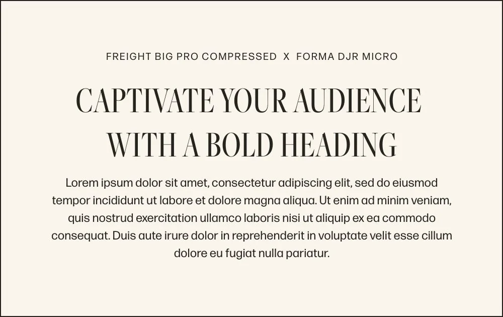
12. Freight Big Pro Compressed & Forma DJR Micro
Sophisticated and editorial, with a serious, professional edge — Freight Big Pro Compressed's tall, narrow serifs feel like they belong on a magazine cover, while Forma DJR Micro keeps the body text sharp and legible. This is the pairing for brands with an authoritative, no-nonsense voice — think clinical practitioners, established consultants, and anyone whose credibility needs to read at a glance.
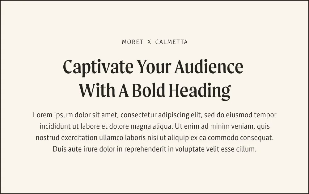
13. Moret & Calmetta
Edgy and retro, with a message that wants to be noticed — Moret's bold, characterful caps give headlines real attitude, while Calmetta's elegant serif body brings it back to earth. This combination is built to captivate, not blend in. Perfect for disruptive brands and personality-forward practitioners who are ready to stand out from the sea of soft, sameish wellness sites.
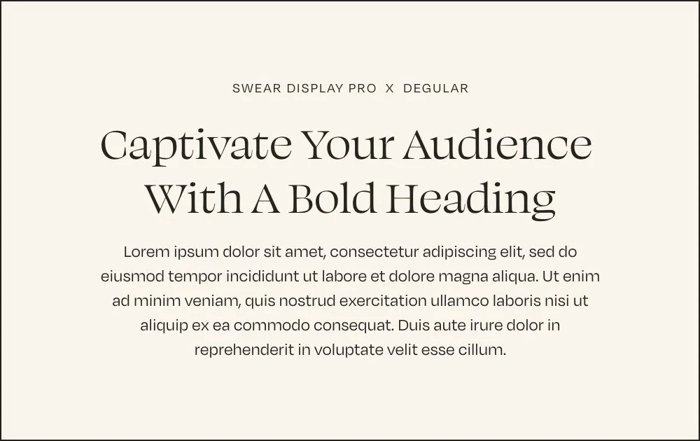
14. Swear Display Pro & Degular
Sophisticated and modern, with subtle character in the details — Swear Display Pro's elegant serif curves feel intentional and polished, while Degular's clean sans keeps the body text crisp. This pairing reads editorial without feeling cold. A great match for design-conscious brands that want a headline with a bit of personality baked into an otherwise minimalist aesthetic.
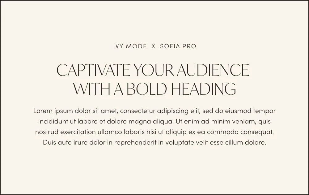
15. Ivy Mode & Sofia Pro
Chic, minimal, and unmistakably luxury — Ivy Mode's tall, thin caps feel high-fashion and refined, while Sofia Pro's rounded sans keeps the body text soft and easy to read. This pairing is all about restraint; nothing here is loud, and that's exactly the point. Ideal for chic feminine brands focused on simplicity — think minimalist coaches, boutique studios, and practitioners whose whole brand is "less, but better."
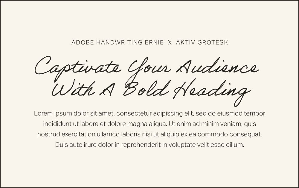
16. Adobe Handwriting Ernie & Aktiv Grotesk
Personal and warm, like a note from a friend — Adobe Handwriting Ernie's casual script brings an intimate, handwritten feel to headlines, while Aktiv Grotesk keeps the body text clean and legible underneath. This pairing works because the contrast feels human, not gimmicky. Best for personal brands and practitioners who want their site to feel like a real conversation, not a pitch.
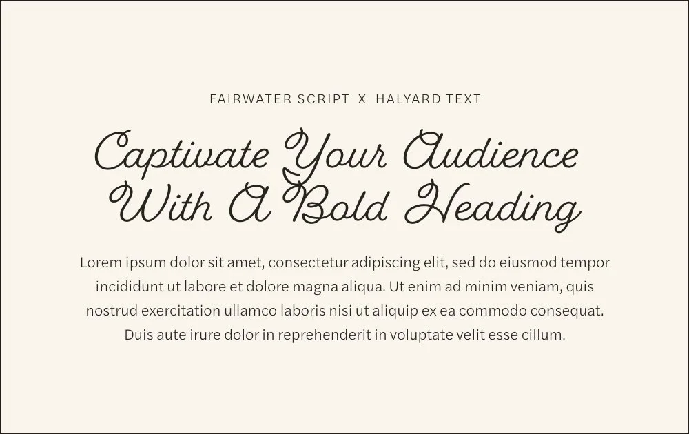
17. Fairwater Script & Halyard Text
Playful and romantic, with a flowing, feminine energy — Fairwater Script's bold, looping curves give headlines real personality, while Halyard Text's clean sans grounds the page so it doesn't tip into overly precious territory. This pairing suits brands with softness and a bit of whimsy — think bridal-adjacent wellness brands, feminine lifestyle coaches, and practitioners who want warmth up front.
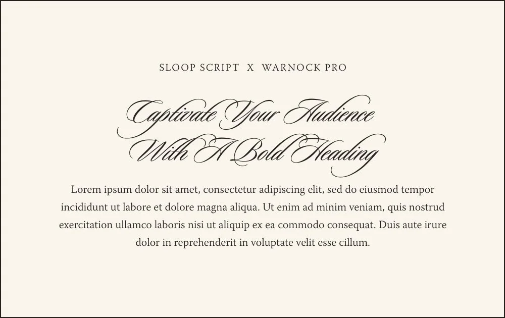
18. Sloop Script & Warnock Pro
Luxurious and formal, with old-world elegance — Sloop Script's elaborate calligraphy-style flourishes feel like a wedding invitation, while Warnock Pro's classic serif body keeps things readable and grounded. This is a special-occasion pairing, not an everyday one. It's best reserved for high-end feminine brands where formality and romance are the whole point — think luxury bridal, fine art photography, or premium event-based practices.
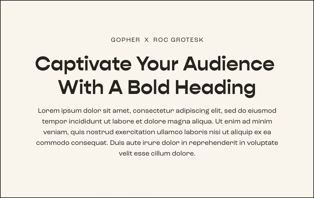
19. Gopher & Roc Grotesk
Bold, rounded, and instantly approachable — Gopher's friendly, chunky caps give headlines a confident but soft presence, while Roc Grotesk keeps the body text clean and contemporary. This pairing feels current without chasing a trend. A strong fit for growth-focused practitioners and coaches who want their brand to feel modern, warm, and easy to trust at first glance.
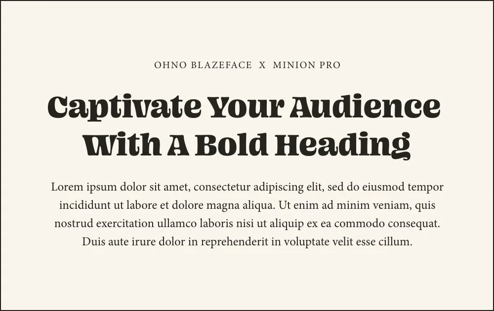
20. Ohno Blazeface & Minion Pro
Fun, quirky, and full of retro charm — Ohno Blazeface's bold, bouncy letterforms bring instant personality to a headline, while Minion Pro's classic serif body balances it out with quiet readability. This pairing captures attention without losing credibility underneath. Great for brands with a playful, memorable voice — practitioners who want to be the fun one in the room without sacrificing polish.
How to Choose the Right Fonts for Your Brand
Before you jump into choosing the font pairings you think you like, it’s important to do some brand strategy work first to ensure that you are choosing the best fonts that fit your brand.
→Get the full step by step guide on choosing fonts for your Squarespace website
Here are a few things to consider before choosing your brand and website fonts:
Understand Your Ideal Clients:
The font you choose should resonate with your target audience. Consider the demographics and preferences of your ideal clients. What is their personality like? What are their interests and hobbies? What are their purchasing behaviors like? What kind of content do they consume? Understanding who your clients are and what appeals to them is the first step in selecting the right font.
Reflect on Your Brand’s Values:
Every brand has core values that define its mission and approach. Your font should mirror these values. If your brand values simplicity and clarity, a clean and minimalist font would be appropriate. Conversely, if creativity and innovation are your hallmarks, experimenting with unconventional fonts might be more fitting. Choose a font that embodies the essence of your brand's values.
Express Your Brand Personality:
Your brand's personality should shine through in your font choice. Is your brand playful, serious, luxurious, or down-to-earth? The personality of your font should match. Playful brands might use light, whimsical fonts, while luxury brands might lean towards elegant, refined typography. The key is ensuring that your font aligns with how you want your brand to be perceived.
Cultivating Brand Perception:
Think about how you want your brand to be perceived in the market. Fonts can influence perception significantly. A tech company might use sleek, futuristic fonts to convey innovation, while a boutique shop might prefer a hand-written or script font to express uniqueness and personal touch. Select a font that helps in shaping the desired perception of your brand.
Align with Your Brand Voice:
Your brand font pairing is the visual expression of your brand voice– whether it's authoritative, friendly, informative, or casual. An authoritative brand might opt for strong, bold fonts, while a friendly brand could choose a more relaxed, approachable font. Ensure that your typography complements and enhances your brand's voice, as it is a crucial component of your overall communication strategy.
What are the best fonts for Squarespace websites?
The best Squarespace fonts balance readability with brand personality — pairing a distinctive header font with a clean, legible body font. Popular categories include serif fonts for elegance, sans-serif for a modern feel, and script fonts for warmth.
Where do I find the full Squarespace fonts list?
Squarespace's built-in font library includes hundreds of Google Fonts and Adobe Fonts, searchable directly in Site Styles > Fonts.
How many fonts should I use on my Squarespace site?
Most well-designed sites use 2-3 fonts total: one for headers, one for body text, and occasionally a third accent font for subheads or buttons.
Can I use premium fonts like Adobe Fonts on Squarespace?
Yes — Squarespace integrates with Adobe Fonts (Typekit), giving you access to premium typefaces like the ones featured in our pairing guide above, in addition to the free Google Fonts library.
Next Steps
Mastering the art of font pairing on Squarespace is a game-changer for any website. It's about striking that perfect balance between aesthetics and usability.
As we explored various Squarespace font combinations, from modern and luxurious to fun and engaging, remember that these choices are integral to your brand's story and audience engagement. The right mix of Squarespace fonts can elevate your site from good to great, making it not only visually appealing but also functionally effective. Here’s to creating impactful, beautiful, and successful online spaces!
If you liked this post, you may also like:
→ Choosing Fonts for Your Squarespace Website: A Step By Step Guide
→ Choosing Colors for Your Squarespace Website
→ How to Make Your Website Look More Professional
→ How to Effortlessly Set Up Site Styles in Squarespace
Don’t forget to save this post to Pinterest!


Hey I'm Jamie
-web designer, brand strategist, and former certified health coach turned creative studio founder. I specialize in building strategic, elevated Squarespace websites for wellness professionals who are ready to grow their business with more clarity, confidence, and ease.
After designing over 90 websites and supporting dozens of service-based entrepreneurs, I’ve seen firsthand how intentional design and smart strategy can completely shift the way you show up, and how you sell. This blog is where I share the real stuff: design tips, marketing strategies, and behind-the-scenes insights to help you build a brand that actually works for you.
Disclaimer: My policy is to only share products and resources that have brought value to me and/or I believe will bring value to my audience. Some of the links in this post are affiliate links, and I will earn a commission if you make a purchase using them.
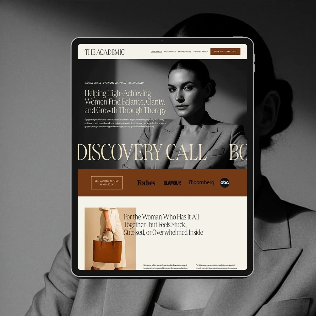
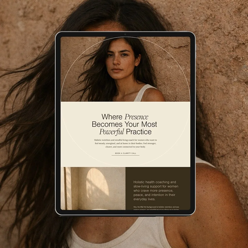
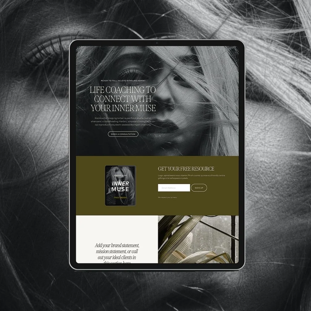
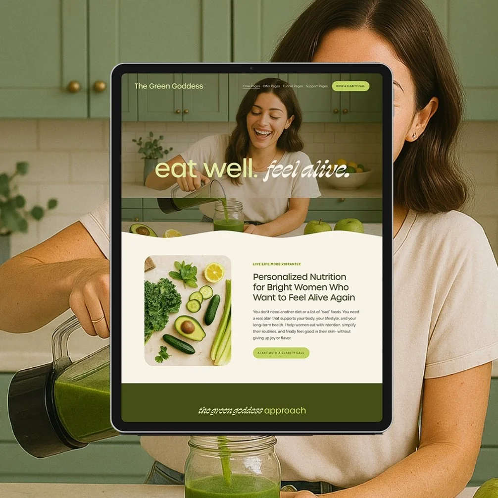
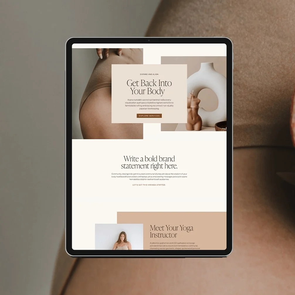
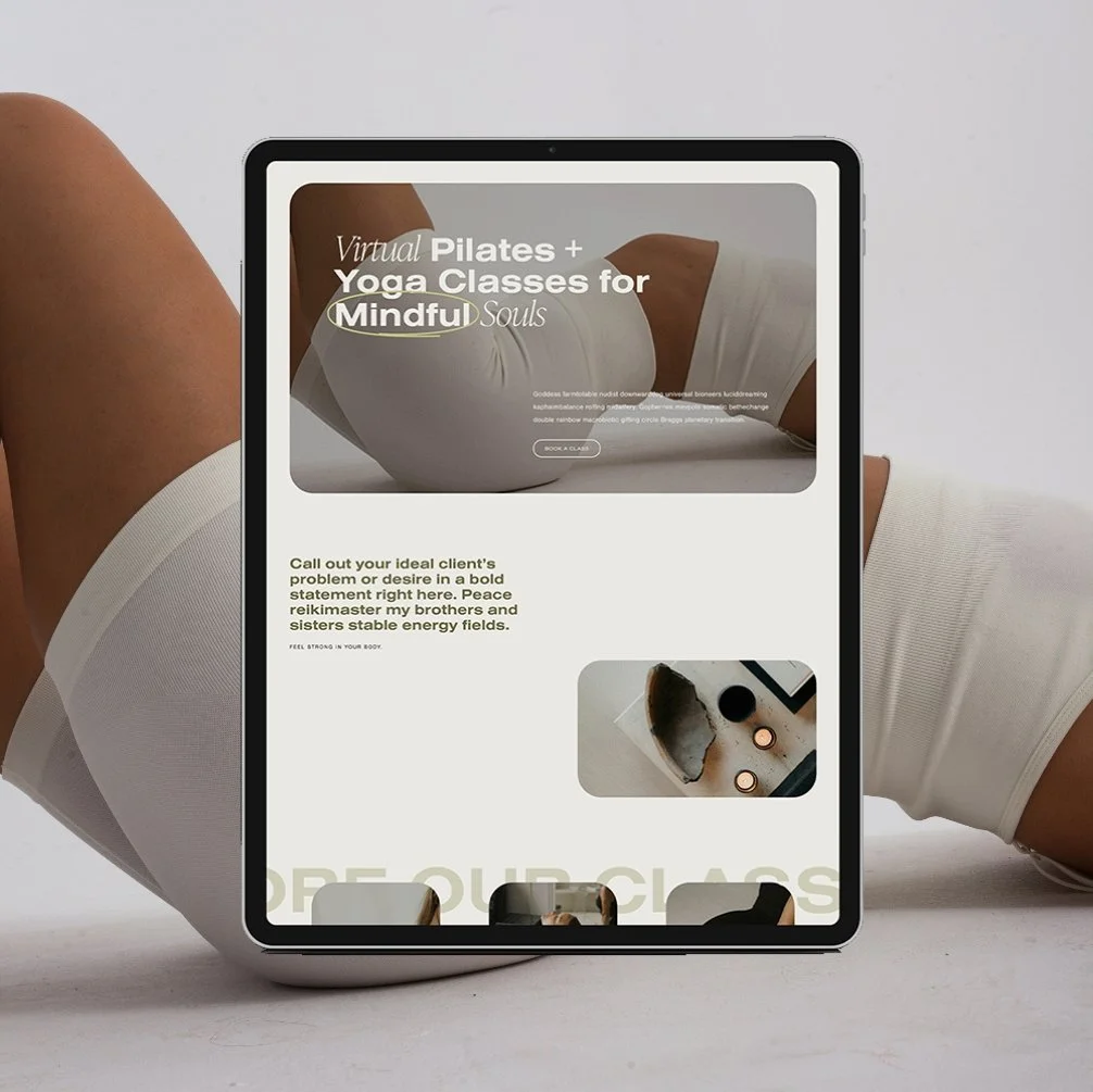
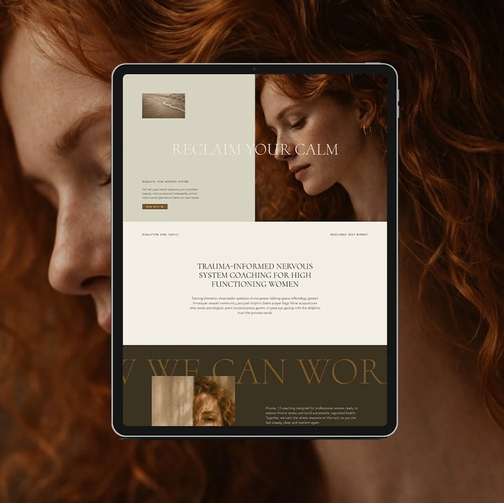

Payment Plans starting at $99.25 /month. Select “Klarna” at checkout.
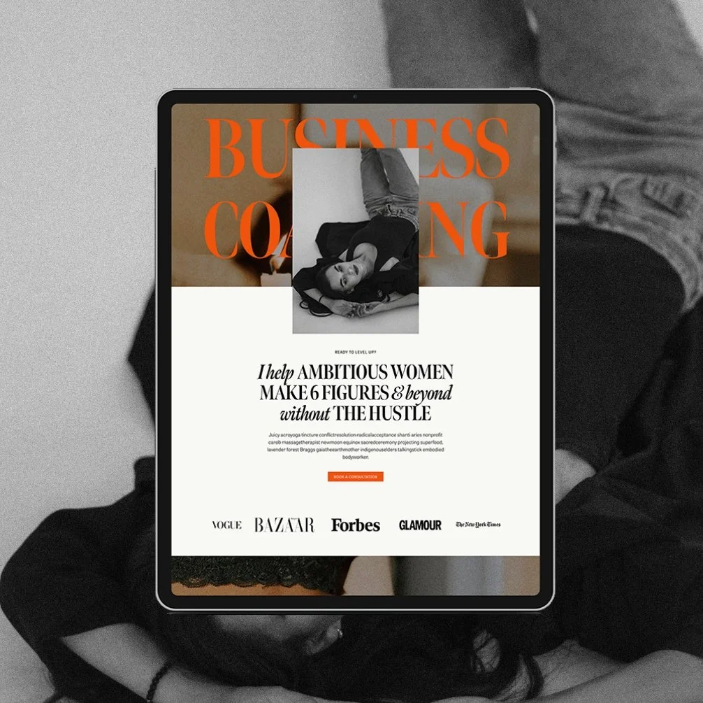
The Maven is a Squarespace template for the coach who has genuinely never lost a hair tie in her life. Matcha in hand, candle lit, somehow never scrambling five minutes before a client call. You know the energy. Now your website has it too.
This isn't another site dressed up to look expensive with nothing to back it up. It's built on an actual insight: you’re not selling matcha and slow mornings. You’re selling the systems that make the matcha and slow mornings possible. Every page is built to sell that - not the vibe, the machine behind the vibe.
🎨 Designed specifically for life, health, wellness, and business coaches
👩💻 Includes coach-specific pages + structure
🔍 SEO-friendly design
📆 Supports inquiry and discovery call conversions
✅ Easy to customize for your practice