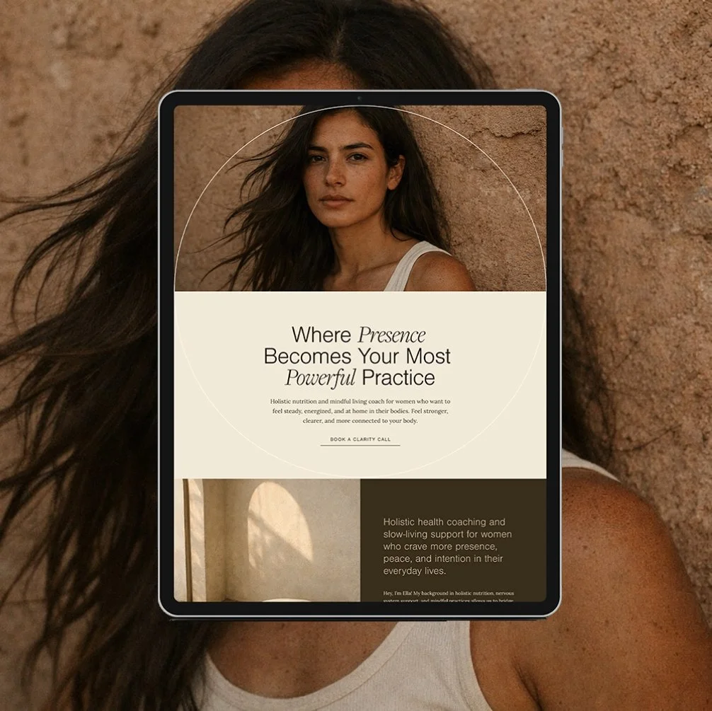
Choosing Colors for Your Squarespace Website
If you’ve ever spent way too much time scrolling Pinterest, saving “vibe-y” brand palettes, and still felt totally unsure about what colors to use on your site... you’re not alone.
Choosing the right color scheme for your website feels deceptively simple, until you realize your colors can make or break how your brand is perceived online.
Whether you’re launching your first Squarespace website or refreshing your brand visuals, your color palette deserves more than just a gut decision. In this post, we’re breaking down how to choose brand colors, avoid common color combo mistakes, and set up your Squarespace color palette with intention (and ease).
Why Is Color So Important in Web Design?
Color isn’t just about aesthetics- it plays a critical role in user experience, brand recognition, and conversion. Studies show that color influences how people feel about your business and how likely they are to take action on your site.
Think about it this way:
If you were a therapist who wants your clients to feel relaxed and comfortable, would you want your website to be black and red with neon green buttons? Probably not.
Your color scheme sets the tone for your entire brand. And in a crowded online space, strategic color choices help you stand out and feel aligned.
What to Consider When Choosing Your Website Colors
Before you start pulling swatches, take a moment to think about:
How do you want your audience to feel? Safe, energized, calm, inspired?
What message does your brand communicate? Luxe? Holistic? Approachable?
Where will these colors live? On your website, social media, lead magnets, course platforms, etc.
Choosing a color scheme isn’t just about what’s “pretty.” It’s about what’s purposeful and intentional for your brand.
The 3 Color Rule in Web Design
If you’re feeling overwhelmed by options, start with the 3 color rule in web design:
Primary Color: your dominant brand color (used ~60% of the time)
Secondary Color: a supporting accent (~30%)
Action/Contrast Color: your CTA button/highlight color (~10%)
This rule helps keep your palette simple, intentional, and balanced, so your site looks polished without being chaotic.
Don’t forget to save this post to Pinterest!
How to Choose the Right Color Scheme for Your Brand & Website
Here’s how to build a brand-aligned palette that actually works on your Squarespace site:
1. Define Your Brand Identity
Before you even think about hex codes, take a step back and get rooted in your brand identity.
Choosing the right colors for your Squarespace website starts with clarity- who you are as a brand, and who you're here to serve.
Your brand colors aren’t just about your personal preferences (though yes, they should feel good to you). They also need to resonate with the people you're trying to attract. This is where many business owners miss the mark: they choose colors they love, but forget to consider how those choices feel to their ideal clients.
Here’s what to ask yourself:
What feeling do I want people to experience when they land on my website?
What words describe the energy of my brand? (Ex: grounded, luxe, nurturing, bold, calming)
Who are my ideal clients, and what visuals, aesthetics, or emotional tones do they connect with?
What are my values, and how can my colors reflect that?
When your color palette reflects both your authentic self and the aspirations of your audience, you create a visual brand that feels magnetic. It aligns you with the kind of clients you want to call in, without ever needing to “sell.”
It’s a dance between inner alignment and outer strategy, and when you get that right, your website becomes more than beautiful. It becomes powerful.
2. Consider Color Psychology
Color psychology is the study of how colors influence perception, mood, and behavior- and in web design, it plays a bigger role than most people realize.
Your color palette isn't just visual- it's emotional. Different colors evoke different feelings, which can help (or hurt) how people connect with your brand. That’s why understanding the basics of color psychology is so valuable when choosing the right color scheme for your website.
Here’s a simple breakdown of how common colors are often interpreted:
Blue – calm, trustworthy, healing
Green – natural, healthy, growth-oriented
Purple – spiritual, intuitive, luxurious
Pink – nurturing, feminine, compassionate
Red – bold, passionate, energizing, confident
Orange – enthusiasm, success, creativity
Yellow – joy, energy, youthful
Brown – reliable, dependable, reserved
Black – powerful, elegant, authority
White/Cream – clean, peaceful, innocence
That said, color psychology isn’t an exact science.
Context, culture, brand tone, and how colors are combined all influence the message your palette sends. For example, pale pink paired with deep forest green feels earthy and elegant… while that same pink paired with gold and cream might feel soft and luxe.
So don’t get too hung up on textbook definitions. Let color psychology guide you, but not box you in. What matters most is how your palette feels as a whole, and how well it supports the emotional experience you want to create for your audience.
3. Create Your Palette
Now that you’ve defined your brand and explored how colors feel, it’s time to actually build your palette, and keep in mind: simple is better.
Squarespace uses a 5-color palette system for each site style:
Lightest
Light
Accent (Bright)
Dark
Darkest
You don’t have to fill all five with bold colors- in fact, you shouldn’t. Using more than 5 colors often creates visual chaos and inconsistency. For a clear and cohesive brand, stick to a 3- to 5-color palette max.
Here’s how to create a clean, cohesive palette that works beautifully on Squarespace:
Start with your Primary Color (60%)
This is the color most associated with your brand- used across backgrounds, headings, and big blocks of visual identity. It should reflect your brand’s core vibe.
Choose a Secondary/Complementary Color (30%)
This is your supporting color- something that adds dimension and contrast without competing with the primary. Think: accent sections, subheadings, or highlights.
Pick a bold Accent Color (10%)
Your accent should pop- this is for CTAs, buttons, links, and other conversion-driving spots. It should contrast well with your background and draw attention.
Select your Lightest Neutral (off-white)
You’ll almost always want a clean, light base for your background or whitespace. A bright white, cream, or super soft gray works well.
Choose your Darkest Neutral (off-black)
You’ll also need a deep tone for text. Consider charcoal, espresso, or a soft black that pairs well with the rest of your palette.
Pro Tip: Test your full palette together before finalizing. Lay them out side-by-side to make sure the tones feel cohesive, easy to read, and aligned with the energy of your brand.
Keep in mind: some of the strongest websites are built with just three core colors and two neutrals. You don’t need a rainbow- you need clarity and consistency.
What to Look For in a Good Color Combo
Choosing your color palette is only the beginning. The next step—refining—is where your brand really starts to take shape.
A strong color combination doesn’t just look aesthetically pleasing—it functions strategically across all parts of your website and brand. It supports readability, emotional resonance, and conversion. And it holds up whether your audience is viewing on mobile, desktop, or social platforms.
Here’s what to look for as you refine your palette:
Contrast
Your colors need to work together functionally—not just visually. Make sure your text stands out clearly against background colors, and that your buttons or calls to action are easy to see and click. Low contrast can hurt both accessibility and conversions.
Balance
Each color in your palette should have a purpose. Your primary color should carry most of the visual weight, your secondary color should support it, and your accent color should draw attention where it matters. If one color is overpowering the others or doesn’t quite fit, it’s a sign to adjust.
Cohesion
Your colors should feel like they’re part of the same world. Put your full palette next to your brand photos, logo, and typography—does everything feel aligned? Do the tones tell the same story?
Emotional Alignment
When you look at your palette, does it feel like your brand? Would your ideal clients feel welcomed, seen, or inspired by this combination? Sometimes it helps to take a step back or ask for honest feedback.
Remember: most palettes don’t start perfect. Small tweaks- deepening a tone or softening a neutral can make a huge difference. The goal is a palette that feels intentional, not accidental. One that not only looks beautiful, but functions seamlessly across every touchpoint of your brand.
If something feels “almost right,” keep refining. You’ll know when you land on it.
Keep Your Colors Consistent Across Every Platform
Once you’ve chosen your color palette, the real work is making sure it shows up consistently- everywhere.
Consistency builds recognition and trust. When your audience sees the same colors used intentionally across your website, Instagram, newsletter, booking pages, and digital resources, they begin to associate those colors with your brand. That kind of brand cohesion isn’t just about looking polished—it helps people remember you, trust you, and take you seriously.
Inconsistent color usage, on the other hand, can dilute your brand presence. If your primary brand color is a soft green on your website but suddenly shows up as a bright lime on your Instagram graphics or PDFs, your brand starts to feel scattered and less professional.
To keep things cohesive, check these key platforms and tools:
Squarespace Website – Make sure your color palette is applied correctly to your design theme (primary, secondary, accent) and used consistently across pages.
Instagram Graphics – Use the same hex codes in Canva or Illustrator when creating content. Stick to your designated roles: background, accent, CTA, etc.
Lead Magnets & PDFs – Apply your brand colors in headings, highlights, and graphic elements the same way you do on your site.
Email Templates – Match your buttons, banners, and body text colors to your site- especially the accent color for CTAs.
Booking & Scheduling Platforms – Whether you're using Acuity, HoneyBook, or another tool, update the branding settings with your hex codes to keep the look aligned.
Course Platforms or Client Portals – If you run a membership, course, or client experience space, carry your palette through those spaces as well.
Also be mindful of how you’re using your colors. Your primary color shouldn’t randomly become a CTA color on social. Your accent color shouldn’t suddenly be used for text. Keeping the roles of each color consistent is just as important as keeping the hex codes the same.
Take the time to create a simple brand style guide (even if it’s just in Notion or Canva) so you can refer back to your palette and apply it with intention. The more consistent you are, the more confident and cohesive your brand will feel- both to your audience and to you.
How to Set Up Your Squarespace Color Palette
Before you dive into Squarespace settings, it’s important to define your color palette first- outside the platform.
Trying to figure out your brand colors directly inside Squarespace can lead to a lot of guesswork and inconsistency. It’s not the place to experiment. Instead, take the time to build and refine your palette before applying it to your website.
You can use simple tools like:
Canva – Create a color palette board with your five brand colors and test them in mockups, IG graphics, or lead magnet templates to see how they look together.
Coolors.co – A powerful (and free) tool for generating color palettes, adjusting tones, and seeing how colors interact in real time.
Pinterest – If you're more visual, search for color palette inspiration based on keywords like “wellness brand color palette” or “luxury web design colors.” Just be sure to refine the palette to make it your own.
Once your palette feels solid, save your final HEX codes and assign them roles (primary, secondary, accent, lightest, darkest) before bringing them into Squarespace.
Here’s how to apply your palette in Squarespace:
Go to Design > Site Styles > Colors
Click into your active theme’s palette to edit it
You’ll see five color slots—these correspond to Squarespace’s site-wide “color sets”
Input your HEX codes for each:
Lightest (usually off-white)
Light (secondary or background)
Accent (CTA/highlight)
Dark (supportive text or section color)
Darkest (usually used for text or footers)
Click around your site to preview how Squarespace applies each color to different sections and blocks. Make adjustments if needed.
If you want a deeper walkthrough of how Squarespace’s color system works, check out my full blog post on:
→ How to Set Up Squarespace Site Styles.
Taking the time to prep your palette beforehand will make the design process smoother, more intentional, and way less stressful. You’ll enter your Squarespace settings with a clear plan—no guessing, no clashing shades, no backtracking. Just clean, confident design.
Common Color Combination Mistakes
Even the most beautiful colors can fall flat if they’re not used thoughtfully. These are some of the most common mistakes I see, especially on DIY Squarespace websites, and how to avoid them:
Using too many colors
It’s tempting to grab a whole Pinterest board’s worth of color inspiration, but more is not better. Stick to three main brand colors plus two neutrals max. More than that, and your site starts to feel chaotic.
Choosing colors with low contrast
Soft text on soft backgrounds (or bright-on-bright) might look pretty at first, but it’s a huge readability issue- especially for mobile users or visitors with visual impairments. Always test your contrast.
Letting trends drive your palette
Bold blacks and whites, neutral beiges, and jewel tones may be trending, but are they you? Are they aligned with your brand’s energy and message? Choose colors that will grow with your business, not just what's popular today.
Inconsistent usage across platforms
One of the biggest signs of a DIY brand is when colors show up differently everywhere. Even slight variations can create confusion. Keep your exact hex codes saved and stick to them everywhere.
If your current palette feels “off,” revisit the basics: Does it feel like your brand? Is it easy to use? Is it working across platforms? Small adjustments can make a big difference in how your brand is received.
Final Thoughts
Choosing your website color palette is more than just a design task- it’s a foundational part of your brand. The right color scheme creates connection, builds trust, and supports everything from conversions to content creation.
But here’s the truth: you don’t need to be a designer to get this right.
You just need clarity on your brand, a basic understanding of how colors work together, and a willingness to simplify and refine. Trust your intuition, but also anchor it with strategy. And remember- your website doesn’t need to be perfect on day one. It just needs to feel aligned and intentional.
Whether you're customizing a Squarespace template or designing from scratch, your color palette will set the tone for everything that follows.
Start simple. Stay consistent. Let your brand speak through color—and create an experience your audience won’t forget.
If you liked this post, you may also like:
10 Best Squarespace Font Pairings of 2025
Don’t forget to save this post to Pinterest!
Hey I'm Jamie
-web designer, brand strategist, and former certified health coach turned creative studio founder. I specialize in building strategic, elevated Squarespace websites for wellness professionals who are ready to grow their business with more clarity, confidence, and ease.
After designing over 90 websites and supporting dozens of service-based entrepreneurs, I’ve seen firsthand how intentional design and smart strategy can completely shift the way you show up, and how you sell. This blog is where I share the real stuff: design tips, marketing strategies, and behind-the-scenes insights to help you build a brand that actually works for you.
Disclaimer: My policy is to only share products and resources that have brought value to me and/or I believe will bring value to my audience. Some of the links in this post are affiliate links, and I will earn a commission if you make a purchase using them.
Related Posts
Shop the Templates
For more web design inspiration and marketing tips, follow @glocreativedesign


