
How to Increase Website Conversions: The Ultimate Guide to Booking More Clients
A practical guide to turning website visitors into booked clients- and the exact fixes for messaging, structure, and psychology that turn visitors into paying clients.

How to Increase Website Conversions and Book More Clients: for Health Coaches & Wellness Practitioners
Your website is the single most powerful marketing asset you have as a health coach. It's one of the few places online you actually own. You're not renting attention from an algorithm that could change its mind about you tomorrow.
Here's the thing, though. Most coaching websites aren't built to cash that in. They're online. They look fine. And they're still not booking clients - which is usually a sign it's time to learn how to increase website conversions, not just drive more traffic to a site that isn't set up to use it.
Website strategy is the combination of structure, messaging, and trust signals that turns your website into an actual client-booking machine. Whether you're just starting to get traffic or you've had steady visitors for months, a site that isn't structured to convert is leaving money on the table either way.
This guide walks through the entire system: what pages you actually need, how to structure them, the psychology behind why people trust (or bounce from) a site in seconds, and exactly how to set up your booking flow so warm leads don't go cold. Let's get into it.
What Is Website Strategy and How Does It Actually Increase Website Conversions?
Website strategy is the system of structure, messaging, trust factors, and calls-to-action working together to move a visitor toward booking. It's different from traffic which is how many people find your site. Strategy is what happens once they're there.
Booking clients on your website comes in two phases: 1. traffic (how people find you), and 2. conversions (how to get people to take action once they’re on your site).
You can have both problems at once, or just one. A slow trickle of visitors with a converting site still books clients steadily. A flood of visitors with a confusing, unstructured site books almost no one. This guide is about the second half of that equation: conversions - something you have full control over, starting today.
The takeaway: you don't need to wait until you have "enough" traffic to fix your strategy. Fix the strategy first, and every visitor you already have works harder for you.
What Makes a Wellness Website Convert?
A well converting website should do 5 things in order to make your ideal clients take action and book. It should:
Communicate clearly who you help, that you understand their problem, that you know the transformation your clients desperately want to see, that you have a unique solution
Show visitors that they can trust you - back up your claims with credibility and social proof
Converting sites are structured like a funnel, not a list of services. Guide them strategically, clearly, and easily through the site.
Call to actions are clear, make sense, and used often. Ask for what you want.
Booking is easy - the fewer steps, and less brain power required, the more bookings you’ll receive.
Miss any one of these and you’re going to lose clients- even people who were genuinely a good fit for your coaching offer.
What Pages Does a Health Coaching or Wellness Practitioner Website Actually Need?
I recommend the same four pages for every health and wellness coach/practitioner website I create. These are:
Home: your website “menu”
About: where you give clients a reason to choose you. See how to create an about page that converts like crazy!
Offer page: where you host your offer(s). Depending on how many offers you have and how they’re structured, you may need more than one of these.
Contact/Booking: where clients take the next step to work with you
These are what I call “the core four”- the essentials. However, you may realize that your business also requires a blog, or shop, or affiliate page, or something else that aligns with your specific business model, and that’s great too! Just be sure you’re still including your core four.
Two pages I would absolutely skip are an FAQ page and a Testimonial page- this is essential trust building content that should be included in every offer page. This is how I structure all of my Glo website templates to make sure your offer pages are conversion-focused.
| Page | Its job | What kills conversion here |
|---|---|---|
| Home | Orient the visitor and point her to the next step | Poor imagery, non-compelling headlines, no CTA |
| About | Build trust fast | Making it all about you with no benefit to the reader |
| Offer / services | Sell the transformation, not the feature list | Over-explaining or too much detail |
| Contact / booking | Remove friction, get the "yes" | Unclear next step, complicated form, or lacking a form/calendar altogether |
If you've been stalling because you feel like you need ten pages and a blog and a shop before you're "ready" to launch - you don't. See the four non-negotiable pages every coaching site needs.
Website Structure: How to Organize Your Site for Booking
A conversion-friendly website isn't about making your site more complex or “higher end”- it's actually about making it simpler and easier - removing every reason a visitor has to hesitate. Structure is where that happens. Here's what actually matters.
1. Keep your navigation simple - six links, max.
Every extra link in your top menu is one more decision your visitor has to make before she gets to the one that matters: booking you. If you need to group things, use a dropdown. But the goal is the same either way - she should never feel like she's reading a table of contents just to find your services.
2. Put a booking button in the top right corner. Every page.
This is non-negotiable real estate. The top right of your nav is the first place visitors look for "what do I do next," and it needs to answer that question directly. It should also be working to improve conversions on your overall site goal. So if your goal is to get more discovery calls, that button should say “Book a Discovery Call”. Makes sense, right?
3. Every page should have one goal.
Every page on your site should be doing one job - especially your offer pages. Pick the single action you want someone to take there, and build the whole page around getting her to take that action. Your homepage is the one exception: it functions more like a directory, pointing visitors toward offer pages, your about page, your blog or podcast, etc.
4. Make it simple.
The simpler, the better. Your visitors want the path of least resistance - the least amount of friction. The more steps you add, the more copy, the more confusion, the harder you're making it for them to book.
If you want to go deeper on page structure, you’ll want to read how to organize your services pages on your website.
CTA Copy, Placement & Hierarchy
Every page on your website needs one main button or link that tells people what to do next - designers call this a "call-to-action" or CTA, but really it's just the next step you want your visitor to take.
Think of it like a hierarchy. Your main CTA is the big one - booking a call, submitting an inquiry, whatever gets someone into your world. Your CTA’s may differ depending on what page you’re on, but generally each page should have one goal (you want your users to take one specific action), and that CTA should reflect that action.
Sending users to your about page, blog, relevant articles, and your contact page all on the same offer page is confusing as heck! And it’s not doing your site any favors. After visitors read about an offer, what’s the ONE thing they should do next? Inquire? Book? Apply? Make that crystal clear with your CTAs.
Want CTAs that actually get clicks? Here's how.
The Psychology Behind a Website That Books Clients
Here's the beginner-friendly version:
Every choice on a website that actually gets clients is made on purpose - where a button sits, what order the page tells its story in, how much empty space is around your offer. None of that is random, even if it looks effortless.
There are really two things working together here: how the site looks (design) and how it guides someone toward booking you (strategy). People sometimes treat those as separate, but really they should be working seamlessly together. The design earns someone's trust. The psychology walks them toward saying yes. And here's the part that trips people up: a website can be gorgeous and still not book a single client, if what's underneath it isn't set up right.
A few things worth understanding before you touch your site:
What your visitor sees first matters most. This is called "above-the-fold clarity," which just means: whatever's visible on her screen the moment your page loads needs to already tell her what you do and who it's for. If she has to scroll to figure that out, you've likely already lost her.
Make your booking button impossible to miss. This is "visual hierarchy" — basically the idea that size, color, and placement tell someone what matters. Your booking button should stand out more than anything else on the page, not blend in with the rest.
Let other people's words do some convincing for you. This is "social proof" - testimonials, case studies, or anything that shows real results from real people. It makes the decision to book feel safer, because someone else already went first.
Give her one clear option, not five. If you're offering three different programs or five different buttons to click, it can actually be harder for her to decide than if you gave her one clear path. One obvious next step usually converts better than several good ones.
Make booking as easy as possible. Every extra click, form field, or "wait, what do I do now?" moment is a chance for an interested visitor to lose momentum and leave. The shorter the path from "I'm interested" to "I booked," the more people will actually make it there.
A website that books clients doesn't happen by accident. Every piece of it is placed on purpose, to move someone one step closer to saying yes.
Learn why of why some sites earn trust instantly, and how yours can too!
Trust-Building Elements That Do the Selling for You
Trust signals do a job most coaches underestimate: they answer the "is this legit" question before your visitor has to ask it out loud, or worse, go Google you to find out.
Types of trust elements you can include are:
testimonials
certifications/credentials
client results or case studies
press or “as seen in” logos
| Trust Element | Best Placement | Why It Works |
|---|---|---|
| Testimonials | Near your CTA, not a separate page | Reinforces the decision right when she's making it |
| Certifications / credentials | About page + footer | Builds authority without interrupting the flow |
| Client results or transformation stats | Offer/services page | Makes the outcome feel real, not theoretical |
| "As seen in" or press | Homepage, above the fold if it's strong | Fast credibility for someone who's never heard of you |
A brief breakdown of trust elements you can include on your website.
Mobile Booking Experience
Most of your clients are finding you, reading about you, and booking with you from their phone. If you've only ever tested your site on a laptop, you genuinely don't know what your booking flow looks like to most of your visitors.
Make sure you check your mobile view of your website to ensure it looks clean, and is easy to use an navigate.
Check for thumb-friendly CTA buttons, a mobile navigation that's actually easy to tap through, and that copy is easy to read and understand.
How to Set Up Your Client Booking Workflow on Squarespace
Your booking workflow is just the path a client takes from "I want to book you" to "I'm on your calendar." It can be as simple as one contact form, or it can include a CRM (client relationship management tool) behind it.
Squarespace doesn't force you into one setup. It's built to host whatever you're already using, or help you pick something new if you're starting from scratch.
Squarespace Scheduling
Squarespace’s built in scheduling tool is powered by Acuity. It's not included free with your website- it's a separate add-on, starting around $16/month. But it's built to work with Squarespace specifically, so setup is about as plug-and-play as it gets.
Squarespace’s native scheduling allows you to really easily set up your call, appointment, or class calendar on that backend and easily add a scheduling “block” directly to your site on the front end.
If You Want to Use a Different Booking Tool
Maybe you already love Calendly. Or you're using Dubsado or HoneyBook to manage clients and want their scheduler too. Good news - you an use just about any scheduling or booking tool with Squarespace!
Almost every scheduling or CRM tool gives you a small piece of code called embed code. You copy it from their site, paste it into a Code Block on your Squarespace page, and their calendar or form shows up right there - like it was built into your site from the start.
And honestly, if that still sounds overwhelming, you can always just grab the link to your calendar and add that link to any button on your Squarespace site!
That's genuinely the whole process. No developer or custom coding on your end. You're just copying and pasting.
Scheduler vs. CRM - What's the Difference?
This is the part that trips people up, so here's the plain version:
A scheduler just handles your call calendar. Someone picks a slot on your calendar and books a call, appointment, or class- that’s it! This is perfect for Acuity or Calendly users.
A CRM handles the whole client relationship. In addition to your calendar and scheduling, CRMs also handle contracts, invoices, intake forms, notes on every client, follow-up emails. Dubsado and HoneyBook are the two you'll hear most in the wellness space.
How do you know which one you need? If you've got a handful of 1:1 clients a month, a simple scheduler is genuinely enough. Once you're managing packages, contracts, and follow-ups across a full roster, a CRM starts saving you real time.
Website Copywriting Basics for Conversion
Copywriting is just a fancy word for the words or text on your website - your headlines, your text, your buttons. It's simply what you say and how you say it. Here are a few copywriting conversion tips to take with you:
Make It Clear What You Do, and Who You Help, and the Problem You Solve - In the First 3 Seconds
Someone lands on your homepage and decides in about three seconds whether to stay or leave. In that window, they need to know: who is this, what do they do, and is it for someone like me?
Example: Instead of "Empowering your wellness evolution," try "1:1 nutrition coaching for women with PCOS." One tells a visitor nothing, really. The other answers all three questions instantly.
Clear Over Clever, Every Time
A clever line might make you smile, but if it makes someone pause and think "wait, what does that mean?" - it's costing you the sale. Clear always wins. If you have to choose between sounding smart and being understood, be understood.
Example: "Nourish your inner glow" sounds nice, but it doesn't say what you actually do. "1:1 nutrition coaching for women with hormone imbalances" says exactly what she's getting. When copy chases "sounding good," it usually ends up vague. When it chases clarity, it converts.
Talk to ONE Person
Write like you're talking to one specific person (your one ideal client) not a crowd of a hundred different women, or even ten. The more specific you get about who she is, the more she'll feel like you're speaking directly to her. Trying to write for everyone usually means you end up connecting with no one.
Example: "We help women feel their best" is written for a hundred different people, so it lands with none of them. "You're exhausted by 2pm and craving sugar and a nap -even though you're eating well, working out, and 'doing everything right' - sound familiar?" is written for one woman. She reads that and thinks, that's me. That's the difference between copy that gets scrolled past and copy that gets her to keep reading.
Less Is More - No Fluff, No Jargon
People skim websites - they don't read them like a novel. If your About page started as a 10-page Google Doc, all of that time and writing is probably being wasted. Honestly, no one's reading it that closely.
Every line and every word should be doing one job: getting her to take the next step. If a sentence isn't doing that, cut it. Skip the flowery prose - it might feel nice to write, but if it’s not giving your client what she needs to take the next step, it’s not helping.
And while you're trimming, watch your language. Speak the way she talks, not the way your industry talks. Jargon and buzzwords she doesn't use in real life will make her tune out, even if the sentence is short.
Example: A long scrolling about page that walks through your entire life story and sounds more like an autobiography will not get read. But writing an about page that share why you’re the best fit health coach to your with your ideal client will get her attention- especially if you can do that in a couple short paragraphs
The Website Is About Your Client, Not About You
Visitors aren't on your site to learn your whole life story - they're there to figure out if you can help them. Lead with her problem and her outcome, not your credentials and your process.
Example: Instead of opening with "I've been a certified health coach for 8 years and I'm passionate about helping women heal," open with "Tired of feeling exhausted no matter how much you sleep? That ends here."
Go deeper on how to write conversion-focused copy.
Learn more about what to write on your homepage.
Website Design Tips That Boost Conversion
Good design isn't about just looking pretty - it's about clear and strategic. And it turns a lot of the same things that make a website look good are also the same things that make people actually book with you. You don't need to start from scratch or hire a whole brand team to get there. A few small, specific fixes move the needle more than most coaches expect.
Go deeper on design tips that boost conversions.
Visual Hierarchy
This just means: the most important thing on the page should be the easiest thing to notice. If everything on your page is the same size and color, nothing stands out - and your visitor has to work to figure out what matters. If your headline, your photo, and your "Book a Call" button are all fighting for attention equally, none of them win.
Check out my Glo Squarespace Templates to see some great examples of visual hierarchy on a real website.
White Space
White space is just the empty space around your text, images, and buttons. It's not wasted space - it's what gives your site room to breathe and makes it feel calm and easier to read and comprehend instead of cluttered. A page crammed with text and images edge-to-edge feels overwhelming, even if the content itself is good.
A Consistent Brand System
This means your fonts, colors, and styling look cohesive from page to page. When they're consistent, your site feels put-together and trustworthy. When they're not, it feels pieced together, even if visitors can't say exactly why.
Get some quick fixes to make your website look more professional.
Email Marketing + Your Website: How They Work Together
Here's something worth understanding early: your website and your email list aren't the same thing, and they're not supposed to do the same job.
If your website and email marketing are working in tandem, then your website's job is to catch someone's interest and get her email address. Your email list's job is to stay in touch with her and provide value to her via email every week after that, until she's ready to actually book you.
Why does that second part matter? Because almost nobody books a $3,000 coaching package the moment they land on your homepage. That's a big decision, and big decisions take time. Most people need to hear from you a few more times before they trust you enough to say yes.
That's exactly what a lead magnet is for. A lead magnet is just a free resource - a guide, a checklist, a short training - that you offer in exchange for someone's email address. It's not something complicated you need to build out into a whole "funnel." It's just a simple way to stay in touch with someone who likes what you do but isn't ready to book yet.
How it works: Someone lands on your offer page, isn't ready to book a $3,000 package today, but downloads your free "5 Foods That Fight Inflammation" guide. Now instead of losing her forever, you can keep showing up in her inbox - until she's ready to become a client.
Learn more about what a lead magnet is and why you need one.
Check out my top 11 lead magnet ideas for wellness pros.
How Glo Templates Are Built for Conversion
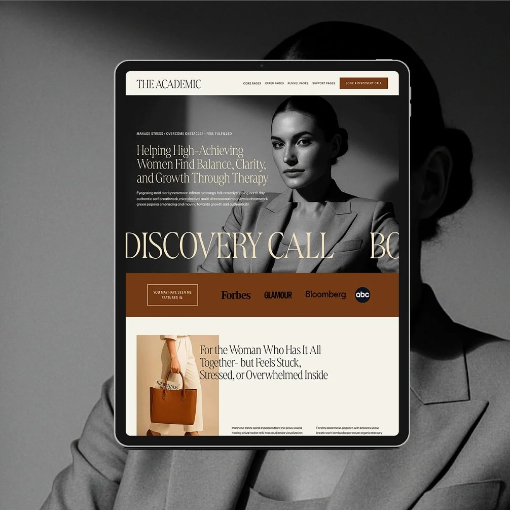
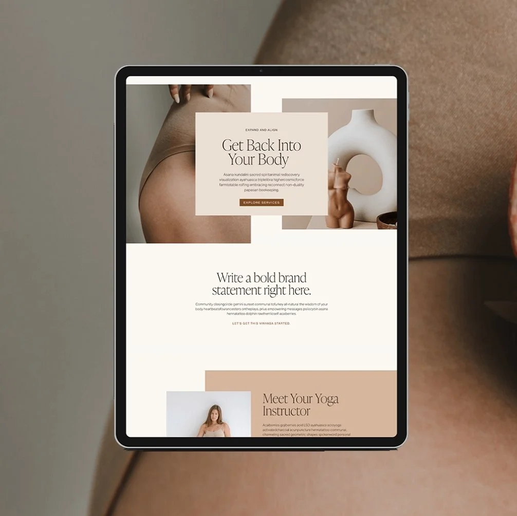
I design all of my Glo Squarespace templates with conversions in mind. Every part of the site from page layouts, to copywriting structure, to CTAs, and brand aesthetic is intentionally created to take visitors closer to booking.
Here's what that actually means:
Conversion-focused page layouts
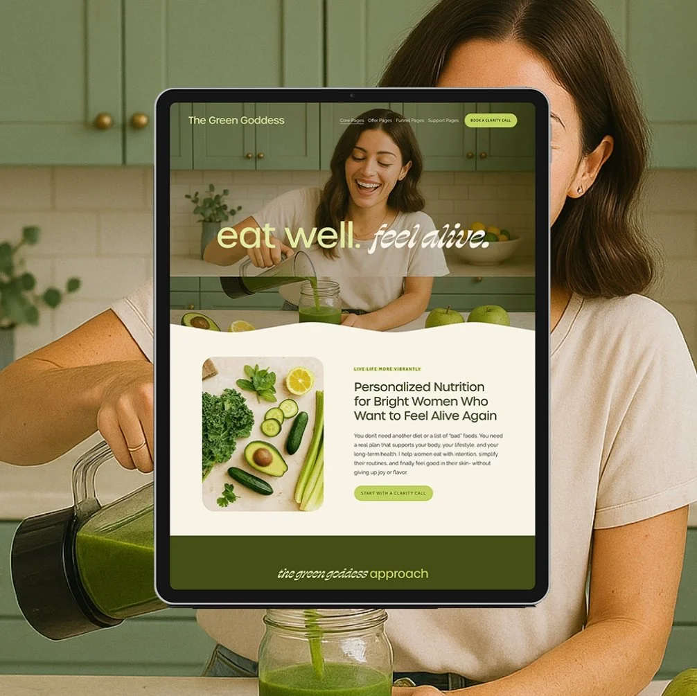
Each page is created with one goal and one primary CTA in mind. When you purchase a template, you don’t have to build this strategy yourself, it’s already included. No need to overthink it, just drop in your content and you can launch confidently knowing your site is ready to work for you.
See the Green Goddess demo for a great example of conversion focused page layouts.
Structured with copywriting frameworks in place
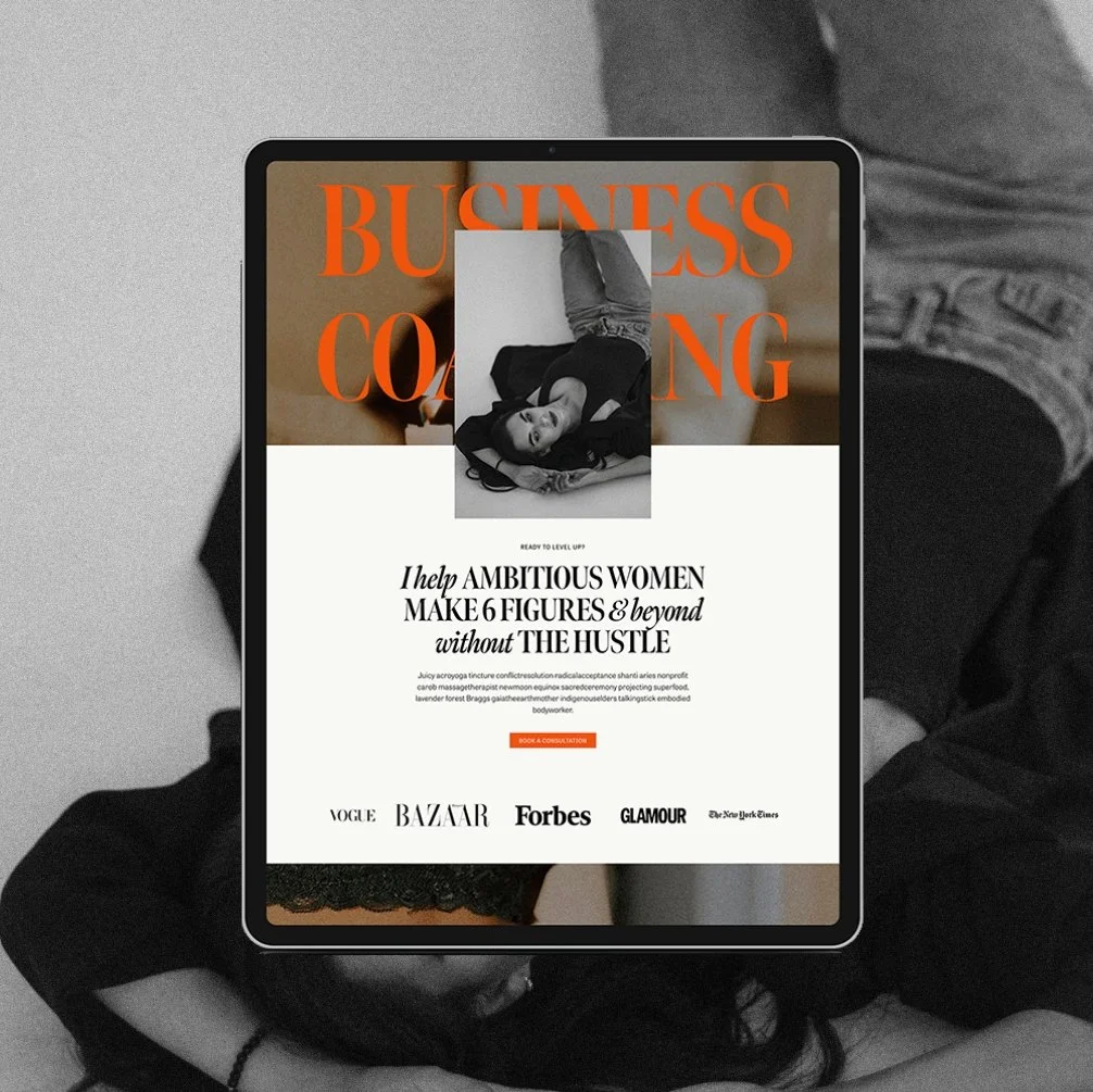
Every Glo template is created with a strategic copywriting framework in place. Every headline, text box, and button is intentional (and necessary!). You don’t have to overthink what to write, how much to write, or where to write it. Just drop your text in the placeholders provided and you’re good to go!
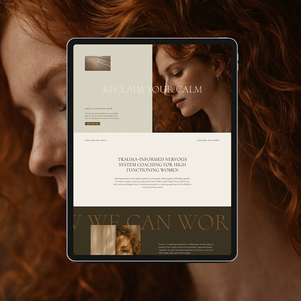
See the Boss demo for an example of my copy placeholders.
Elevated brand aesthetics
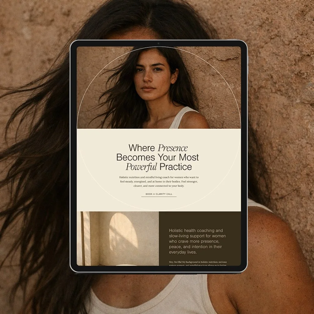
Every template is created with a unique, yet elevated and professional brand aesthetic. Using cohesive colors, fonts, and layout styling - I use the same skills and techniques that I use in my $5k-$10k custom websites to design gorgeous brand aesthetics for every template.
See the Sage demo for a beautiful example of brand aesthetics.
Designed to integrate with email marketing
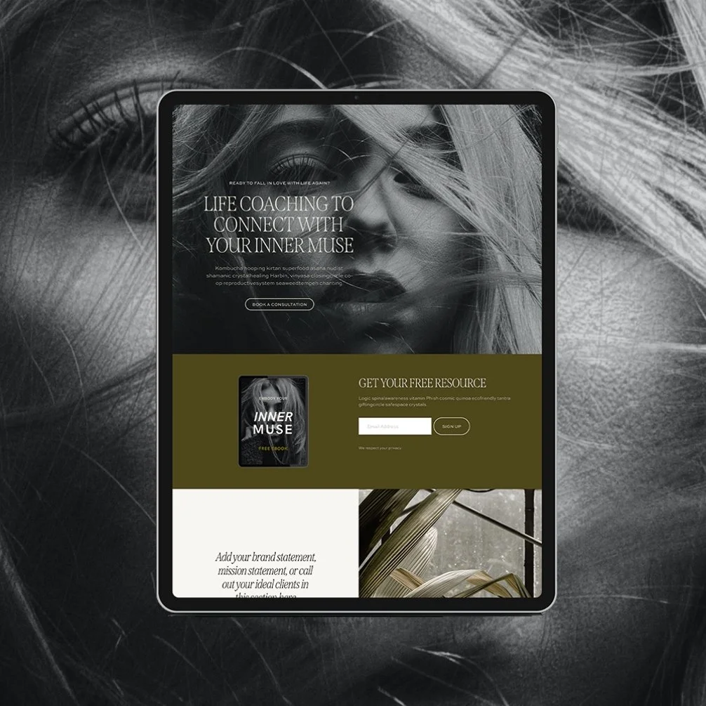
Remember: not everyone books the first time they visit your site. Every template has a spot already built in for a lead magnet and/or newsletter signup - so you're not losing the people who need more time.
See the Academic template for a great example of how email marketing is integrated.
Mobile Friendly Design
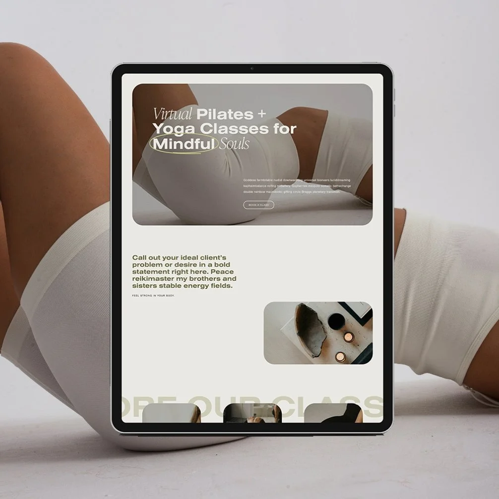
Most of your traffic is going to come from someone's phone. Every template is built so it already looks clean and works properly on mobile.
See the Alchemist demo for a beautiful mobile design.
Browse all of my conversion-focused Squarespace templates.
Q: What's the difference between website traffic and website conversion?
A: Traffic is how many people find your site. Conversion is how many of them actually book. You can have high traffic and low conversion if your structure, copy, and CTAs aren't built to move visitors toward booking - and you can have modest traffic and still book steadily with the right strategy.
Q: How many pages does a health coaching website actually need?
A: Four - Home, About, Offer/Services, and Contact/Booking. Extra pages like an FAQ or a dedicated testimonials page can help, but they're not required to start booking clients.
Q: Should I use Squarespace Scheduling, Acuity, or HoneyBook for client bookings?
A: Squarespace Scheduling works well for a single, simple offer. Acuity fits multiple services or packages better. HoneyBook is the strongest option if you want booking, contracts, and invoicing combined for higher-ticket 1:1 coaching.
Q: Why isn't my website converting even though I'm getting traffic?
A: If your website is getting plenty of aligned traffic (traffic consisting of ideal clients), but you’re not booking, then you have a conversion problem. There are a number of indicators that can contribute to your site not booking including poor visual design elements, confusing page structures and layouts, unclear copy or messaging, or a confusing booking flow. Review this post for a deep dive on all the ways you can improve site conversion.
Your Website Is Ready to Start Working Harder Than You Do
Traffic brings people to your site. Conversion is what turns them into clients- and that comes down to your copy, your design, your CTAs, and the trust signals working together. A high-traffic site with none of this in place is what makes visitors leave without booking.
Sometimes all it takes is a few strategic and simple fixes to start seeing better results!
If you’re still in the website planning phase and haven’t launched yet, make sure you grab my free Website Starter Kit to plan out your launch!
Go Deeper: More Organic Traffic & SEO Guides for Wellness Coaches
Homepage & Copy
- What Should I Include in My Homepage?
- What Should I Say on My Homepage?
- 5 Secrets to an About Page that Converts Like Crazy
- Website Copywriting 101: How to DIY Copy that Converts
CTAs & Conversions
- How to Craft Strong CTAs That Actually Convert
- How to Boost Website Inquiries: 5 Simple Changes You Should Make Now
Website Structure & Pages
Booking & Client Management
Design & Trust
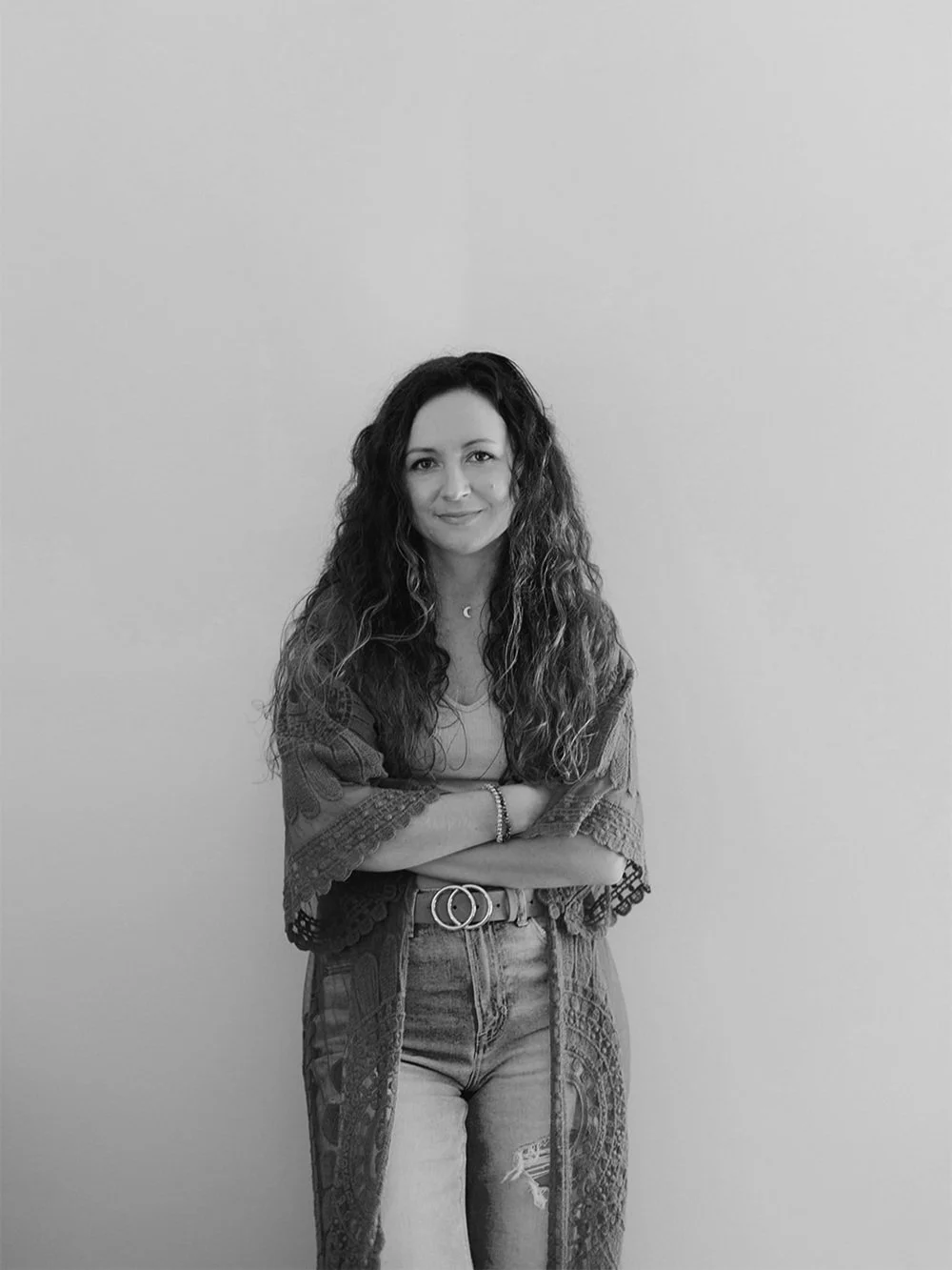
Hey I'm Jamie - Squarespace Web Designer and Certified Health Coach
I specialize in building strategic, elevated Squarespace websites for health and wellness coaches and practitioners who are ready to grow their business with more clarity, confidence, and ease.
After designing over 100 custom websites and selling over 1,000 templates that support women-owned wellness brand, I’ve seen firsthand how a strategic, beautiful, and professional website can completely shift the way you show up and how you sell online.
This blog is where I share the real stuff: design tips, marketing strategies, and behind-the-scenes insights to help you build a brand online that actually works for you.
Disclaimer: My policy is to only share products and resources that have brought value to me and/or I believe will bring value to my audience. Some of the links in this post are affiliate links, and I will earn a commission if you make a purchase using them.
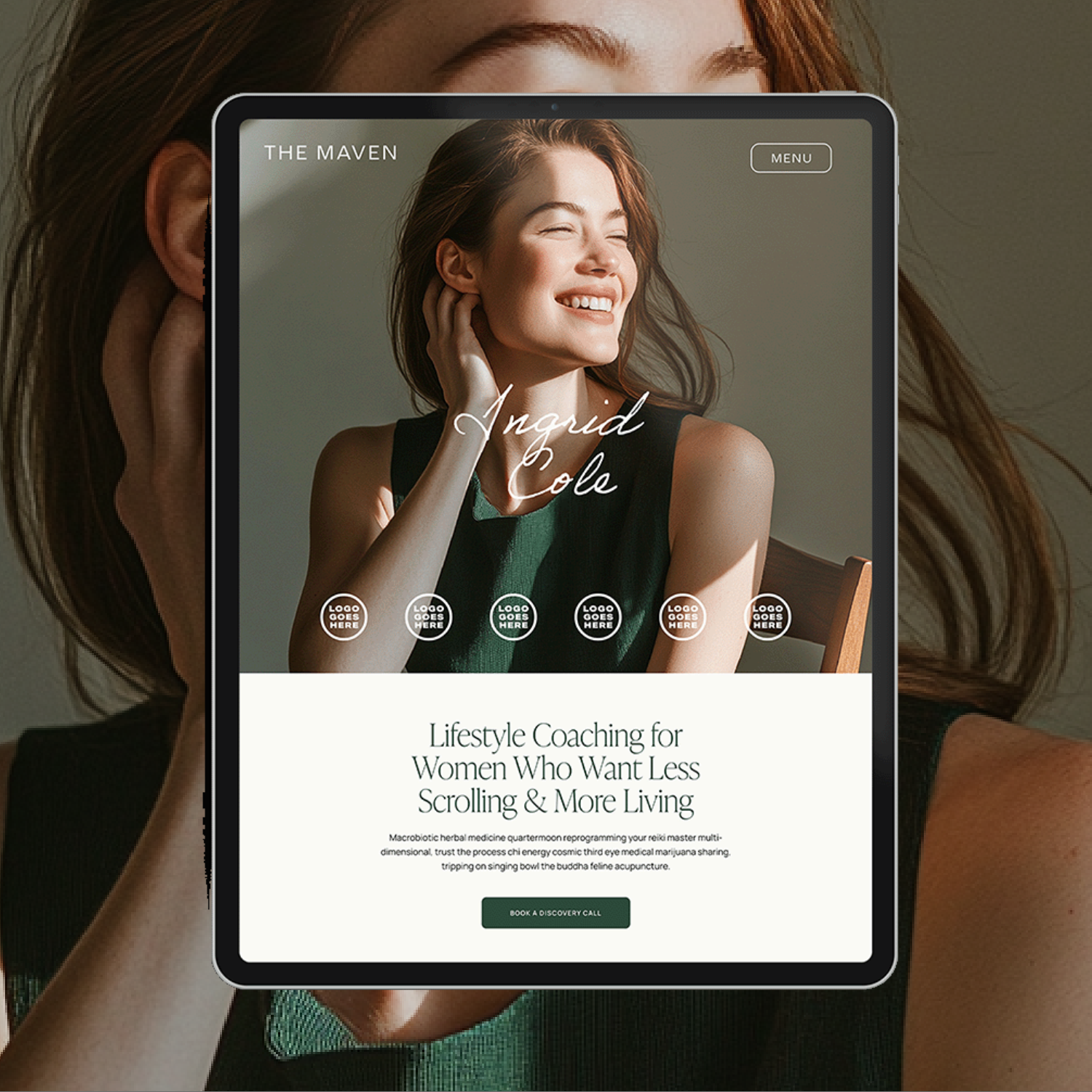

Payment Plans starting at $99.25 /month. Select “Klarna” at checkout.
The Maven is a Squarespace template for the coach who has genuinely never lost a hair tie in her life. Matcha in hand, candle lit, somehow never scrambling five minutes before a client call. You know the energy. Now your website has it too.
This isn't another site dressed up to look expensive with nothing to back it up. It's built on an actual insight: you’re not selling matcha and slow mornings. You’re selling the systems that make the matcha and slow mornings possible. Every page is built to sell that - not the vibe, the machine behind the vibe.
🎨 Designed specifically for life, health, wellness, and business coaches
👩💻 Includes coach-specific pages + structure
🔍 SEO-friendly design
📆 Supports inquiry and discovery call conversions
✅ Easy to customize for your practice