How to Design a High-Converting Wellness Website
You’ve probably heard the phrase “high-converting website” before, but let’s be honest: what does that actually mean?
Does it mean more sales? More clicks? More views?
For service providers, a high-converting wellness website is one that turns visitors into booked clients. A site that’s intentionally designed to lead someone from “this looks interesting” to “I’m ready to work with her.”
This post will break down what that really looks like, beyond the buzzwords, so you can feel confident about the website you’re building (or reworking). Whether you're DIY-ing with a high-converting website template or hiring a designer like me, this is what actually matters when it comes to conversion.
What Is a High Converting Wellness Website?
A high converting website is one that guides visitors to take a specific action- usually booking a call, submitting an inquiry, or downloading your freebie so they can join your list.
But here's the part most people miss:
Conversion doesn’t just happen on a single button click. It’s the result of your entire website working together- strategy, layout, copy, visuals, and flow- to build enough trust and clarity that someone says, “Yes, I want this.”
Why it matters:
If your website isn’t set up to convert, you’re not just losing leads, you’re losing time. Every person who lands on your site without a clear next step is a missed opportunity.
Don’t forget to save this post to Pinterest!

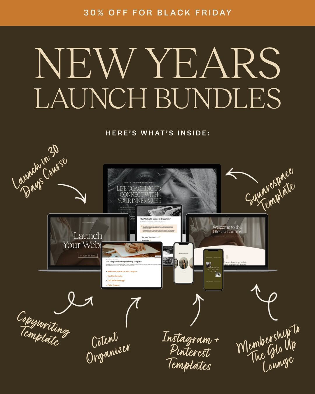
Shop Squarespace Wellness Website Templates
If you’re ready for a website that feels aligned and brings in more inquiries and bookings, explore our collection of conversion-driven Squarespace templates.
How to Increase the Conversion Rate of Your Website
Before we jump into how to improve it, let’s define what a conversion rate actually is—because I promise, it’s not just a techy marketing buzzword.
What Is a Website Conversion Rate?
Your conversion rate is the percentage of people who land on your website and take the action you want them to take.
That action might be:
Filling out your inquiry form
Booking a discovery call
Downloading your lead magnet
Purchasing a product
Joining your email list
For service providers, it’s often all about more qualified inquiries and more discovery calls booked.
Here’s the math: If 100 people visit your site and 5 submit your contact form, your conversion rate is 5%.
The goal isn’t just to get more traffic, it’s to make sure the traffic you already have is actually doing something valuable once they land on your site.
5 Website Conversion Tips That Actually Move the Needle
How to actually increase the conversion rate of your website. Here are specific, needle-moving things you can do. If you want to explore this topic more, check out: 5 Simple Ways to Boost Website Inquiries
1. Clarify Your Homepage Headline
Say what you do, who it’s for, and the outcome.
Example: “Functional Nutrition Support for Women Navigating Hormonal Imbalance.”
This builds immediate connection and lets visitors self-identify instantly.
If you’re not sure what should actually go on your homepage, I walk through the full structure in this post on what every wellness website homepage needs.
2. Add a CTA Button Above the Fold
Place a bold, direct button (“Book a Discovery Call” or “Get the Free Guide”) at the very top of your homepage.
This tells people exactly what you want them to do and makes it easy to submit an inquiry or book a call.
Calls-to-action are one of the biggest drivers of conversion. If you want more examples of what this looks like in practice, check out How To Craft CTAs That Actually Convert.
3. Simplify Your Navigation
Limit your main menu to 6 links max.
Ex: Home, About, Services, Blog, Contact
This keeps is clean and easy to navigate to your conversions without unnecessary distractions
4. Install a Customized Booking or Inquiry Form
Use a tool like Acuity, Honeybook, or a custom Squarespace form that collects specific information you need to know from your client before booking or getting on a sales call. Keep it simple, yet customized.
This is so much more professional than a simple Name, Email, Message form, and builds trust in your leads.
5. Add a Freebie to Capture Leads Who Aren’t Ready to Book Yet
A freebie or lead magnet is something free that you give in exchange for someone’s email address. This could be a pdf guide, workbook, mini workshop (anything really!)
Some visitors need a little more time before booking. Getting them on your list keeps you top of mind.
Need more freebie inspiration? Check out: What is a Lead Magnet and Why Do You Need One?

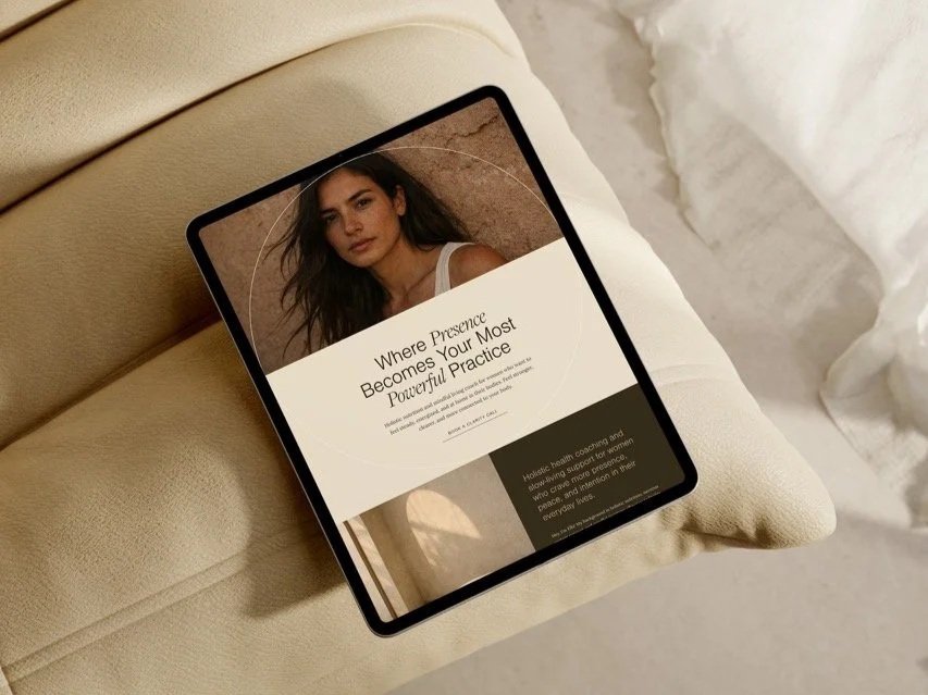
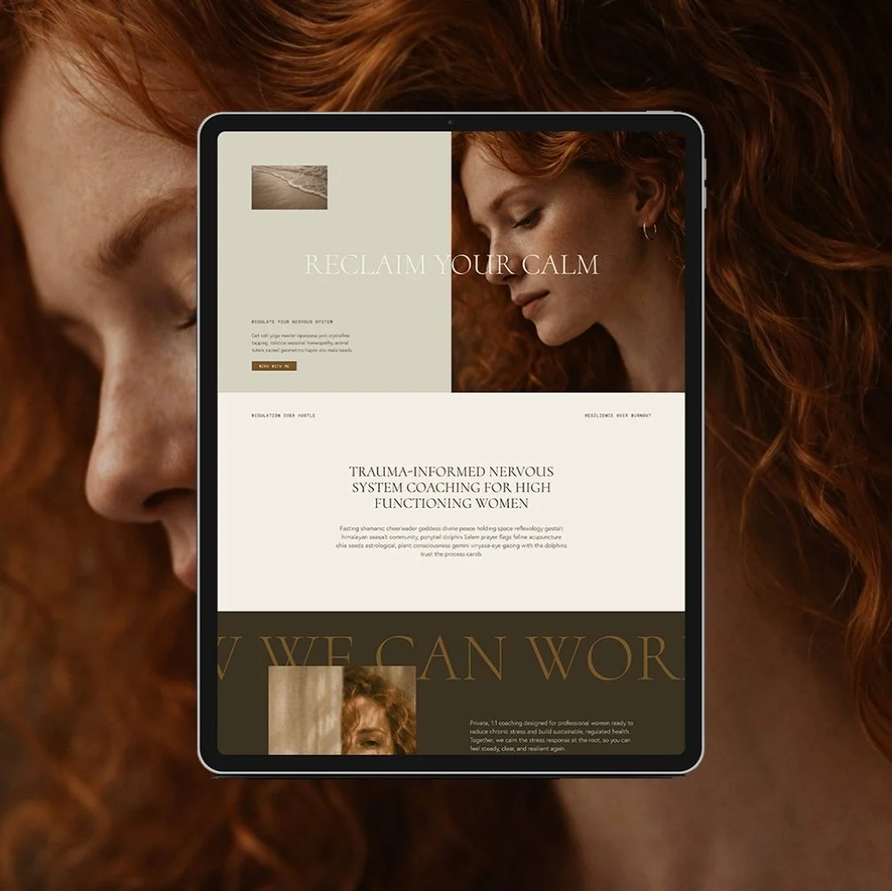
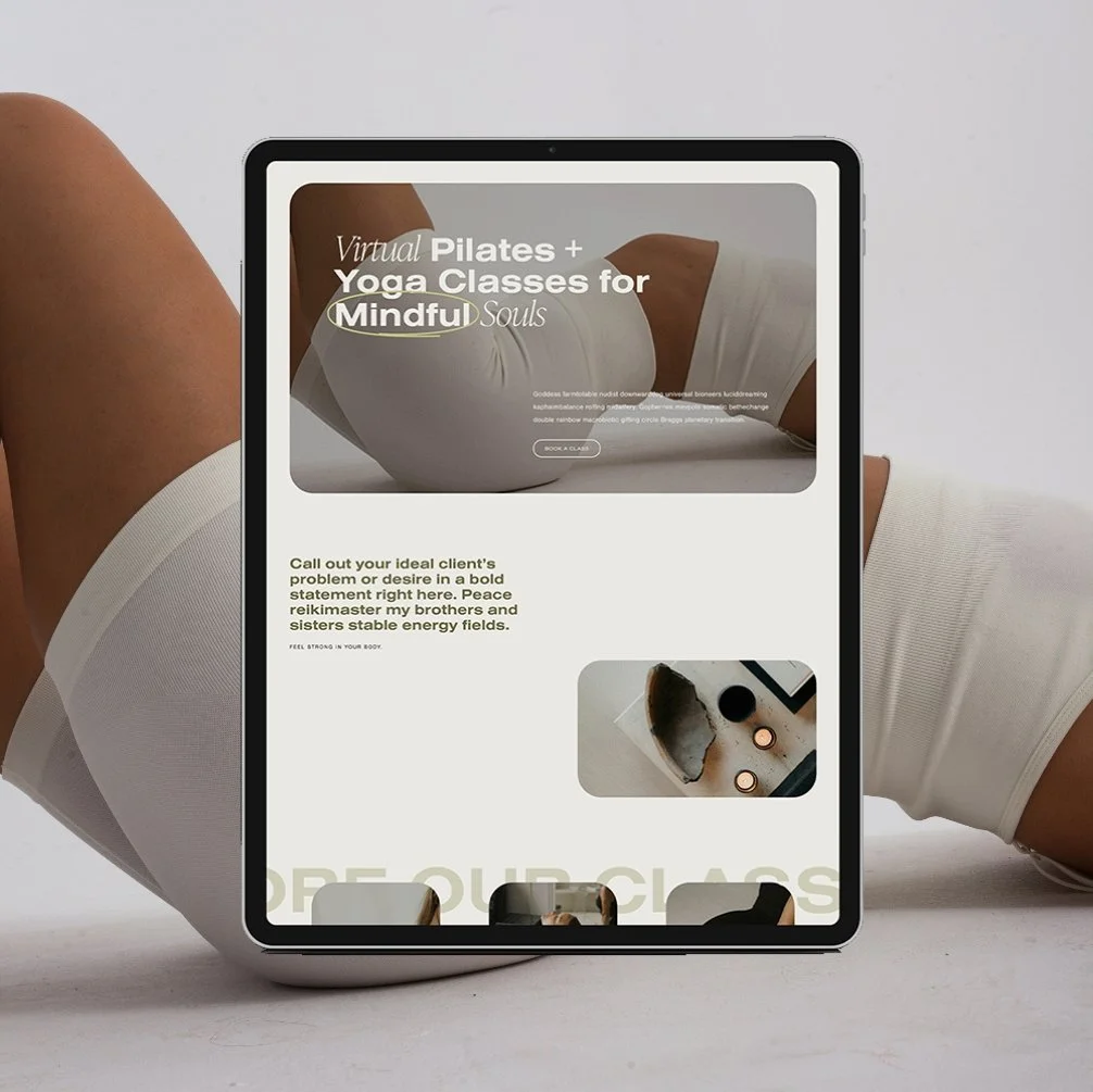
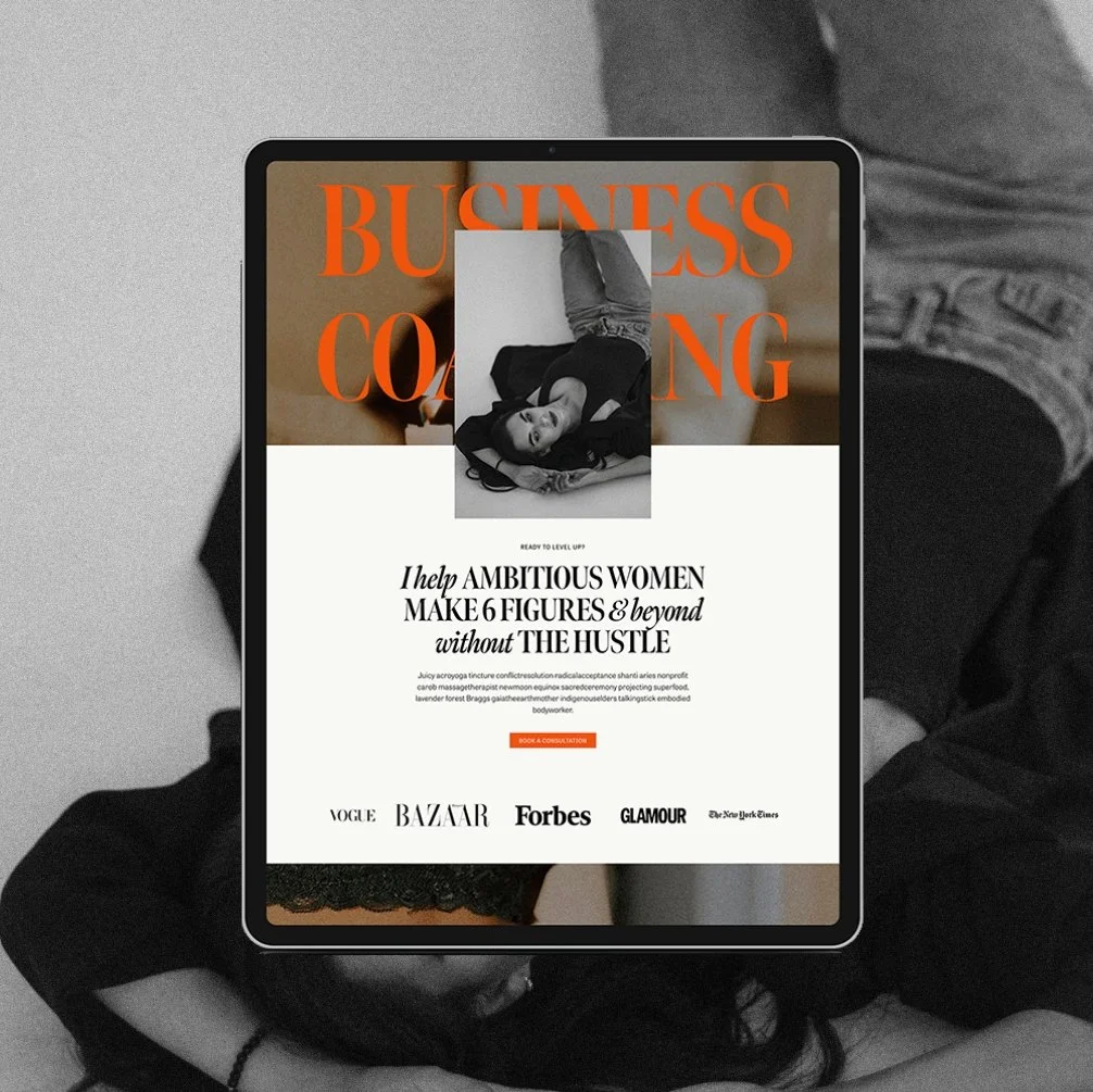
Explore The Queen Template

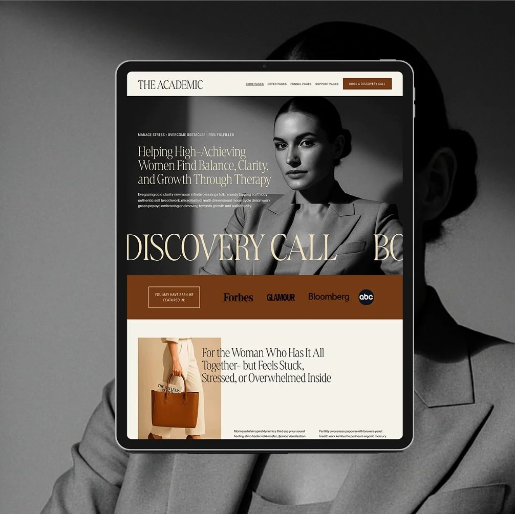
Explore The Academic Template
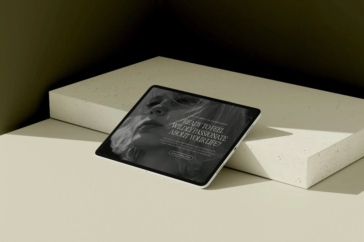
Explore The Muse Template
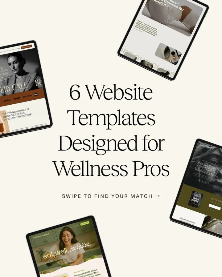
High-Converting Website Templates for Wellness Businesses
Let’s clear something up:
Just because a template is labeled as “high converting” doesn’t mean it actually is.
A truly high conversion website template is built with strategy in mind- not just aesthetics. It’s designed to do more than look pretty. It’s designed to work- to help guide your dream clients toward action (booking a call, downloading your freebie, or filling out your inquiry form).
For example, many of the Glo Wellness Squarespace Templates are designed with built-in sections like testimonial blocks after offer introductions, service highlights that guide visitors toward booking, and offer page layouts that naturally lead someone through your story before inviting them to take the next step.
This kind of structure helps your website feel intuitive for visitors instead of confusing or overwhelming.
They’re designed to help you convert more easily, but remember, you also have to do the work to bring all of the pieces together. It’s not a magic wand solution- it’s still a template, which means it’s up to you to make sure you have a strong brand, messaging, offer suite, and business foundations in place to fill-in-the-blanks.
So if you're not ready for full custom design yet, choosing the right template can absolutely support your growth, as long as you know what to look for.
What Does “Conversion-Driven” Actually Mean in a Website Template?
In simple terms: a conversion-driven template makes it easier for your website visitors to say yes to working with you.
It helps you:
Communicate clearly who you are and what you offer
Build trust and connection fast
Guide the user through a journey that ends in action (like booking or signing up)
If your template doesn’t support those three things, it might not be truly designed for conversion- no matter what the product page says.
What to Look for in a High Converting Wellness Website Template
Not all templates are built the same. Here’s what to actually look for when choosing a high conversion website template:
Strategic page layouts that guide your user to take action (not just trendy designs)
Clear call-to-action buttons placed throughout
Lead magnet/opt-in page to grow your email list
Services page that’s easy to skim and take action from
SEO-friendly structure
Testimonials or space for social proof
If the template looks “cute” but makes you wonder where the booking button should go… it's not built for conversion.
What We Focus on at Glo to Create Conversion-Driven Templates
When we say our templates are strategically designed for conversion, we mean it. Our templates are designed through the lens of strategy-first, beauty-seond (yes, both matter- but strategy leads).
Every layout, button, and section is placed with purpose- not just to look good, but to guide your dream client through a seamless experience that builds trust, sparks connection, and inspires action.
Here’s what sets Glo templates apart:
Strategic Layouts That Guide the User Journey
We don’t just drop content blocks onto a page. We intentionally map out the flow of each template, especially on key pages like your Home, Services, and Booking pages, so visitors are gently led through a story arc of who you are, how you help, why you’re credible, and what they should do next.
Section Placements That Build Connection + Drive Action
Our templates are structured to:
Build trust with social proof near CTAs
Space out your content to avoid overwhelm
Repeat key offers or CTAs at intentional touchpoints
Show just enough to intrigue, but never too much to confuse
This makes the site feel natural, supportive, and confidence-boosting- not pushy and salesy.
Fill-in-the-Blank Copy Guidance (So You Know What to Say)
We don’t leave you staring at a blinking cursor. Each text section inside the template includes prompt-style guidance—so you know exactly what kind of content to include, how to speak to your ideal client, and how to make each section do something (not just take up space). You’ll never be left guessing what to write or where it goes.
Designed to Pre-Sell You Before You Even Get on a Call
The best part? When a template is built this intentionally, your website does a lot of the pre-selling for you. That means by the time someone inquires or books a discovery call, they already know what you offer, understand how to work with you, trust you enough to take the next step. This makes your sales process smoother, easier, and more aligned, without needing to over-explain or convince anyone.
Bonus: Support Inside the Glo Up Lounge
Even the best template won’t drive results if it gets over-edited, rearranged randomly, or filled with placeholder content that doesn’t connect. That’s why every Glo template includes VIP access to the Glo Up Lounge: a private, members-only space with trainings, tutorials, and tools designed to help you launch with confidence.
Inside the Lounge, you’ll find:
Step-by-step video tutorials to guide you through customizing each page with strategy top of mind
A Website Prep Kit to help you gather and organize your b website content before jumping into design
A Launch + SEO Checklist to make sure you’re not missing anything essential before going live
My Web Design Masterclass, where I teach the exact strategy I use to style my designer websites
This means you’re not just customizing your website- you’re making strategic decisions that still support your goals.
Because a high-converting site doesn’t happen by accident. And at Glo, you’re never expected to figure it out alone.
If you're still deciding whether a template or custom design is the right fit, this guide on how to choose the right website template for your business can help.
What to Do After You Purchase a Template to Improve Conversions
Templates give you the structure, but they still need your voice, your offers, and your clarity.
Here’s how to make sure your template works for you after purchase:
✔️ Customize your copy with intention.
Don’t just plug in random text. Use your words to connect, invite, and convert. (Need help? Our Website Copy Template is a perfect add-on.)
✔️ Set up your lead magnet and follow-up emails.
Templates give you the space. Make sure your email system is connected and your welcome sequence is doing its job.
✔️ Stick to the structure.
One of the biggest mistakes? Over-editing the template and breaking the flow. If you’re unsure, follow the layout—it’s designed to convert for a reason.
✔️ Get feedback before launching.
Sometimes you're too close to your site to see what’s unclear. Ask a biz friend or trusted colleague to walk through it as if they were a potential client.
Final Thoughts
Your website shouldn’t just exist online, it should work for you.
It should help you connect with the right people, build trust before the first email, and guide visitors toward becoming paying clients, without relying on flashy trends, complicated funnels, or spending all day in your DMs.
Whether you’re booking clients through a custom design or launching with a high-conversion website template, the goal is the same:
→ Make it easy for the right people to say yes.
→ Make it feel aligned for you.
→ Make it work.
At Glo, we design every single template with strategy, clarity, and real results in mind, so your site doesn’t just look beautiful. It converts.
If you’re ready for a website that feels aligned and brings in more inquiries and bookings, explore our collection of Wellness Squarespace templates.
You're not here to play small.
And your website shouldn’t be either.
Don’t forget to save this post to Pinterest!


Hey I'm Jamie | Squarespace Web Designer and Certified Health Coach
I specialize in building strategic, elevated Squarespace websites for wellness professionals who are ready to grow their business with more clarity, confidence, and ease.
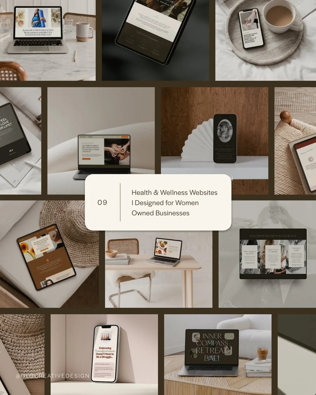
After designing over 90+ websites and supporting dozens of women-owned wellness entrepreneurs, I’ve seen firsthand how intentional design and smart strategy can completely shift the way you show up, and how you sell.
This blog is where I share the real stuff: design tips, marketing strategies, and behind-the-scenes insights to help you build a brand online that actually works for you.
Disclaimer: My policy is to only share products and resources that have brought value to me and/or I believe will bring value to my audience. Some of the links in this post are affiliate links, and I will earn a commission if you make a purchase using them.
Related Posts


For more web design inspiration and marketing tips, follow @glocreativedesign