How to Boost Website Inquiries: 5 Simple Changes You Should Make Now

Starting a new business is an exciting journey. It requires energy, creativity, and hard work. However, one of the things that so many new service based businesses struggle with is getting a flow of quality inquiries so that they consistently book clients.
Inquiries can come to your business through several different avenues including social media and referrals… however that strongest way to acquire inquiries that you can convert quickly into booked clients is through your website.
But generating website inquiries might feel really challenging as a new business, and without a concrete plan, you may feel stuck. The good news is, there are a few simple changes you can make to your website today that will help you convert more website visitors into inquiries.
According to the Harvard Business Review, “89% of businesses that have implemented an effective content marketing strategy have reported an increase in web inquiries.”
Remember, you website is a marketing tool, not just a pretty platform to showcase your offers. This means that there should be some strategy built in to your content and design to help you convert more dream clients and reach your business goals.
So, how do you boost website inquiries?
In this post, we’ll discuss five simple changes you can make to your website to get more inquiries, quickly and easily. Whether you’re an established small business owner, or just getting started, you’ll walk away with five simple website strategies you need to get more website inquiries.
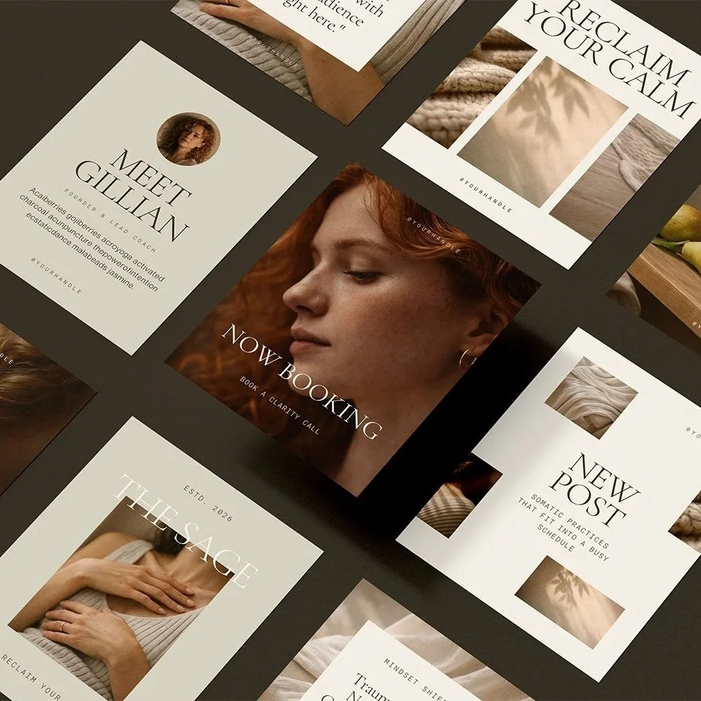
Don’t forget to save this post to Pinterest!

5 Simple Steps to Increase Website Inquiries
1. Include a Contact Page
The most important step if you want to increase website inquiries is to make sure that you have a designated Contact, Inquire, or Booking page.
Including a contact page makes it super-clear how to get in touch with you. The last thing you want is for your visitors to be searching each page of your site trying to figure out how to inquire about your services. It should be the simplest and clearest step of their user experience journey.
Be sure to include a contact form on your contact page. Keep it simple. The goals is to have interested leads take the first step by reaching out, so you don’t want to make your contact form feel intimidating or complicated. Ask a few essential questions related to your services, and be sure to include a timeframe of when they can expect to hear back from you.
Contact forms are proven to increase inquiry conversion over simply listing your email. This is because it takes fewer steps for visitors to fill out, they don’t have to think about what to say in an email they’re writing from scratch, and they don’t have to leave you website to do so.
Keep your contact page simple. The goal of the contact page is for visitors to connect with you, so you don’t want to litter it with anything that isn’t relevant to this. Aside from a compelling heading and contact form, you could also include a section with a signup for your freebie or newsletter (this invites them to connect via your email list). You can also include a section with links to social media platforms, inviting them to connect with you as a part of your online community.
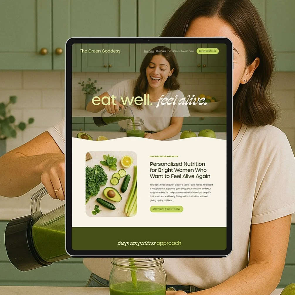
2. Simplify Your Site Map
Your site map is how you map out your user experience (the pages or navigation) of your website. One of the biggest problems I see in DIY web design are websites that have complicated site maps. Your user experience should be clear and simple. Adding too many pages, or un-necessary pages can take your visitors attention away from what is most important- your offers and goals.
For a service-based business there are four core pages your website should include:
a Home page
an About page
a Services page -you may need multiple services pages for each service you offer. You shouldn’t be trying to cram lots of information about three different services on one page
a Contact page
Depending on your business and what you offer you may also need:
a Sales page
a Blog
an Online Store
Pages you do not need and which can distract visitors from the main goal of your website are:
Testimonial page - instead, sprinkle these throughout your sales, services, about, and homepages to integrate them into your visitor’s journey
FAQ page- instead, include these at the bottom of your services and sales pages so that visitors can get their questions about each relevant offer answered in the same location
Payment page- in most cases, payment information should be included on the corresponding sales or services page which eliminates an extra step for interested inquiries
With a cleaned up site map, you’ll simplify your user experience, highlighting only the most important parts of your business, making it crystal clear what you offer and how to work with you.
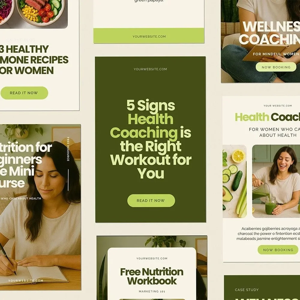
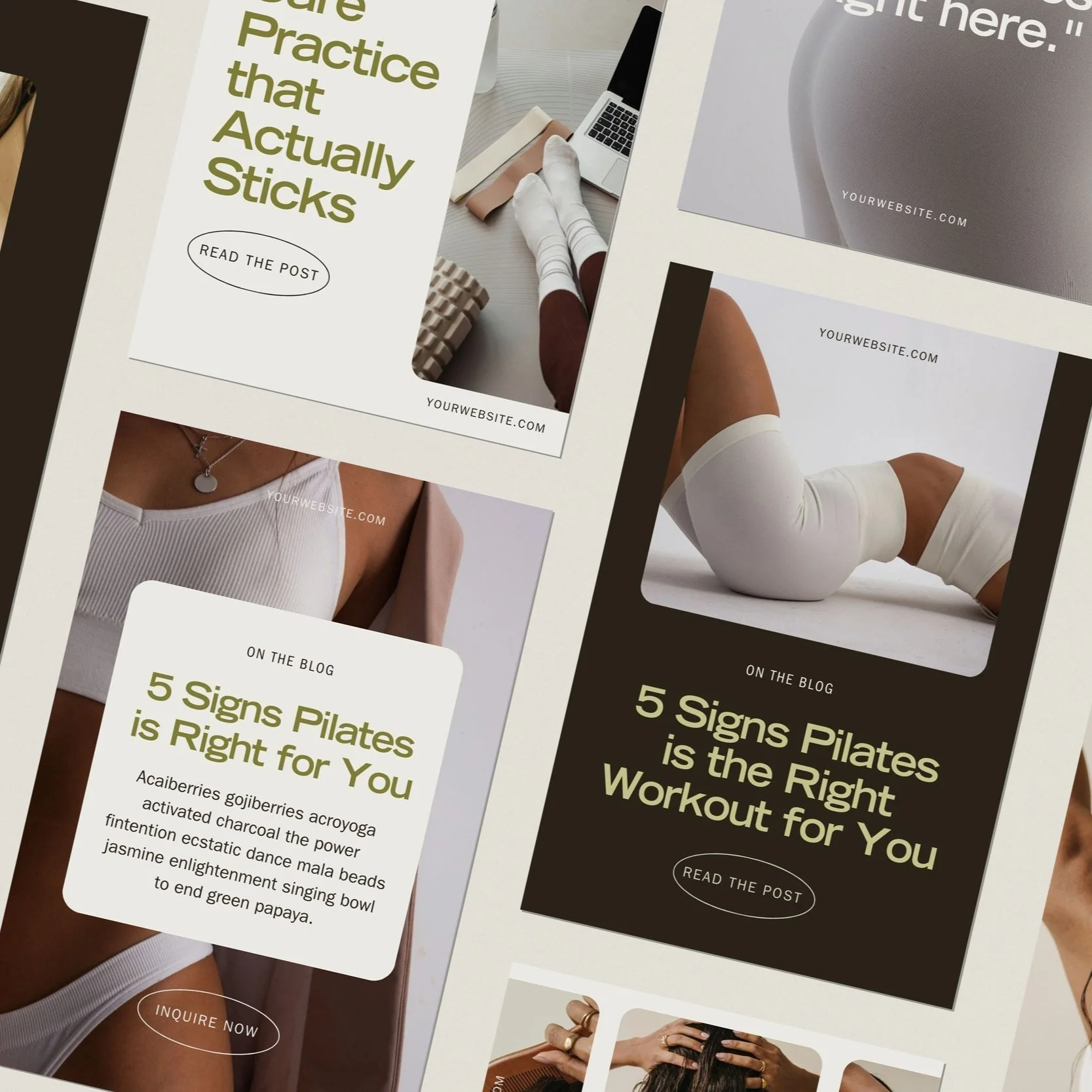
3. Use CTAs
Your CTA, or call to action is your “sales” request. A CTA directs your visitors, making it clear what action they should take next. This is typically the text that you’ll see on buttons on your website.
CTAs have been proven to increase both click conversions and sale conversions.
It’s important to remember to be super, super clear when using CTAs. It’s easy to get caught up with using clever phrases to stand out, but if it doesn’t really make sense, don’t do it.
Some examples of CTAs include:
Learn More
Read the Blog
Shop Now
Book a Free Consultation
Schedule an Appointment
Inquire Now
Get Started
Download Now
Let’s Chat!
Get Instant Access
CTA’s should be used strategically to guide visitors through an exceptional user experience. Keep the goals of your website in mind when using CTA’s and planning your site map.
Consider what pages you’ll need visitors to go to in order to receive inquiries. Most likely these will be your services and/or sales page. On these pages they’ll learn more about your offer and become interested in working together. From here, you’ll want them to inquire with you on your contact page. Be sure your CTA’s reflect this journey that you want your visitors to take.
Without a strategic use of CTAs, website visitors can easily feel lost or confused on your site. It can become difficult to understand how to connect with you, or what your offer even is.
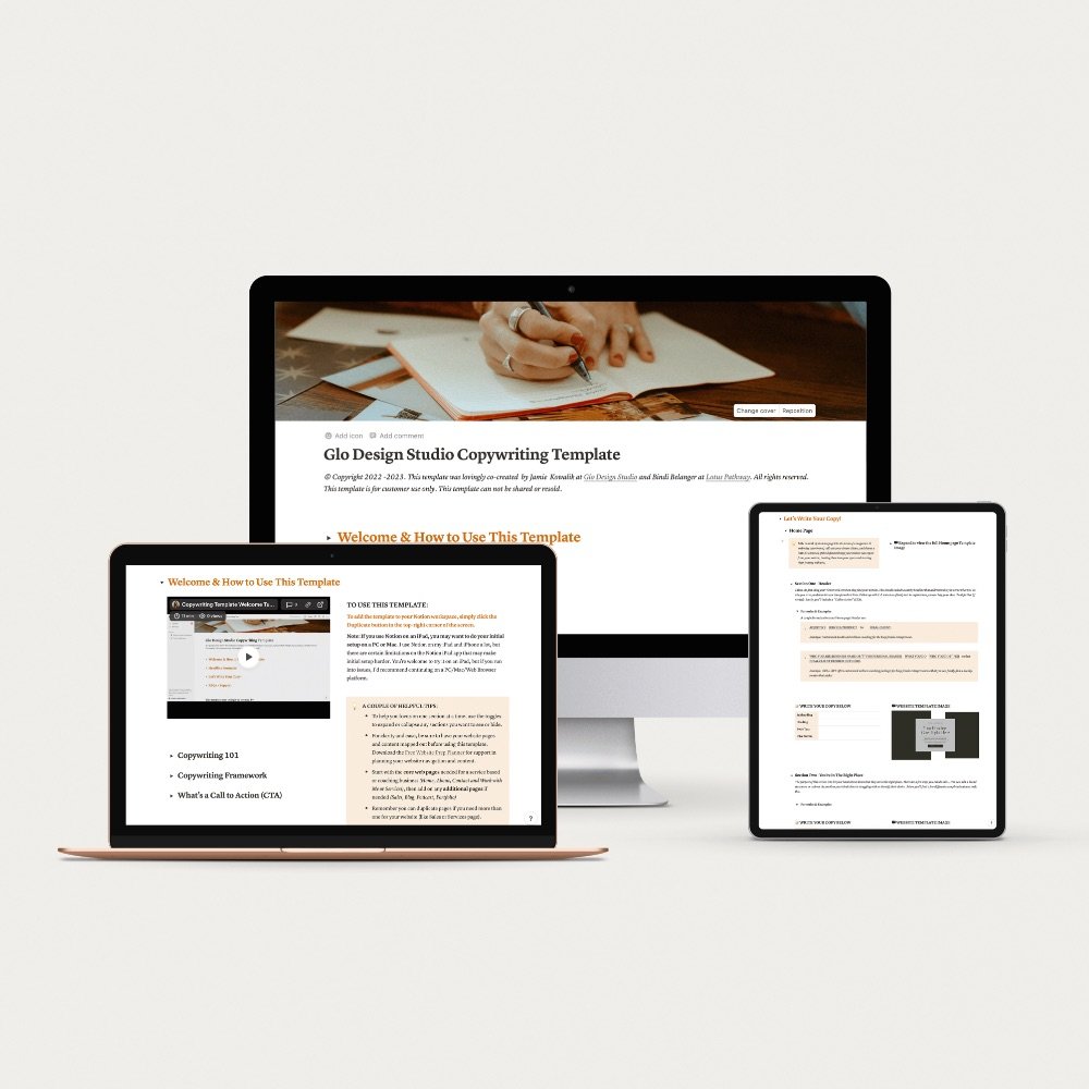
4. Clean up your copy
Copywriting is writing for marketing and sales. When you hear someone refer to copywriting, this is in reference to all of the words and text on your website (because your website is a marketing tool, therefore all of your words are written to sell, right?)
Copy can make or break your site. If your words aren’t clear or aligned with your website goals and your ideal clients, this could be costing you website inquiries.
Here are a few basic Copywriting 101 Tips to follow when you clean up your site copy:
Your website is not about you. It’s about your dream client.
What your clients want to know is how they will benefit from your service. What value does it provide for them? How does it solve their problem?
This is why it is important to position your client as the “hero” when writing your website copy, and your brand as the “guide”, helping them navigate their way to that desired result (and preferably with ease!)
Great copy is simple and straight to the point.
It’s important to write copy that is clear and concise. Remember that we read websites like a magazine, skimming headlines, to subheads, to body text. This is why it’s essential that each sentence is intentional and has a purpose.
When editing your copy, review each sentence and ask yourself, “Is this clearly understood?” and “Is this necessary?” Look closely for “fluff” or filler words and sentences that can be cut out.
Break up your text
Breaking up your text into digestible and readable tidbits is a great way to ensure your copy is read in a hierarchy and all of the essential points are being seen and your website is readable.
The first thing to consider is utilizing headlines, subheadlines, and body text in your copy. Headlines being the larger text that is read first, subheadlines being the supporting text read second, and body text being the more in depth text that is usually read only after the headline or subheadline spikes your readers interest.
Another way to break up text is to use bullet points when you can. Bullet points draw in reader and break down text is a digestible way.
5. Refresh your web design
Your website’s design and visual aesthetic is also a key player in boosting website inquiries. The design of your site is the visual representation of your brand. It highlights what is most important in your business and showcases your offers. Your design speaks to your dream clients and develops a perception about your brand. It has the ability to evoke emotion from visitors and make them feel like you are the perfect solution to their problem.
Here are a few ways to refresh your website’s design to increase inquiries:
Branding
Run through your site to ensure that your visuals are up to date with your brand and everything looks cohesive. Check your color palette, font hierarchy and usage, button styling, and imagery. If anything is not aligned with your brand guidelines, be sure to update these elements.
Simplify
When you look at your site, does it feel clear and easy to understand? Oftentimes a website can start to feel confusing when there are too many colors, too many fonts, images that don’t make sense with your brand or your offer, too many graphic elements, or too much copy or graphics crammed into each section.
Contrast
Using good contrast in your color palette ensures that your text is easy to read and your images stand out. Review your site to make sure that your color palette includes good contrast that allows your site to be clearly read and understood.
Next Steps
Ready to get more inquiries through your website?
Making simple changes to your website can be an effective and efficient way to boost inquiries from potential customers. From ensuring that your website includes a designated contact page, to simplifying your site map, to including strong CTAs, to cleaning up your copy, to refreshing your design - taking these steps will dramatically increase the likelihood of website inquiries from clients. Moreover, doing so will result in increased sales and enhance your brand reputation. By making these five simple changes, you can start increasing website inquiries now and give your business the boost it needs.
Now that you know the simple changes you can make to get more website inquiries, be sure to start implementing them today to increase the number of inquiries you receive.
If you liked this post, you may also like:
→ 8 Ways to Create Hype for Your Website Launch
Don’t forget to save this post to Pinterest!


Hey I'm Jamie
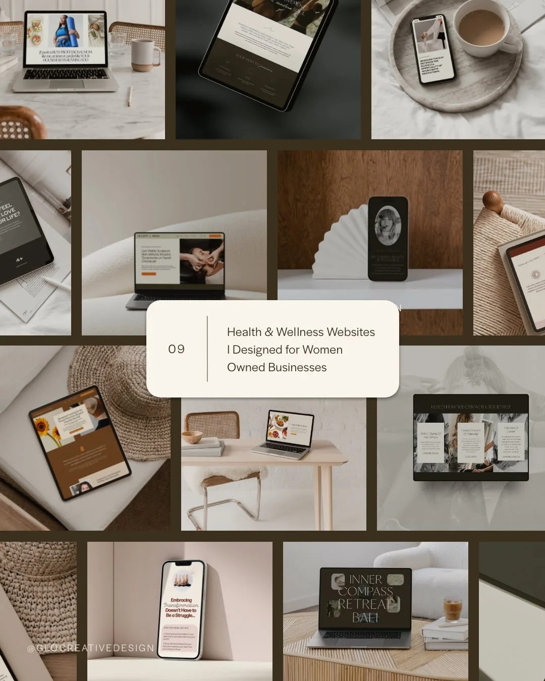
-web designer, brand strategist, and former certified health coach turned creative studio founder. I specialize in building strategic, elevated Squarespace websites for wellness professionals who are ready to grow their business with more clarity, confidence, and ease.
After designing over 90 websites and supporting dozens of service-based entrepreneurs, I’ve seen firsthand how intentional design and smart strategy can completely shift the way you show up, and how you sell. This blog is where I share the real stuff: design tips, marketing strategies, and behind-the-scenes insights to help you build a brand that actually works for you.
Disclaimer: My policy is to only share products and resources that have brought value to me and/or I believe will bring value to my audience. Some of the links in this post are affiliate links, and I will earn a commission if you make a purchase using them.
Related Posts

Shop the Templates


For more web design inspiration and marketing tips, follow @glocreativedesign