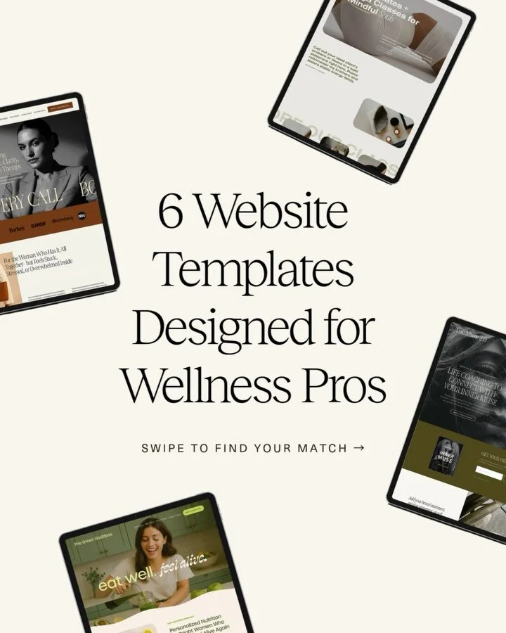
How to Craft Strong CTAs That Actually Convert

Let’s be honest, most CTAs on wellness websites are either giving nothing (“Learn More”) or trying way too hard (“Book Now Before It’s Too Late!!!”). Neither is doing your business any favors.
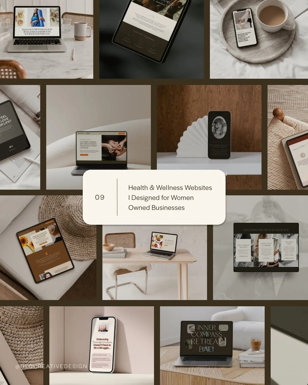
As a web designer who’s worked on over 90 websites for women in wellness, I’ve seen firsthand how powerful a clear, aligned call-to-action strategy can be- not just for clicks, but for conversions that feel good on both sides. So today we’re digging into what makes a CTA work, how to avoid the pushy marketing vibes, and how to create a homepage (or sales page, or services page...) that actually moves people to take the next step.
Don’t forget to save this post to Pinterest!

Crafting Strong CTAs That Actually Convert (Without Feeling Pushy)
What is a Call to Action in Website Design?
A call to action (CTA) is a prompt that tells your website visitor what to do next, like "Book a Call," "Download the Free Guide," or "Start Here."
In wellness website design, your CTA is an invitation. A gentle nudge. A moment to build trust and momentum toward working together. Without one? Your audience is left hanging and you’ll be missing out on getting more eyes on your services and sales pages and more inquiries in your inbox.
Think of CTAs as your site’s built-in navigation system for decision-making.
What Is the Difference Between a Link and a CTA?
This might seem subtle, but there’s actually a big strategic difference between a link and a call to action, and understanding it is key if you want your website to convert.
A link is passive.
It usually lives in your body text and helps people navigate. It’s informational. Think:
“Read more about my approach.”
“Click here to view my blog.”
“Head to my About page.”
It doesn’t ask the visitor to do anything specific other than look at something.
A CTA is intentional and action-driven.
It invites your visitor to engage, take the next step, or make a decision. It lives inside buttons or styled elements that are designed to stand out. Examples:
“Book a 1:1 Consult”
“Download the Free Anxiety Toolkit”
“Start Your Healing Journey”
“View My Signature Program”
CTAs are outcomes-oriented. They support your business goals (like growing your list or getting consults) while also guiding your audience toward something that can help them.
So how do you know if it’s a link or a CTA?
Here’s a quick test:
If it’s just sending them to another page, it’s a link.
If it’s designed to drive action, it's a CTA.
Let’s say you’re a nutritionist:
Link: “Learn more about my process here.”
CTA: “Book a free discovery call to get started.”
See the difference? A link just informs. A CTA invites and inspires.
And for your wellness website, you need both—but your CTAs are what ultimately help you build trust, generate leads, and create conversions. So they need a bit more love.
What Is a Call to Action Strategy?
It’s not just about having buttons—it’s about using them with purpose.
A strong call to action strategy isn’t random. It’s a thoughtful plan for how your website guides visitors from curious to confident—without overwhelm, confusion, or pressure.
It’s the difference between a website that looks good and one that quietly leads to more consults booked, more offers downloaded, and more aligned clients saying “yes.”
Let’s break it down.
A CTA Strategy Considers:
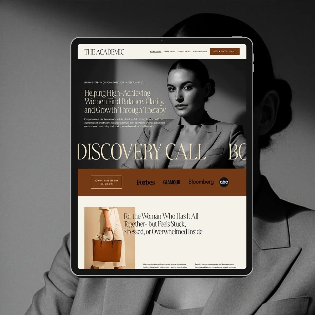
1. Your Visitor’s Stage of Awareness
Not every visitor is ready to buy. Your CTAs should reflect where they are in their journey.
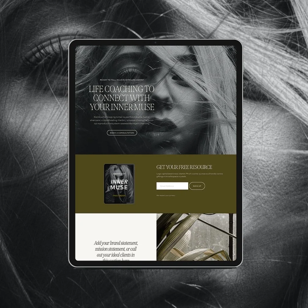
Brand new? Use low-commitment CTAs like:
→ “Start Here”
→ “Explore My Approach”
→ “Download the Free Guide”
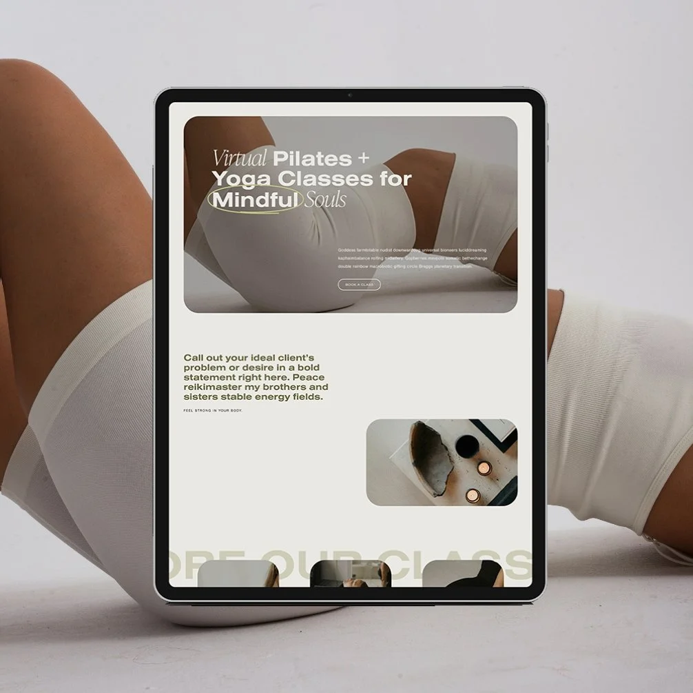
Warmer lead? Offer a clear next step:
→ “View Services”
→ “Check My Availability”
→ “Book Your Spot”
Why it matters: If you only have “Book Now” everywhere, you might be missing all the people who want to work with you but aren’t quite ready to commit.
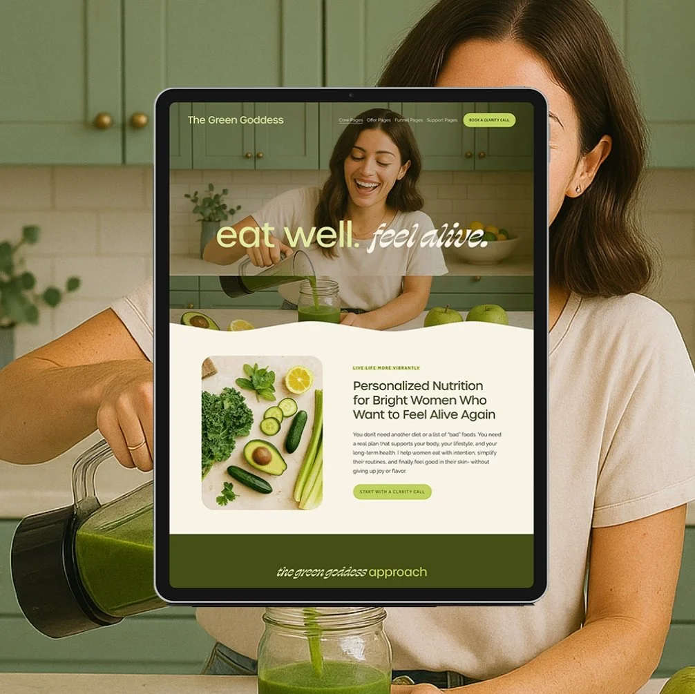
2. The Page’s Purpose
Each page should have a primary goal—and the CTA should reflect it.
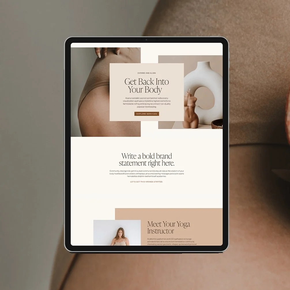
Homepage? Guide them into your site with a clear direction (like “View My Services” or “See If We’re a Fit”).
About page? Build connection, then invite them to learn more or take action (“See How I Work” or “Ready to Chat?”).
Services page? Give them clarity, then make it easy to take the next step (“Book a Free Consult” or “Start Your Application”).
Why it matters: CTAs without context confuse people. Strategic CTAs help them feel led and supported.
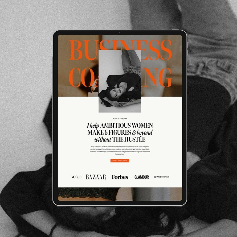
3. Your Offer Type + Sales Process
Selling a self-paced $47 workshop? That CTA can be direct and product-focused.
Selling a 4-month private coaching program? Your CTA needs more space to build trust.
Examples:
Low-ticket / passive → “Buy Now” or “Join Instantly” works fine.
High-touch services → Try “Let’s Connect” or “Apply to Work Together.”
Why it matters: The higher the investment or emotional commitment, the more thoughtful and spacious your CTA should feel.
4. The Emotional Landscape
This one’s big for wellness pros: think about how your client feels when they land on your site.
Are they overwhelmed? Burnt out? Hopeful? Anxious?
Your CTAs should reflect the emotional shift they want.
Examples:
“Start Your Healing Journey”
“Feel Better in Your Body”
“Get Grounded, Gain Clarity”
Why it matters: A well-written CTA is not just functional—it’s felt.
A solid call-to-action strategy weaves all of this together. It's not about being pushy—it's about being intentional.
When you do it right, your website flows naturally, builds trust, and turns visitors into aligned clients... without anyone needing to second guess what to do next.
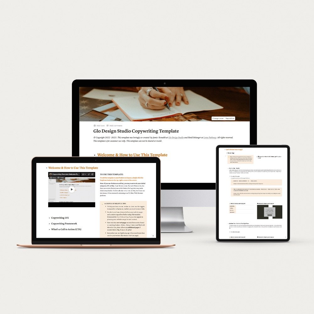
Need Help Writing the Actual Words?
It’s one thing to know what your CTA should be doing—and another to actually write it in a way that sounds like you, connects with your audience, and feels aligned with your brand.
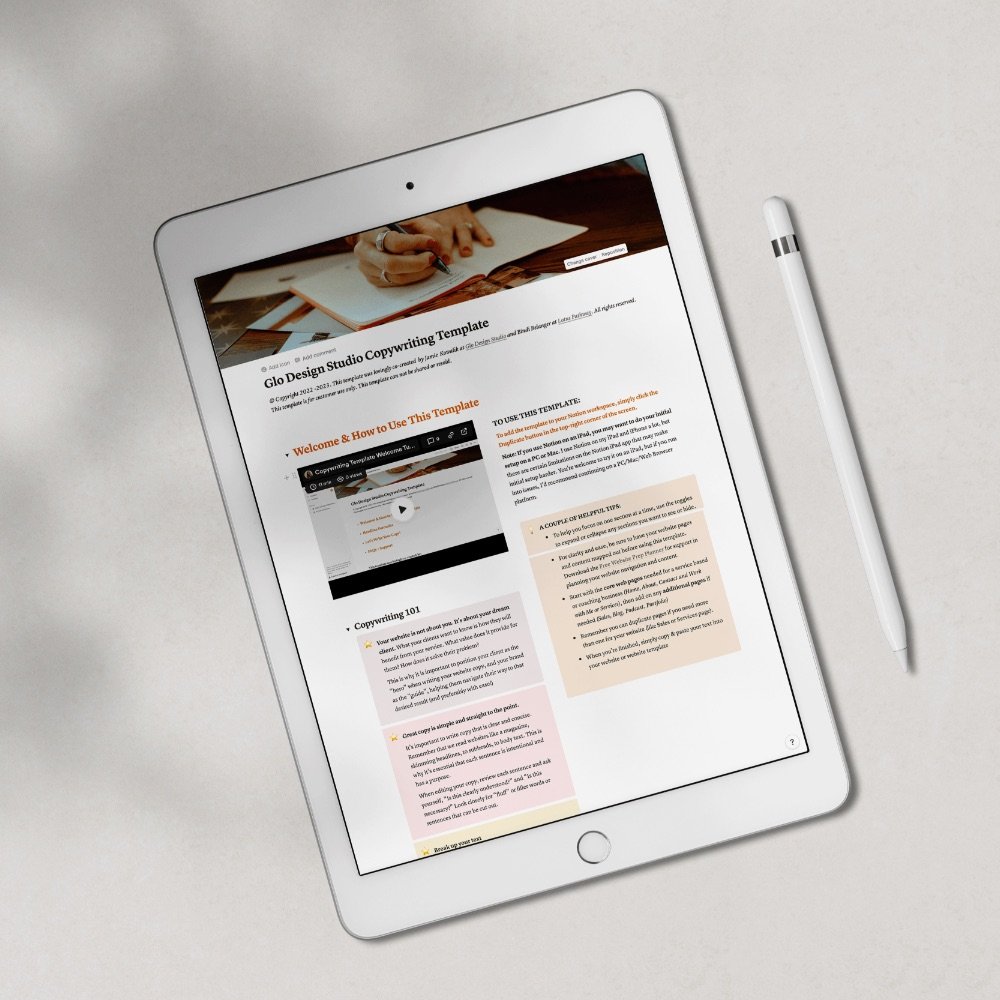
That’s exactly what my Website Copywriting Template is designed to help you do. It’s a plug-and-play system that walks you through writing your full site, including strong, conversion-driven CTAs throughout- so you never have to second-guess what to say or how to say it.
→ Check out the Website Copywriting Template here
Call-to-Action Examples (That Actually Feel Good)
Here are a few CTA examples I’ve written or loved that strike the balance between compelling and non-pushy:
“Book a Free Clarity Call”
→ Great for 1:1 coaches or therapists who need to connect before onboarding.
“Start Your Personalized Plan”
→ Feels actionable for nutritionists or wellness coaches offering custom programs.
“Let’s Talk About What You Need”
→ Warm, grounded CTA that feels personal and low-pressure—perfect for therapists.
“Take the First Step Toward Feeling Better”
→ Emotionally resonant for anyone helping clients with stress, burnout, or chronic health struggles.
“Download the Free Wellness Starter Kit”
→ Ideal for email list growth and guiding new visitors toward deeper connection.
“Explore My 1:1 Services”
→ Invites curious visitors into your offer suite without forcing a decision.
“Get Support That Actually Feels Supportive”
→ Speaks directly to the therapy/coaching audience—validating and safe.
“See If We’re a Fit to Work Together”
→ Especially good for high-touch offers where alignment is key (and helps filter leads).
“View My Signature Program”
→ Gives structure and clarity to your offer while piquing interest.
“Start Nourishing Your Body Today”
→ A CTA that blends encouragement with agency—perfect for nutritionists.
“Browse Session Options + Pricing”
→ Great for wellness pros who want to be transparent without inviting overwhelm.
“Let’s Make Space for What You Need Most”
→ Grounded, calming CTA for therapists or mindset coaches with a softer tone.
Website CTA Conversion Tips
If you want your website to convert (without making your audience cringe), here are a few best practices:
Clarity > cleverness: It’s tempting to get poetic, but clear CTAs convert better than cute ones.
Match your brand voice: If your brand is soft and nurturing, “Let’s Begin Your Healing” might feel better than “Buy Now.”
Limit your options: Too many CTAs = analysis paralysis. Stick to one clear action per section.
Style it with intention: Don’t let your buttons hide. Use brand colors, hover effects, and consistent placement to draw the eye.
Use intuitive language: Speak like a human. “See Pricing” or “Book a Call” is more effective than “Click Here.”
Final Thoughts: You don’t need to be pushy to get conversions
You just need clarity, intentional design, and a CTA strategy that reflects the kind of experience you want to offer. Because the right clients want to take the next step- they just need to be shown how.
P.S. My website templates are built with thoughtful, intuitive CTA placement built in, so you don’t have to overthink what goes where. Explore the templates right here or start with the free Website Inspiration Workbook to map your CTA flow with confidence.
If you liked this post, you may also like:
→ What Should I Include in My Homepage?
Don’t forget to save this post to Pinterest!


Hey I'm Jamie
-web designer, brand strategist, and former certified health coach turned creative studio founder. I specialize in building strategic, elevated Squarespace websites for wellness professionals who are ready to grow their business with more clarity, confidence, and ease.
After designing over 90 websites and supporting dozens of service-based entrepreneurs, I’ve seen firsthand how intentional design and smart strategy can completely shift the way you show up, and how you sell. This blog is where I share the real stuff: design tips, marketing strategies, and behind-the-scenes insights to help you build a brand that actually works for you.
Disclaimer: My policy is to only share products and resources that have brought value to me and/or I believe will bring value to my audience. Some of the links in this post are affiliate links, and I will earn a commission if you make a purchase using them.
Related Posts
Shop the Templates
For more web design inspiration and marketing tips, follow @glocreativedesign