What Should I Include in My Homepage?

If you're staring at a blank Squarespace canvas wondering what in the world your homepage is supposed to include- you're not alone. Whether you're a nutritionist, therapist, or health coach, your website homepage should do more than just look cute. It should work to build trust, direct traffic, and convert visitors into aligned, ready-to-pay clients.
So let’s break it all down. Here's what a good website homepage looks like for wellness pros, and how to make yours intuitive, strategic, and beautiful (without overthinking every square inch).
Don’t forget to save this post to Pinterest!

First, what makes a good website homepage design?
Think of your homepage like the menu of a really good wellness magazine. You’re not telling the whole story, you’re giving your visitors a little preview of what they’ll find on the inside. They should be able to give it a scan and easily decipher where to go next.
A good homepage doesn’t just look nice. It’s strategic. It should:
Give a quick first impression of who you are + what you do
Speak clearly to your ideal client (and make them feel seen)
Highlight your offers
Show your credibility
Lead visitors deeper into your site (no dead ends, please)
Prompt action with strong CTAs (calls-to-action)
And for wellness professionals especially? Your homepage should create clarity, not overwhelm. Your dream clients are already navigating burnout, brain fog, stress, or decision fatigue. Don’t make them work hard to figure out how you can help them.
What is the best layout for a homepage?
Here’s a simple, yet wildly effective homepage framework I’ve refined after working with over 90 wellness pros:
1. Navigation
→ Logo, navigation, and a CTA (like “Book a Call” or “Free Consultation”)
→ Make sure your logo links back to your homepage (a surprising number of sites miss this!)
2. Brand Statement or Hero Section
→ One clear, confident sentence: What you do, who you help, and what result you offer.
→ Bonus points for a CTA button leading to your services or booking page.
💡 Example: “Functional nutrition support for busy moms who want more energy, less stress, and hormone balance that actually lasts.”
→ Use imagery that makes sense for your brand and what you do, and evokes emotion from your viewers
3. Services Preview
→ A quick overview of your signature services or packages (with links to learn more).
→ Keep it digestible- think brief 1-2 sentence descriptions. You can add more detail on the services page. We don’t need a novel here.
4. About You (Just a Taste)
→ A brief 2–3 sentence intro with a friendly photo, eyes looking at the camera.
→ Link to your full About page for those who want to dive deeper.
5. Testimonials or Social Proof
→ One strong quote or a short carousel of kind words.
→ Make it real and specific. “She changed my life” is great, but “I went from daily bloat to loving my body again” hits different- viewers are seeing specific results and experiences.
6. Content or Credibility Builder
→ Blog posts, podcast episodes, free resources—whatever helps build trust.
→ Not only does this boost your SEO, but it also shows you’re generous, thoughtful, and know your stuff.
7. Freebie or Newsletter Signup
→ An image of the freebie if you have it is most effective
→ 2-3 sentence description of the freebie + link to your email marketing platform
8. Final CTA
→ What’s your #1 goal of this website? Booking a consultation? Scheduling an appointment? Make sure you give them one last invitation to do so on your homepage.
What does a good wellness website homepage look like?
A good homepage is a vibe and a strategy. It doesn’t have to be flashy. It doesn’t need to scroll forever. But it does need to check a few non-negotiable boxes, especially if you're a wellness professional trying to stand out in a sea of same-same green-and-cream websites.
Here’s what the best wellness website homepages all have in common:
A strong first impression – You have 3–5 seconds to communicate who you are, what you do, and who you help. This should be visually clear and emotionally resonant.
A clear brand statement – Think of this as your elevator pitch, but shorter. It should explain who you are, what you do, and who you help clearly and concisely.
Visual hierarchy – Your most important sections should stand out and be easy to scan. People don’t read websites-they skim them.
A guided experience – Your homepage should lead your visitor somewhere within each section: to a service, a booking form, your blog... Never leave them wondering what to do next.
Strategic links – A good homepage is not a dead-end. Link to your top offers, content (blog/podcast), and a clear CTA like “Work With Me” or “Book a Call.”
The goal is to meet your dream client where they’re at and help them feel like they’re in the right place.
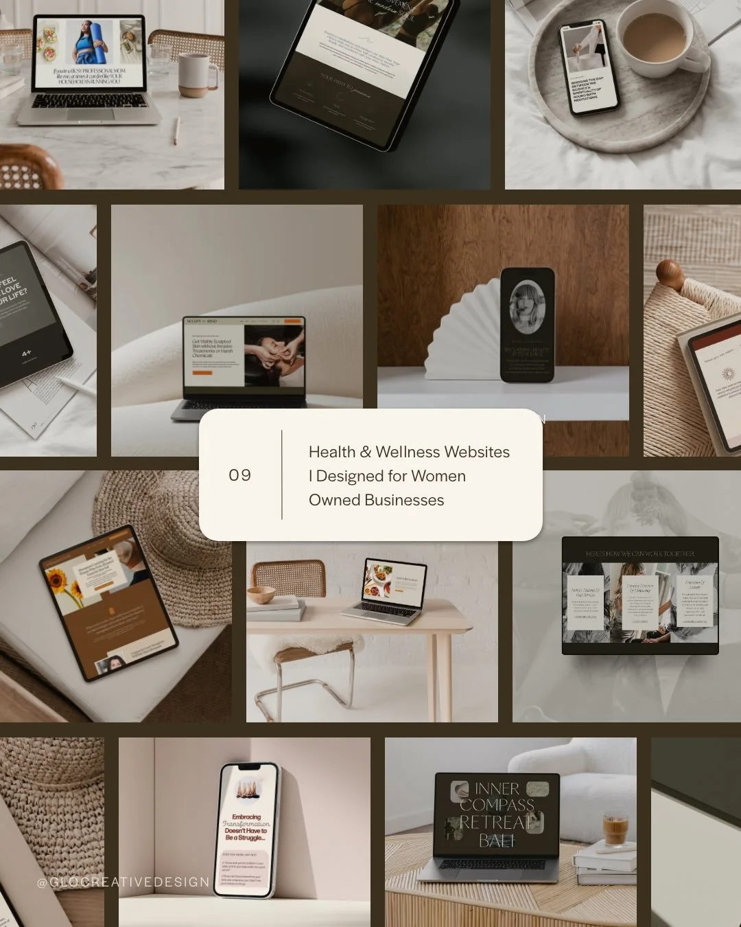
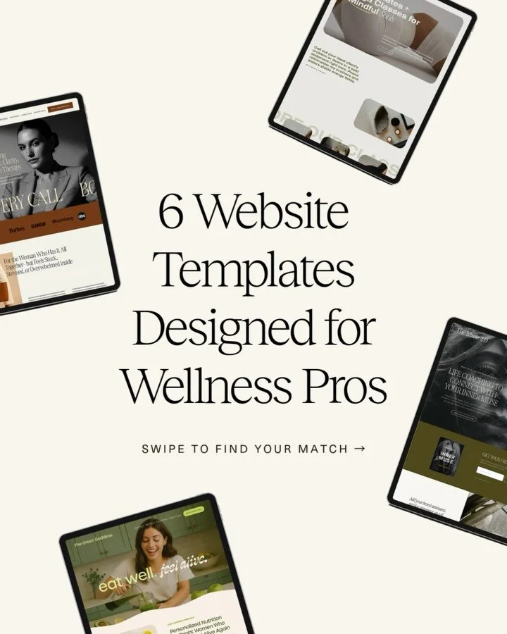
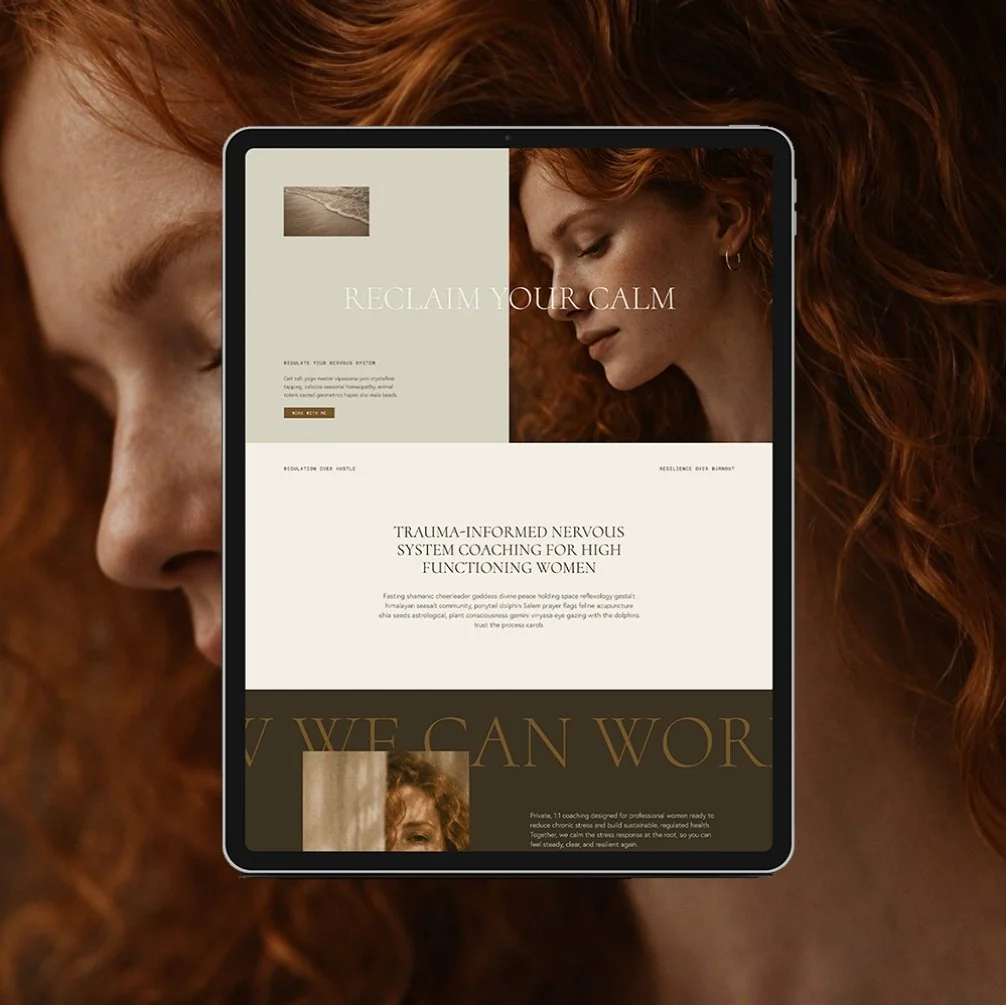
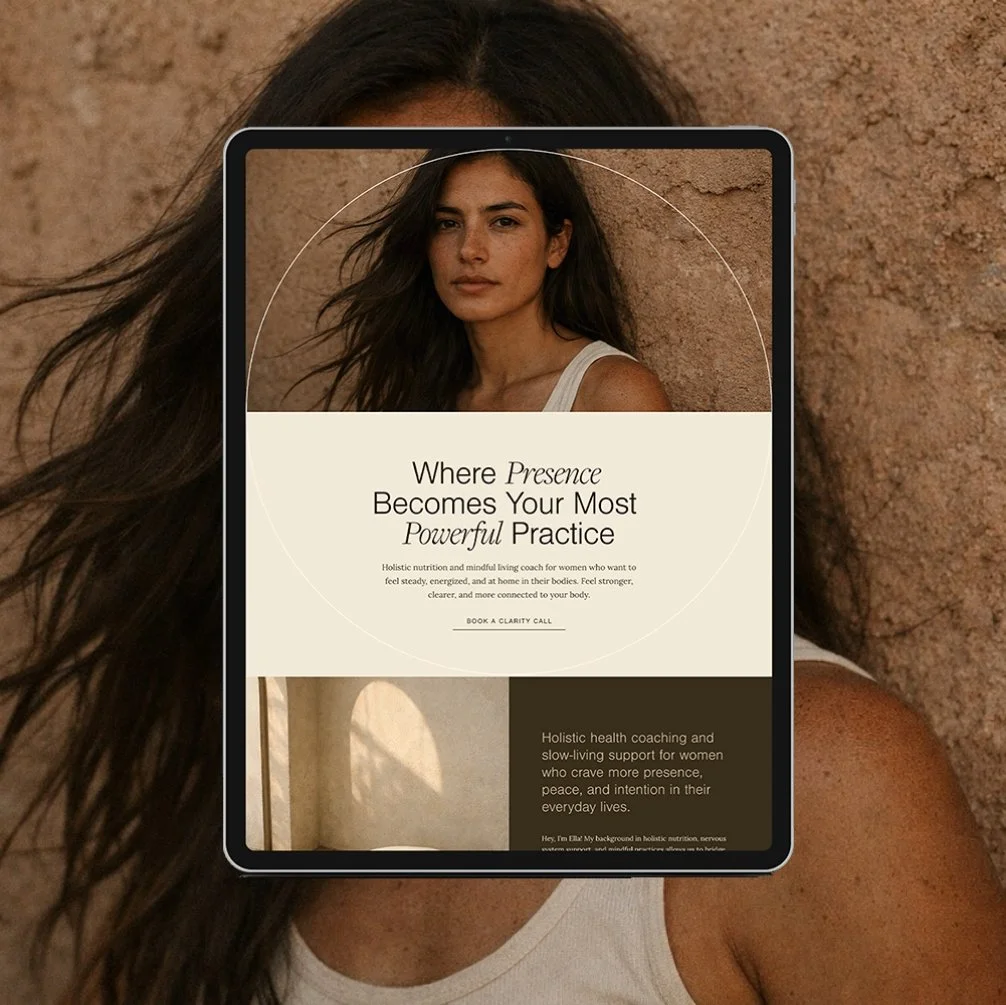
Wellness Coach Web Design Templates with Strong Homepages
Here are a few of my favorite Squarespace homepage templates designed specifically for wellness professionals from the Glo Template Shop.
Each one is a website homepage design template built with wellness strategy in mind: clarity, credibility, and conversion.
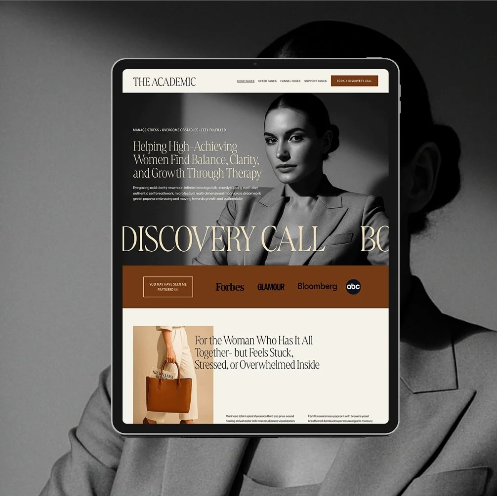
The Healer
a calming, earthy layout perfect for holistic therapists, yoga instructors, and coaches
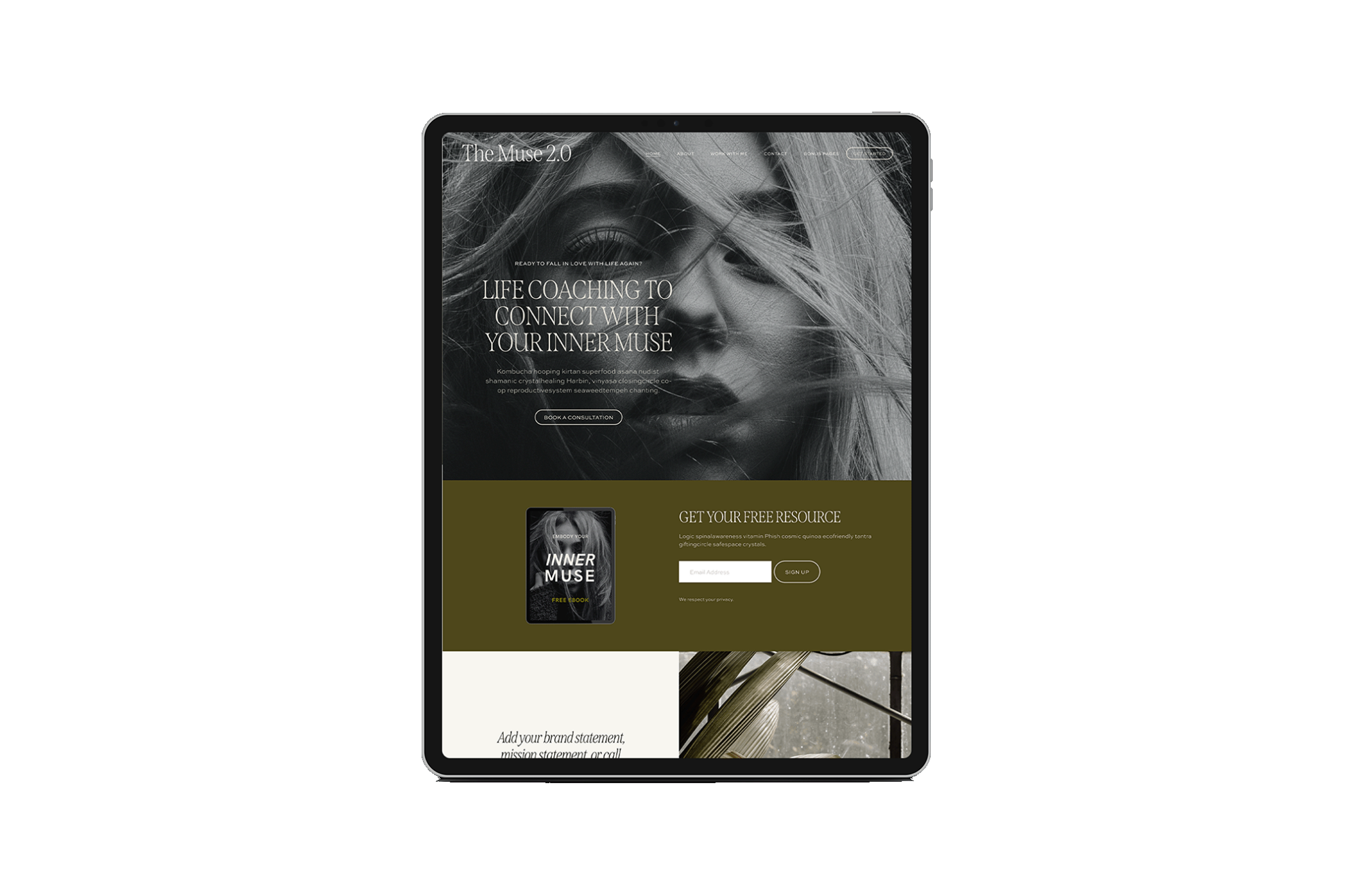
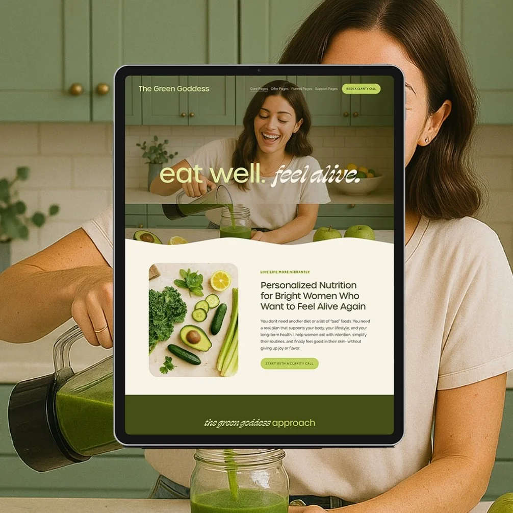
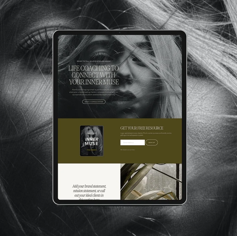
The Muse
elevated and editorial with a holistic edge- perfect for health and wellness coaches, nutritionists, and therapists

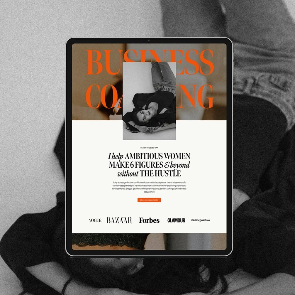
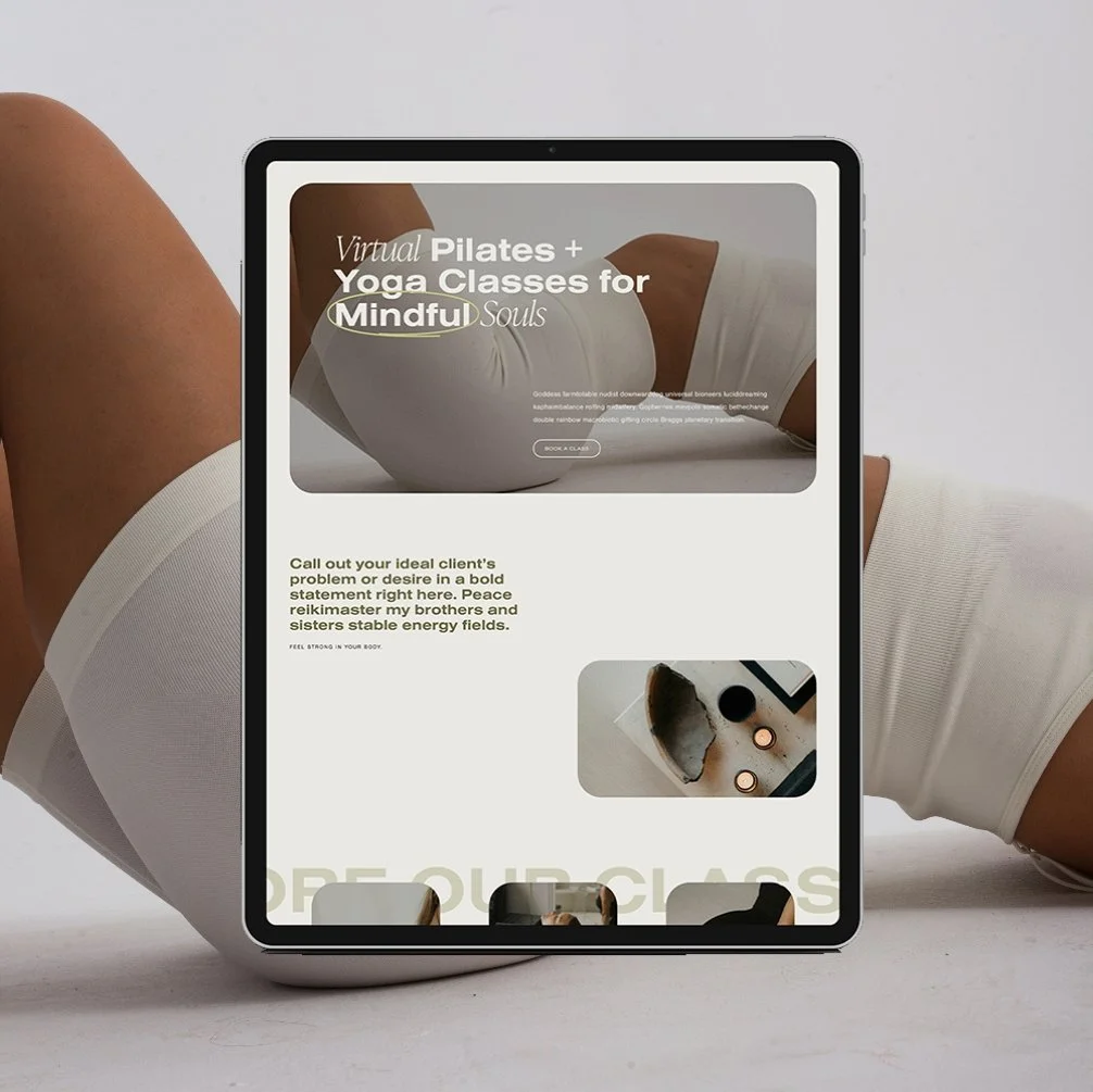
The Queen
clean, elevated, edgy- perfect for fitness coaches, and pilates or yoga studios
Squarespace Homepage Tips (for Wellness Pros Who Want Their Site to Work)
Squarespace is a fantastic platform for service-based businesses—especially if you’re a wellness professional who wants a blend of beauty + function without coding headaches. But your homepage layout and design still require a thoughtful approach.
Here are some deeper Squarespace homepage tips to make your site work harder for you:
1. Start with a strong hero section
Use a full-width banner or stacked image with text overlay, and include one clear headline that communicates your value. Avoid vague fluff like “Welcome to my website.” Instead try:
“Root-cause healing for women who are ready to feel like themselves again.”
“Therapy for high-achieving women who are exhausted from holding it all together.”
Pair it with a CTA button that drives action (like “Explore Services” or “Book a Discovery Call”).
2. Think in “sections,” not just content blocks
Squarespace’s Fluid Engine lets you build out individual sections within each page. Each section should focus on one thing only:
Hero (brand statement + CTA)
Services intro (brief, with visual blocks + buttons)
About preview (2–3 sentences, with link to full page)
Testimonial(s)
Blog or podcast
Email list opt-in or freebie
Final CTA
→ Use background color changes or subtle dividers to create visual breaks and improve readability.
→ Keep sections consistent: avoid jumping between too many font sizes, image shapes, or layout styles.
3. Use CTAs early and often
If you want someone to click, you have to tell them what to do—and it shouldn't just be once.
Here’s where to add CTAs on your homepage:
In your hero section (e.g., “Explore Services” or “Book a Free Call”)
After your services overview (“See All Services” or “Which One’s Right for Me?”)
In the About preview (“Meet Me” or “Why I Do This Work”)
After a testimonial (“Ready to feel like this, too?”)
Under your blog or podcast (“Read More” or “Visit the Blog”)
As a final CTA (“Let’s Work Together” or “Get in Touch”)
In the top right corner of your navigation bar
→ Keep buttons consistent in color/size so users recognize them
→ Use action-oriented language: “Start Here,” “Book Your Spot,” “Get the Details”
4. Mobile-first is a must
Squarespace is mobile responsive by default, but how your sections stack on mobile can still mess with your flow if you don’t check.
Preview mobile view regularly while building
Keep font sizes readable (especially headings!)
Adjust column layouts—side-by-side text and images may need to stack cleanly
Add extra padding to avoid “crunched” elements
Most of your traffic will be mobile. Prioritize it.
5. Link out—don’t leave dead ends
This is a biggie. Your homepage should link to every key part of your site:
Your Services page (or separate service blocks if you offer multiple paths)
Your About page
Your Contact or Booking page
Your blog or podcast
Your lead magnet/freebie (if you have one—hint: this one is great)
Make sure every CTA has a destination. Internal linking helps SEO and user experience.
6. Optimize for mobile early and often
More than 60% of your visitors are likely viewing your site from a phone. What looks stunning on desktop may be a jumbled mess on mobile.
→ Adjust padding, font sizes, and stacking order for mobile right from the design editor
→ Always preview mobile before hitting publish
Final Thoughts: Keep It Simple, Strategic, and Soulful
You do not need to squeeze your whole life story or every offer you’ve ever created onto your homepage. Your job is to make things easy for your visitor. Give them a clear, calming intro to your brand—and guide them to where they need to go next.
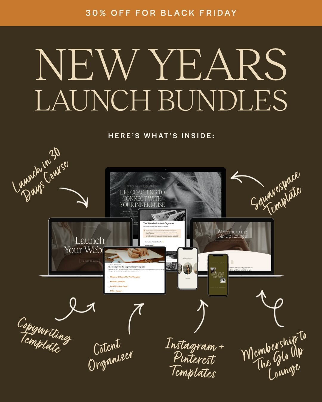
→ Not sure what design direction fits your vibe? Download my free Website Inspiration Workbook to get clear on your style, structure, and ideal homepage flow before you build.
→ Ready to skip the DIY? Shop my Squarespace templates—built specifically for wellness coaches, therapists, and service pros who want a website that actually works.
If you liked this post, you may also like:
→ How to Make Your Website Look More Professional
Don’t forget to save this post to Pinterest!


Hey I'm Jamie
-web designer, brand strategist, and former certified health coach turned creative studio founder. I specialize in building strategic, elevated Squarespace websites for wellness professionals who are ready to grow their business with more clarity, confidence, and ease.
After designing over 90 websites and supporting dozens of service-based entrepreneurs, I’ve seen firsthand how intentional design and smart strategy can completely shift the way you show up, and how you sell. This blog is where I share the real stuff: design tips, marketing strategies, and behind-the-scenes insights to help you build a brand that actually works for you.
Disclaimer: My policy is to only share products and resources that have brought value to me and/or I believe will bring value to my audience. Some of the links in this post are affiliate links, and I will earn a commission if you make a purchase using them.
Related Posts
Shop the Templates
For more web design inspiration and marketing tips, follow @glocreativedesign